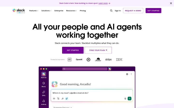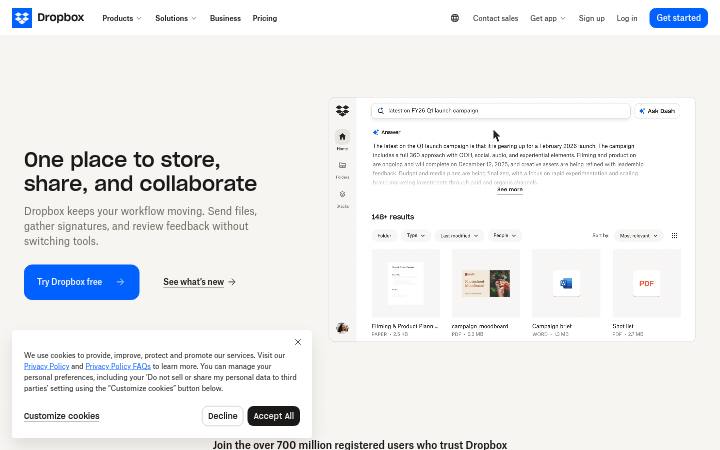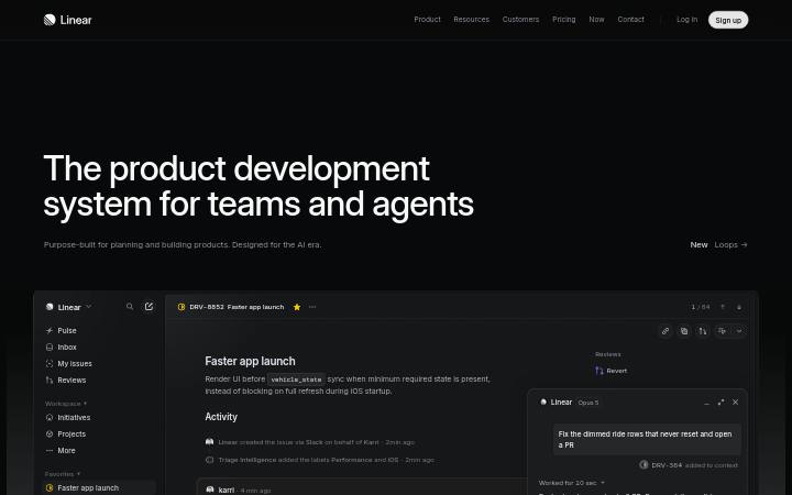
نظام تصميم notion.com
The AI workspace that works for you. | Notion
يعتمد notion.com على NotionInter في النصوص، وعلى #0075de كلون مميز. تم القياس في 28 سبتمبر 2026.
استخدمها مع الذكاء الاصطناعيموجود أيضًا في ملف zip باسم README.md وPROMPT.md
- .
- فك ضغط الحزمة داخل مشروعك بحيث يكون المجلد في
design/notion.com-design-pack/. - اختياري: انسخ المجلد أيضًا إلى
.claude/skills/notion-com-design/. يجعل SKILL.md الموجود بداخله Claude Code يحمّل الحزمة تلقائيًا كلما بنى واجهة. - الصق الـ prompt أدناه في Claude Code واكتب ما تريد بناءه.
Prompt
يبقى الـ prompt بالإنجليزية: فهو يسمّي ملفات الحزمة، ويقرؤه الذكاء الاصطناعي بأي لغة.
Use the design pack in `design/notion.com-design-pack/` as the source of truth for how the UI looks and behaves. It was measured from https://www.notion.com/.

1. Read DESIGN.md (colours, type, spacing, radii, shadows, components) and BEHAVIOR.md (hover, focus, tooltips, menus, motion, scrolling, forms, responsive rules) before writing any code.
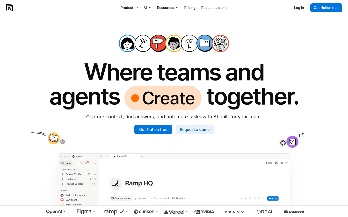
2. Look at every image in `design/notion.com-design-pack/screenshots/` and match the composition, density, whitespace and image treatment. Tokens do not carry those; the screenshots do.
3. Style everything with `design/notion.com-design-pack/tokens.css` (or `tailwind.css` if this project uses Tailwind v4). Do not invent colours, radii, shadows or font sizes that are not in the pack.
4. Load the fonts named in DESIGN.md. Where a font is not freely available, use the stand-in it names at the same sizes and weights.
5. Match the breakpoints and hover, focus and motion rules in BEHAVIOR.md. The site has no dark mode, so do not add one.

Now build: [describe the page or app you want]

When you are done, compare the result with the screenshots at desktop and phone widths, fix the biggest visual difference first, and repeat.الألوان9 tokens
background
#ffffff
surface
#ffdec4
surface-2
#e6f3fe
foreground
#0d0d0d
muted-foreground
#ffffff
primary
#0075de
on-primary
#ffffff
secondary
#ffb110
border
#e6e6e6
الخطوط1 عائلة خطوط
NotionInterمستضاف ذاتيًا، بديل Inter
headline-displayQuick brown fox96px / 600 / lh 1.04 / -4.6px
headline-lgQuick brown fox22px / 700 / lh 1.27 / -0.25px
headline-mdQuick brown fox16px / 700 / lh 1.5
body-mdThe quick brown fox jumps over the lazy dog14px / 500 / lh 1.43
label-mdThe quick brown fox jumps over the lazy dog13px / 500 / lh 1.4
buttonThe quick brown fox jumps over the lazy dog16px / 500 / lh 1.5
الأحجام المستخدمة
141618202242547296
التفاعل والحركة
- button primary "Get Notion free": background #0075de → #005bab
- button secondary "Get Notion free": background #0075de → #005bab
- nav link "Pricing": background transparent → #0000000d
- تركيز button primary: outline 2px solid rgba(0, 117, 222, 0.843), offset 2px
- التلميحات: No tooltip could be triggered from the first viewport, but the stylesheet defines tooltip rules (.Tooltip-module__5ukQdW__popup): background: var(--bg-inverse); color: var(--content-primary); box-shadow: rgba(0, 0, 0, 0.08) 0px 4px 12px -2px, rgba(255, 255, 255, 0.05) 0px 0px 0px 1px inset; outline: rgba(0, 0, 0, 0) solid 1px; opacity: 0.
- القوائم: Hover/click menus: below the trigger, 29px gap, shifted right; #ffffff, radius 16px, padding 16px 16px, shadow yes; 22 items, 44px tall, 16px, padding 0px 0px, with icons, with descriptions, 3 columns; n/a; n/a.
- الحركة: 154 elements carry transitions; typical 0.2s with cubic-bezier(0.42, 0, 1, 1), mostly on background-color, text-decoration-color, color. 10 running keyframe animations (Agent-module-scss-module__7kINlq__agentMarkEnter 0.6s 1; Agent-module-scss-module__7kINlq__agentTaskEnter 0.6s 1; Agent-module-scss-module__7kINlq__agentTaskScroll 1s 1). 4 sizable elements sit at opacity 0 before scrolling: scroll-reveal animations are in use (reveal on enter, fade + rise is the usual recipe).
المسافاتوحدة 4px
- عرض المحتوى
- 1229px
- نقاط التوقف
- 600, 840, 1080, 1280, 1440px
الاستدارة
زر 8pxحقل 8pxبطاقة 12pxصورة 0px
الظلال3
1
2
3
المكونات
Get Notion freeProductRequest a demo
- زر primary
- نص #ffffff على #0075de, r 8px, h 36px, 16px/500
- زر ghost
- نص #000000e5 على شفاف فوق #ffffff, r 4px, h 30px, 16px/400
- زر secondary
- نص #005bab على #e6f3fe, r 8px, h 38px, 16px/500
- بطاقة
- #ffffff, 1px solid #0000001a, r 12px
- رابط
- #000000e5, بلا تسطير, 400
- ترويسة
- 64px, relative, 12 روابط بحجم 16px
- h1
- 96px / 600, محاذاة center, الحد الأقصى 1252px
- النماذج
- 0 forms, 1 inputs. Required markers: 0. Help texts: 0. Label placement: no labelled inputs.
- الأيقونات
- Icons: 27 inline SVGs, filled, sizes 24px/10px/12px/14px.
لقطات الشاشةبعرض 1440 و390
السمة
No dark mode responded to prefers-color-scheme, a theme toggle, or a root class/attribute.
التجاوب1440 / 1024 / 768 / 390 px
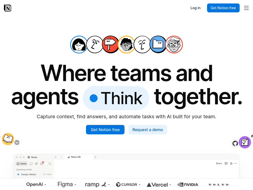
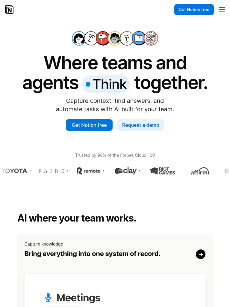
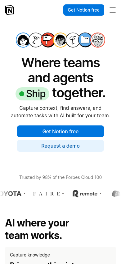
| العرض | المحتوى | الهامش | المتن | H1 | الترويسة | الواجهة الرئيسية | الشبكات | الأزرار |
|---|---|---|---|---|---|---|---|---|
| desktop 1440 | 1229px | 94px | 16px | 96px, 2 lines, center | 64px, 4 links, 1 CTA | media below text | 5→2 col; 3→2 col; 2→1 col | content-width |
| laptop 1024 | 870px | 32px | 16px | 89.7px, 2 lines, center | 64px, hamburger (Toggle main menu), 1 CTA | media below text | 3→2 col; 2→1 col; 5→1 col | content-width |
| tablet 768 | 653px | 32px | 16px | 60.9px, 2 lines, center | 64px, hamburger (Toggle main menu), 1 CTA | text only | 3→1 col; 2→1 col; 5→1 col | content-width |
| phone 390 | 358px | 16px | 16px | 42px, 3 lines, center | 64px, hamburger (Toggle main menu), 1 CTA | text only | 2→1 col; 3→3 col; 4→2 col | 2 full-width |
- H1 goes 96px → 42px (44%), 2 → 3 lines.
- Nav collapses to a hamburger by 390px (first seen at 1024px); header 64px → 64px.
- Hero: media below text → text only.
- Card grids: 2 columns → 1 column on phones (gap normal → normal).
- Body text stays 16px at every width.
- Phone side gutter 16px.
- 2 buttons stretch full-width on phones.
- Section top padding 96px → 32px.
ملفات الحزمة14 ملفات
DESIGN.md
صيغة DESIGN.md من Google؛ تقرؤها Stitch وClaude Code وCursor
tokens.json
W3C Design Tokens (DTCG) لـ Style Dictionary وإضافات Figma
tokens.css
القيم نفسها كخصائص CSS مخصصة
tailwind.css
كتلة @theme في Tailwind v4
SKILL.md
مهارة (skill) لـ Claude Code وCursor ترتّب الحزمة للوكيل بالتسلسل الصحيح
BEHAVIOR.md
حالات hover والتركيز، والتلميحات، والقوائم، والحركة، والتمرير، والجداول، والنماذج، والنص، والتجاوب، والوضع الداكن، والتقنيات المستخدمة
evidence.json
القياسات الخام خلف المستندين (كل عرض شاشة وكل فحص وكل قاعدة)
screenshots/
desktop-1440-fold.png, desktop-1440-full.jpg, laptop-1024-fold.png, tablet-768-fold.png, phone-390-fold.png, phone-390-full.jpg
DESIGN.md236 سطر
---
version: alpha
name: "notion.com"
description: "Design system extracted from https://www.notion.com/ on 2026-09-28"
colors:
  background: "#ffffff"
  surface: "#ffdec4"
  surface-2: "#e6f3fe"
  foreground: "#0d0d0d"
  muted-foreground: "#ffffff"
  primary: "#0075de"
  on-primary: "#ffffff"
  secondary: "#ffb110"
  border: "#e6e6e6"
typography:
  headline-display:
    fontFamily: "NotionInter"
    fontSize: "96px"
    fontWeight: 600
    lineHeight: "1.04"
    letterSpacing: "-4.6px"
  headline-lg:
    fontFamily: "NotionInter"
    fontSize: "22px"
    fontWeight: 700
    lineHeight: "1.27"
    letterSpacing: "-0.25px"
  headline-md:
    fontFamily: "NotionInter"
    fontSize: "16px"
    fontWeight: 700
    lineHeight: "1.5"
  body-md:
    fontFamily: "NotionInter"
    fontSize: "14px"
    fontWeight: 500
    lineHeight: "1.43"
  label-md:
    fontFamily: "NotionInter"
    fontSize: "13px"
    fontWeight: 500
    lineHeight: "1.4"
  button:
    fontFamily: "NotionInter"
    fontSize: "16px"
    fontWeight: 500
    lineHeight: "1.5"
rounded:
  none: "0px"
  md: "8px"
  lg: "12px"
  sm: "4px"
  full: "9999px"
spacing:
  unit: "4px"
  1: "4px"
  2: "8px"
  3: "12px"
  4: "16px"
  5: "24px"
  6: "32px"
components:
  button-primary:
    backgroundColor: "{colors.primary}"
    textColor: "{colors.on-primary}"
    typography: "{typography.button}"
    rounded: "8px"
    height: "36px"
    padding: "4px 14px"
  button-ghost:
    backgroundColor: "#ffffff"
    textColor: "#000000e5"
    typography: "{typography.button}"
    rounded: "4px"
    height: "30px"
    padding: "5px 10px"
  button-secondary:
    backgroundColor: "#e6f3fe"
    textColor: "#005bab"
    typography: "{typography.button}"
    rounded: "8px"
    height: "38px"
    padding: "6px 15px"
  card:
    backgroundColor: "#ffffff"
    rounded: "12px"
    padding: "24px"
---

# notion.com

## Overview

The AI workspace that works for you. | Notion: Build Custom Agents, search across all your apps, and automate busywork. The AI workspace where teams get more done, faster.

Gently rounded controls, layered shadows for depth, large display type at 96px / 600, a single blue accent on neutrals. The site ships in light mode by default. Measured from 894 rendered elements at 1440px wide on 2026-09-28.

Reference screenshots live beside this file; look at them before writing any layout, they carry the composition, density and image treatment that tokens cannot:

- `screenshots/desktop-1440-fold.png`: Desktop 1440, above the fold
- `screenshots/desktop-1440-full.jpg`: Desktop 1440, full page
- `screenshots/laptop-1024-fold.png`: Laptop 1024, above the fold
- `screenshots/tablet-768-fold.png`: Tablet 768, above the fold
- `screenshots/phone-390-fold.png`: Phone 390, above the fold
- `screenshots/phone-390-full.jpg`: Phone 390, full page

## Colors

| Token | Value | Use |
| --- | --- | --- |
| background | `#ffffff` | Page background |
| surface | `#ffdec4` | Cards, panels, raised or recessed surfaces |
| surface-2 | `#e6f3fe` | Secondary surface |
| foreground | `#0d0d0d` | Primary text |
| muted-foreground | `#ffffff` | Secondary text, captions |
| primary | `#0075de` | Accent: primary buttons, links, focus |
| on-primary | `#ffffff` | Text on the accent |
| secondary | `#ffb110` | Secondary accent (yellow) |
| border | `#e6e6e6` | Hairlines, dividers, input borders |

Full painted palette by area (largest first): `#ffffff`, `#097fe8`, `#ffb110`, `#f64932`, `#005bab`, `#e32d14`, `#e89d01`, `#ffdec4`.

Gradients in use: `linear-gradient(rgba(0, 0, 0, 0) 35%, rgba(0, 0, 0, 0.55) 100%)`.

The accent `#0075de` is used sparingly: primary buttons, links and focus rings. Everything else stays neutral.

## Typography

- **NotionInter** for h1, h2, h3, body, button: self-hosted webfont, not freely available; use **Inter** from Google Fonts as the stand-in.

| Role | Family | Size | Weight | Line height | Tracking |
| --- | --- | --- | --- | --- | --- |
| headline-display | NotionInter | 96px | 600 | 1.04 | -4.6px |
| headline-lg | NotionInter | 22px | 700 | 1.27 | -0.25px |
| headline-md | NotionInter | 16px | 700 | 1.5 | normal |
| body-md | NotionInter | 14px | 500 | 1.43 | normal |
| label-md | NotionInter | 13px | 500 | 1.4 | normal |
| button | NotionInter | 16px | 500 | 1.5 | normal |

Type scale in use: 14px, 16px, 18px, 20px, 22px, 42px, 54px, 72px, 96px. Base body size 14px.

The H1 renders at 96px / 600, center aligned, up to 1252px wide, tracking -4.6px. Sample: "Where teams and agents Create together.".

## Layout

- Spacing unit: 4px. Scale in use: 4, 8, 12, 16, 24, 32 (px).
- Flex and grid gaps: 8, 12, 16, 24, 32 px.
- Content max width: 1229px, centred.
- Breakpoints: 600px, 840px, 1080px, 1280px, 1440px.
- Header: 64px tall, relative, background `rgb(255, 255, 255)`; 12 nav links at 16px / 400 (Notion AIAI tools for work · AgentsAutomate busywork · AI Meeting NotesPerfectly written by AI · Enterprise SearchFind answers instantly · Knowledge BaseCentralize your knowledge · DocsSimple and powerful · ProjectsManage any project · ConnectionsConnect your apps).

## Elevation & Depth

Shadows in use, most common first:

- shadow-1: `rgba(0, 0, 0, 0.01) 0px 0.175px 1.041px 0px, rgba(0, 0, 0, 0.02) 0px 0.8px 2.925px 0px, rgba(0, 0, 0, 0.027) 0px 2.025px 7.847px 0px, rgba(0, 0, 0, 0.04) 0px 4px 18px 0px`
- shadow-2: `rgba(0, 0, 0, 0) 0px 1px 0px 0px`
- shadow-3: `rgba(0, 0, 0, 0.008) 0px 0.667px 3.502px 0px, rgba(0, 0, 0, 0.016) 0px 2.933px 7.252px 0px, rgba(0, 0, 0, 0.02) 0px 7.2px 14.462px 0px, rgba(0, 0, 0, 0.024) 0px 13.867px 28.348px 0px, rgba(0, 0, 0, 0.03) 0px 23.333px 52.123px 0px, rgba(0, 0, 0, 0.04) 0px 36px 89px 0px`

## Shapes

- Buttons: 8px
- Inputs: 8px
- Cards and panels: 12px
- Images and media: 0px
- Radius scale: none 0px, md 8px, lg 12px, sm 4px, full 9999px

## Components

### Button, primary

Background `#0075de`, text `#ffffff`, border 1px solid transparent, radius 8px, height 36px, padding 4px 14px, 16px / 500. Sample label: "Get Notion free".

### Button, ghost

Background transparent (it sits on `#ffffff`, so place it on that colour), text `#000000e5`, border none, radius 4px, height 30px, padding 5px 10px, 16px / 400. Sample label: "Product".

### Button, secondary

Background `#e6f3fe`, text `#005bab`, border 1px solid transparent, radius 8px, height 38px, padding 6px 15px, 16px / 500. Sample label: "Request a demo".

### Card

Background `#ffffff`, border 1px solid #0000001a, radius 12px, padding 24px, no shadow. Typical size about 239×160px.

### Link

Colour `#000000e5`, no underline at rest, weight 400.

## Dark Mode

No dark mode responded to prefers-color-scheme, a theme toggle, or a root class/attribute.

## Responsive Behavior

| Viewport | Content width | Gutter | Body | H1 | Header | Hero | Grids | Buttons |
| --- | --- | --- | --- | --- | --- | --- | --- | --- |
| desktop 1440px | 1229px | 94px | 16px | 96px, 2 lines, center | 64px, 4 links, 1 CTA | media below text | 5→2 col; 3→2 col; 2→1 col | content-width |
| laptop 1024px | 870px | 32px | 16px | 89.7px, 2 lines, center | 64px, hamburger (Toggle main menu), 1 CTA | media below text | 3→2 col; 2→1 col; 5→1 col | content-width |
| tablet 768px | 653px | 32px | 16px | 60.9px, 2 lines, center | 64px, hamburger (Toggle main menu), 1 CTA | text only | 3→1 col; 2→1 col; 5→1 col | content-width |
| phone 390px | 358px | 16px | 16px | 42px, 3 lines, center | 64px, hamburger (Toggle main menu), 1 CTA | text only | 2→1 col; 3→3 col; 4→2 col | 2 full-width |

- H1 goes 96px → 42px (44%), 2 → 3 lines.
- Nav collapses to a hamburger by 390px (first seen at 1024px); header 64px → 64px.
- Hero: media below text → text only.
- Card grids: 2 columns → 1 column on phones (gap normal → normal).
- Body text stays 16px at every width.
- Phone side gutter 16px.
- 2 buttons stretch full-width on phones.
- Section top padding 96px → 32px.

## Interaction & Motion

154 elements carry transitions; typical 0.2s with cubic-bezier(0.42, 0, 1, 1), mostly on background-color, text-decoration-color, color. 10 running keyframe animations (Agent-module-scss-module__7kINlq__agentMarkEnter 0.6s 1; Agent-module-scss-module__7kINlq__agentTaskEnter 0.6s 1; Agent-module-scss-module__7kINlq__agentTaskScroll 1s 1).

- Hover on button-primary ("Get Notion free"): background #0075de → #005bab; cursor pointer.
- Hover on button-secondary ("Get Notion free"): background #0075de → #005bab; cursor pointer; transition background-color, color | 0.2s | cubic-bezier(0.42, 0, 1, 1).
- Hover on nav-link ("Pricing"): background transparent → #0000000d; cursor pointer; transition background-color | 0.15s | ease.
- Focus on button-primary: outline 2px solid rgba(0, 117, 222, 0.843), offset 2px.
- No tooltip could be triggered from the first viewport, but the stylesheet defines tooltip rules (.Tooltip-module__5ukQdW__popup): background: var(--bg-inverse); color: var(--content-primary); box-shadow: rgba(0, 0, 0, 0.08) 0px 4px 12px -2px, rgba(255, 255, 255, 0.05) 0px 0px 0px 1px inset; outline: rgba(0, 0, 0, 0) solid 1px; opacity: 0.
- Hover/click menus: below the trigger, 29px gap, shifted right; #ffffff, radius 16px, padding 16px 16px, shadow yes; 22 items, 44px tall, 16px, padding 0px 0px, with icons, with descriptions, 3 columns; n/a; n/a.
- 4 sizable elements sit at opacity 0 before scrolling: scroll-reveal animations are in use (reveal on enter, fade + rise is the usual recipe).
- Portal roots present: portal.

Full detail (every overlay, table, form, scroll and text rule measured) is in `BEHAVIOR.md`; raw evidence in `evidence.json`.

## Do's and Don'ts

- Do use 4px multiples for every padding, margin and gap; the site does not use odd values.
- Do reserve `#0075de` for actions and focus; never paint large areas with it.
- Do keep body text at 14px in NotionInter.
- Do match corner radii per element class (buttons 8px, cards 12px); do not pick one radius for everything.
- Do use the measured shadows above; do not invent heavier ones.
- Don't substitute a different accent hue or introduce gradients that are not listed above.
- Don't rebuild from the tokens alone; open the screenshots for composition, density and image treatment.