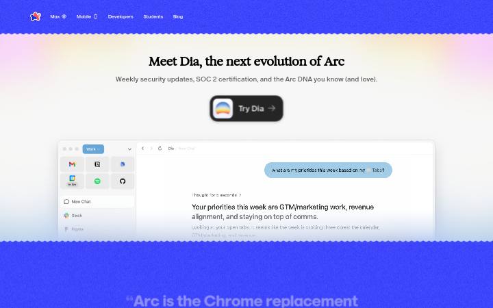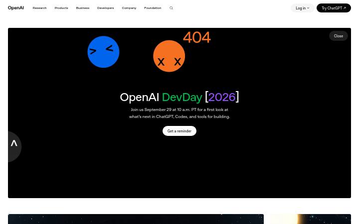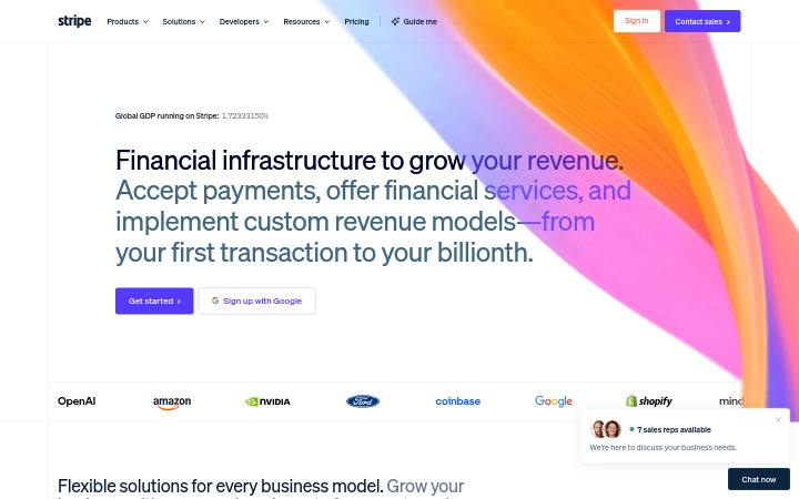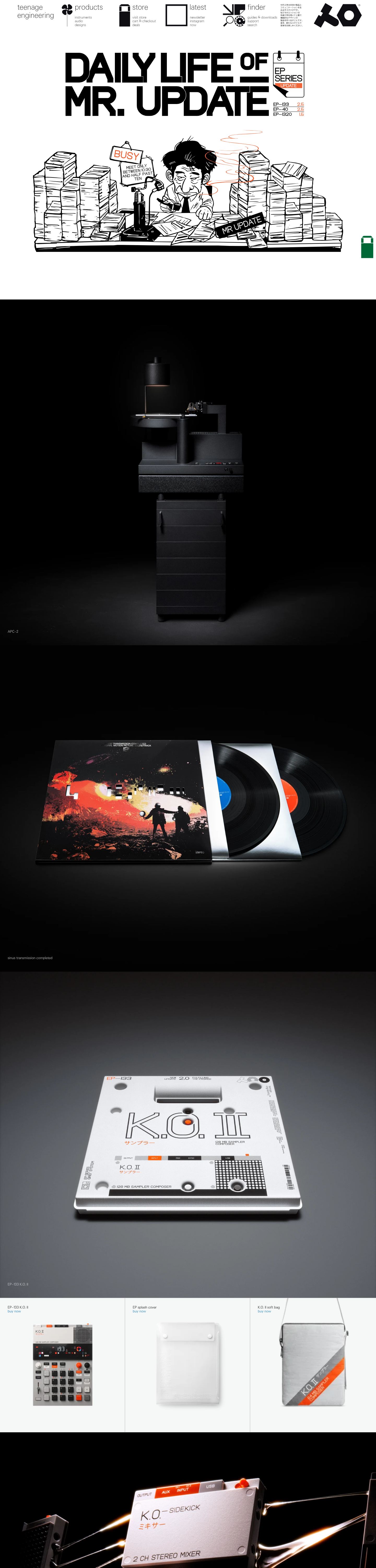
Sistema de diseño de teenage.engineering
teenage engineering
Tecnología de consumoClaro1115 elementos medidos, medido hace 7 horas
teenage.engineering usa te-20 para la tipografía y #0071bb como color de acento.Medido el 28 de septiembre de 2026.
Muestra del sitio
1440 pxÚsalo con tu IA
también en el zip como README.md y PROMPT.md- .
- Descomprime el paquete en tu proyecto para que la carpeta quede en
design/teenage.engineering-design-pack/. - Opcional: copia también la carpeta a
.claude/skills/teenage-engineering-design/. El SKILL.md que hay dentro hace que Claude Code cargue el paquete por sí solo cada vez que crea interfaces. - Pega el prompt de abajo en Claude Code y completa lo que quieres construir.
Prompt
El prompt se queda en inglés: nombra los archivos del paquete, y tu IA lo lee en cualquier idioma.
Use the design pack in `design/teenage.engineering-design-pack/` as the source of truth for how the UI looks and behaves. It was measured from https://teenage.engineering/.

1. Read DESIGN.md (colours, type, spacing, radii, shadows, components) and BEHAVIOR.md (hover, focus, tooltips, menus, motion, scrolling, forms, responsive rules) before writing any code.
2. Look at every image in `design/teenage.engineering-design-pack/screenshots/` and match the composition, density, whitespace and image treatment. Tokens do not carry those; the screenshots do.
3. Style everything with `design/teenage.engineering-design-pack/tokens.css` (or `tailwind.css` if this project uses Tailwind v4). Do not invent colours, radii, shadows or font sizes that are not in the pack.
4. Load the fonts named in DESIGN.md. Where a font is not freely available, use the stand-in it names at the same sizes and weights.
5. Match the breakpoints and hover, focus and motion rules in BEHAVIOR.md. The site has no dark mode, so do not add one.

Now build: [describe the page or app you want]

When you are done, compare the result with the screenshots at desktop and phone widths, fix the biggest visual difference first, and repeat.
Colores
5 tokensComponentes
search
- botón ghost
- texto #0f0e12 sobre transparente sobre #ffffff, r 0px, h 32px, 16px/100
- enlace
- #0f0e12, sin subrayado, 100
- cabecera
- 0px, absolute, 12 enlaces a 16px
- formularios
- 0 forms, 2 inputs. Required markers: 0. Help texts: 0. Label placement: other (1).
- iconos
- Icons: 3 inline SVGs, filled, sizes 35px/47px; icon font classes icon-.
Interacción y movimiento
- nav link "teenage engineering": sin cambio en hover
- tooltips: Tooltip triggers exist (3 × title) but none opened on hover in the first viewport; title attributes fall back to the browser's native tooltip.
- menús: No dropdown menus found in the header.
- movimiento: 3 elements carry transitions; typical 0.2s with ease-in, mostly on background-color, opacity, transform. No running keyframe animations at rest. No scroll-reveal: content is visible without scrolling into view.
Tipografía
1 familiate-20autoalojada, sustituta: Inter
headline-displayQuick brown fox48px / 700 / lh 1.4
headline-lgQuick brown fox32px / 600 / lh 1.4
headline-mdQuick brown fox24px / 600 / lh 1.4
body-mdThe quick brown fox jumps over the lazy dog19px / 100 / lh 1.16
label-mdThe quick brown fox jumps over the lazy dog13px / 500 / lh 1.4
buttonThe quick brown fox jumps over the lazy dog16px / 100 / lh 1.5
Tamaños en uso
131619
Espaciado
unidad de 4px- Ancho del contenido
- 1308px
Radio
botón 0pxcampo 0pxtarjeta 0pximagen 0px
Sombras
0Plano: sin sombras de caja en uso.
Tema
No dark mode responded to prefers-color-scheme, a theme toggle, or a root class/attribute.
Responsive
1440 / 1024 / 768 / 390 px| Viewport | Contenido | Gutter | Cuerpo | H1 | Cabecera | Hero | Cuadrículas | Botones |
|---|---|---|---|---|---|---|---|---|
| desktop 1440 | 479px | 16px | 0px, 22 links | content-width | ||||
| laptop 1024 | 341px | 16px | 0px, 22 links | content-width | ||||
| tablet 768 | 697px | 16px | 0px, 22 links | content-width | ||||
| phone 390 | 354px | 16px | 0px, 0 links | 3→3 col | 1 full-width |
- Nav never collapses to a hamburger (0 links still visible at 390px).
- Body text stays 16px at every width.
- 1 buttons stretch full-width on phones.
Archivos del paquete
14 archivosDESIGN.md171 líneas
---
version: alpha
name: "teenage.engineering"
description: "Design system extracted from https://teenage.engineering/ on 2026-09-28"
colors:
  background: "#f6f8f7"
  foreground: "#0f0e12"
  muted-foreground: "#e5e5e5"
  primary: "#0071bb"
  on-primary: "#ffffff"
typography:
  headline-display:
    fontFamily: "te-20"
    fontSize: "48px"
    fontWeight: 700
    lineHeight: "1.4"
  headline-lg:
    fontFamily: "te-20"
    fontSize: "32px"
    fontWeight: 600
    lineHeight: "1.4"
  headline-md:
    fontFamily: "te-20"
    fontSize: "24px"
    fontWeight: 600
    lineHeight: "1.4"
  body-md:
    fontFamily: "te-20"
    fontSize: "19px"
    fontWeight: 100
    lineHeight: "1.16"
  label-md:
    fontFamily: "te-20"
    fontSize: "13px"
    fontWeight: 500
    lineHeight: "1.4"
  button:
    fontFamily: "te-20"
    fontSize: "16px"
    fontWeight: 100
    lineHeight: "1.5"
rounded:
  none: "0px"
  full: "9999px"
spacing:
  unit: "4px"
  1: "32px"
  2: "68px"
components:
  button-ghost:
    backgroundColor: "#ffffff"
    textColor: "#0f0e12"
    typography: "{typography.button}"
    rounded: "0px"
    height: "32px"
    padding: "0px 37px"
---

# teenage.engineering

## Overview

teenage engineering: teenage engineering creates high quality, well designed, electronic products for all people who love sound and music.

Sharp, squared-off controls, flat surfaces separated by hairlines, confident display type at 48px / 700, a single blue accent on neutrals. The site ships in light mode by default. Measured from 1115 rendered elements at 1440px wide on 2026-09-28.

Reference screenshots live beside this file; look at them before writing any layout, they carry the composition, density and image treatment that tokens cannot:

- `screenshots/desktop-1440-fold.png`: Desktop 1440, above the fold
- `screenshots/desktop-1440-full.jpg`: Desktop 1440, full page
- `screenshots/laptop-1024-fold.png`: Laptop 1024, above the fold
- `screenshots/tablet-768-fold.png`: Tablet 768, above the fold
- `screenshots/phone-390-fold.png`: Phone 390, above the fold
- `screenshots/phone-390-full.jpg`: Phone 390, full page

## Colors

| Token | Value | Use |
| --- | --- | --- |
| background | `#f6f8f7` | Page background |
| foreground | `#0f0e12` | Primary text |
| muted-foreground | `#e5e5e5` | Secondary text, captions |
| primary | `#0071bb` | Accent: primary buttons, links, focus |
| on-primary | `#ffffff` | Text on the accent |

Full painted palette by area (largest first): `#f6f8f7`, `#000000`, `#0f0e12`.

The accent `#0071bb` is used sparingly: primary buttons, links and focus rings. Everything else stays neutral.

## Typography

- **te-20** for body, button: self-hosted webfont, not freely available; use **Inter** from Google Fonts as the stand-in.

| Role | Family | Size | Weight | Line height | Tracking |
| --- | --- | --- | --- | --- | --- |
| headline-display | te-20 | 48px | 700 | 1.4 | normal |
| headline-lg | te-20 | 32px | 600 | 1.4 | normal |
| headline-md | te-20 | 24px | 600 | 1.4 | normal |
| body-md | te-20 | 19px | 100 | 1.16 | normal |
| label-md | te-20 | 13px | 500 | 1.4 | normal |
| button | te-20 | 16px | 100 | 1.5 | normal |

Type scale in use: 13px, 16px, 19px. Base body size 19px.

## Layout

- Spacing unit: 4px. Scale in use: 32, 68 (px).
- Flex and grid gaps: 16, 24 px.
- Content max width: 1308px, centred.
- Header: 0px tall, absolute, background `rgba(0, 0, 0, 0)`; 12 nav links at 16px / 100 (teenage engineering · product · instruments · audio · designs · store · checkout · deals).

## Elevation & Depth

No box shadows in use; depth comes from hairline borders and surface tints (flat design).

## Shapes

- Buttons: 0px
- Inputs: 0px
- Cards and panels: 0px
- Images and media: 0px
- Radius scale: none 0px, full 9999px

## Components

### Button, ghost

Background transparent (it sits on `#ffffff`, so place it on that colour), text `#0f0e12`, border none, radius 0px, height 32px, padding 0px 37px, 16px / 100. Sample label: "search".

### Link

Colour `#0f0e12`, no underline at rest, weight 100.

## Dark Mode

No dark mode responded to prefers-color-scheme, a theme toggle, or a root class/attribute.

## Responsive Behavior

| Viewport | Content width | Gutter | Body | H1 | Header | Hero | Grids | Buttons |
| --- | --- | --- | --- | --- | --- | --- | --- | --- |
| desktop 1440px | 479px |  | 16px |  | 0px, 22 links |  |  | content-width |
| laptop 1024px | 341px |  | 16px |  | 0px, 22 links |  |  | content-width |
| tablet 768px | 697px |  | 16px |  | 0px, 22 links |  |  | content-width |
| phone 390px | 354px |  | 16px |  | 0px, 0 links |  | 3→3 col | 1 full-width |

- Nav never collapses to a hamburger (0 links still visible at 390px).
- Body text stays 16px at every width.
- 1 buttons stretch full-width on phones.

## Interaction & Motion

3 elements carry transitions; typical 0.2s with ease-in, mostly on background-color, opacity, transform. No running keyframe animations at rest.

- Hover on nav-link ("teenage engineering"): no visible change; cursor pointer.
- Tooltip triggers exist (3 × title) but none opened on hover in the first viewport; title attributes fall back to the browser's native tooltip.
- No dropdown menus found in the header.
- No scroll-reveal: content is visible without scrolling into view.

Full detail (every overlay, table, form, scroll and text rule measured) is in `BEHAVIOR.md`; raw evidence in `evidence.json`.

## Do's and Don'ts

- Do use 4px multiples for every padding, margin and gap; the site does not use odd values.
- Do reserve `#0071bb` for actions and focus; never paint large areas with it.
- Do keep body text at 19px in te-20.
- Do match corner radii per element class (buttons 0px, cards 0px); do not pick one radius for everything.
- Don't add drop shadows; this design is flat.
- Don't substitute a different accent hue or introduce gradients that are not listed above.
- Don't rebuild from the tokens alone; open the screenshots for composition, density and image treatment.