glossier.com design system
Glossier
glossier.com टाइपोग्राफ़ी के लिए Apercu और एक्सेंट रंग के रूप में #c8102e इस्तेमाल करता है। 28 सितंबर 2026 को मापा गया।
अपने AI के साथ इस्तेमाल करेंzip में README.md और PROMPT.md के रूप में भी
- .
- पैक को अपने प्रोजेक्ट में unzip करें, ताकि फ़ोल्डर
design/glossier.com-design-pack/पर रहे। - वैकल्पिक: फ़ोल्डर को
.claude/skills/glossier-com-design/में भी कॉपी करें। अंदर की SKILL.md की वजह से Claude Code जब भी UI बनाता है, पैक को अपने आप लोड कर लेता है। - नीचे दिया prompt Claude Code में पेस्ट करें और भरें कि आप क्या बनवाना चाहते हैं।
Prompt
Prompt अंग्रेज़ी में ही रहता है: उसमें पैक की फ़ाइलों के नाम हैं, और आपकी भाषा कोई भी हो, आपका AI उसे पढ़ लेता है।
Use the design pack in `design/glossier.com-design-pack/` as the source of truth for how the UI looks and behaves. It was measured from https://www.glossier.com/.

1. Read DESIGN.md (colours, type, spacing, radii, shadows, components) and BEHAVIOR.md (hover, focus, tooltips, menus, motion, scrolling, forms, responsive rules) before writing any code.
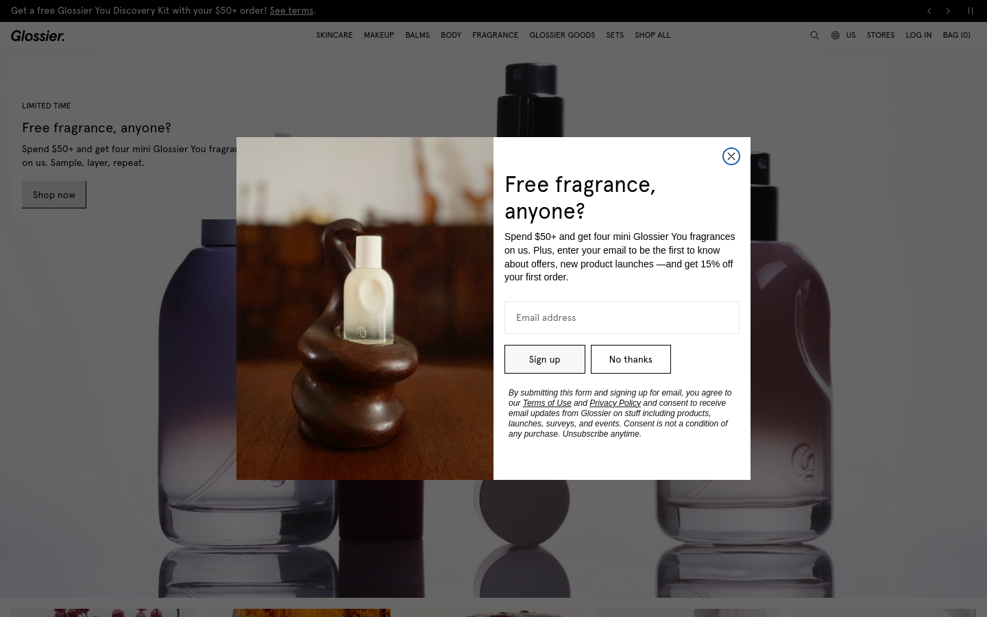
2. Look at every image in `design/glossier.com-design-pack/screenshots/` and match the composition, density, whitespace and image treatment. Tokens do not carry those; the screenshots do.
3. Style everything with `design/glossier.com-design-pack/tokens.css` (or `tailwind.css` if this project uses Tailwind v4). Do not invent colours, radii, shadows or font sizes that are not in the pack.
4. Load the fonts named in DESIGN.md. Where a font is not freely available, use the stand-in it names at the same sizes and weights.
5. Match the breakpoints and hover, focus and motion rules in BEHAVIOR.md. The site has no dark mode, so do not add one.

Now build: [describe the page or app you want]

When you are done, compare the result with the screenshots at desktop and phone widths, fix the biggest visual difference first, and repeat.रंग10 tokens
background
#ffffff
surface
#e8e8e8
surface-2
#f1e4c5
surface-3
#bde1d7
foreground
#000000
muted-foreground
#666666
primary
#c8102e
on-primary
#ffffff
secondary
#dd9cdf
border
#e8e8e8
Spacing4px यूनिट
- कंटेंट की चौड़ाई
- 750px
- Breakpoints
- 600, 700, 768, 1024, 1025px
Radius
बटन 0pxइनपुट 0pxकार्ड 0pxइमेज 0px
Shadows0
Flat: कोई box shadow इस्तेमाल नहीं हुआ।
टाइपोग्राफ़ी1 फ़ैमिली
Apercuसेल्फ़-होस्टेड, विकल्प Figtree
headline-displayQuick brown fox48px / 700 / lh 1.4
headline-lgQuick brown fox12px / 400 / lh 1.7 / 0.04px
headline-mdQuick brown fox14px / 400 / lh 1.4
body-mdThe quick brown fox jumps over the lazy dog14px / 400 / lh 1.4
label-mdThe quick brown fox jumps over the lazy dog12px / 400 / lh 1.4
buttonThe quick brown fox jumps over the lazy dog14px / 400 / lh 1.4 / 0.02625px
इस्तेमाल हो रहे साइज़
1214162032
कंपोनेंट
Shop nowईमेल पता
- बटन secondary
- #e8e8e8 पर #000000 टेक्स्ट, r 0px, h 40px, 14px/400
- इनपुट
- h 49px, 1px solid #e8e8e8, r 0px
- लिंक
- #000000, बिना underline, 400
- हेडर
- 40px, fixed, 12px पर 10 लिंक
- फ़ॉर्म
- 6 forms, 55 inputs. Required markers: 3. Help texts: 0. Label placement: placeholder-only (2).
- आइकन
- Icons: 5 inline SVGs, filled, sizes 14px/12px/16px/24px, stroke 1; icon font classes icon-.
स्क्रीनशॉट1440 और 390 चौड़ाई
इंटरैक्शन और मोशन
- button primary "Shop now": hover पर कोई बदलाव नहीं
- button secondary "Sign up": background #f7f7f7 → #e2e2e2
- nav link "Skincare": hover पर कोई बदलाव नहीं
- body link "See terms": hover पर कोई बदलाव नहीं
- input: border #e8e8e8 → #000000f2
- focus button primary: outline 1px auto rgb(16, 16, 16), offset 1px
- focus body link: outline 1px auto rgb(16, 16, 16), offset 1px
- focus input: outline 2px auto rgba(0, 0, 0, 0.95)
- tooltip: No tooltip could be triggered from the first viewport, but the stylesheet defines tooltip rules (.tooltip-badge[data-v-7bc675e0]): background-color: rgb(255, 255, 255); border-radius: 50px; padding: 4px 12px; font-size: 12px.
- मेन्यू: 1 aria-haspopup triggers exist; none opened on hover (click-to-open menus).
- मोशन: 376 elements carry transitions; typical 0.4s with ease-in-out, mostly on font-size, opacity, visibility. 5 running keyframe animations (marching-ants-full-1 1.5s infinite; onetrust-fade-in 0.4s 1; blinking-dot 1s infinite). 30 sizable elements sit at opacity 0 before scrolling: scroll-reveal animations are in use (reveal on enter, fade + rise is the usual recipe).
थीम
No dark mode responded to prefers-color-scheme, a theme toggle, or a root class/attribute.
रेस्पॉन्सिव1440 / 1024 / 768 / 390 px
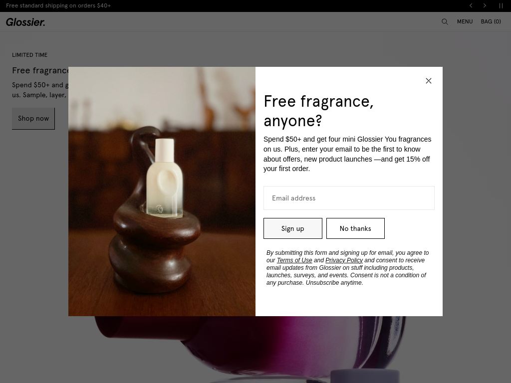
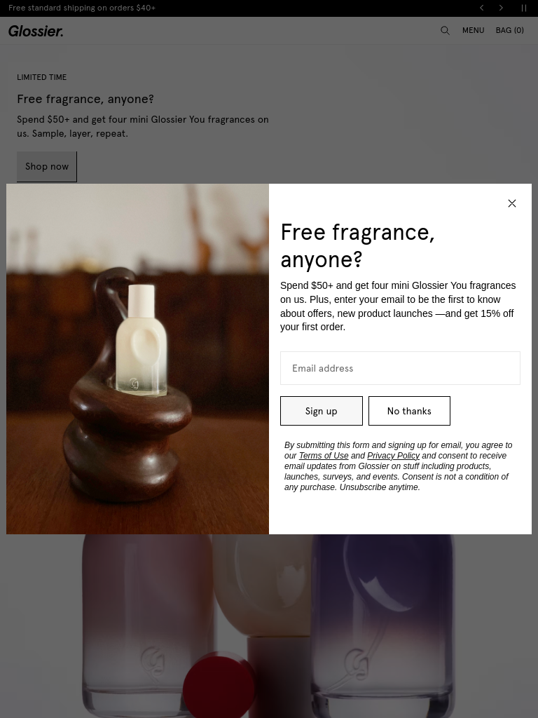
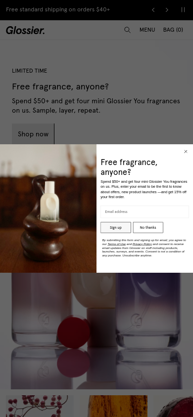
| Viewport | कंटेंट | Gutter | Body | H1 | हेडर | Hero | Grids | बटन |
|---|---|---|---|---|---|---|---|---|
| desktop 1440 | 750px | 32px | 16px | 40px, 10 links | 5→5 col; 2→2 col; 2→1 col | content-width | ||
| laptop 1024 | 1000px | 24px | 16px | 40px, hamburger (icon) | 5→5 col; 2→2 col; 2→1 col | content-width | ||
| tablet 768 | 744px | 24px | 16px | 40px, hamburger (icon) | 5→5 col; 2→2 col; 2→1 col | content-width | ||
| phone 390 | 366px | 24px | 16px | 40px, hamburger (icon) | 5→5 col; 2→1 col; 2→1 col | content-width |
- Nav collapses to a hamburger by 390px (first seen at 1024px); header 40px → 40px.
- Card grids: 5 columns → 5 columns on phones (gap 16px → 12px).
- Body text stays 16px at every width.
- Phone side gutter 24px.
- Section top padding 16px → 12px.
पैक की फ़ाइलें14 फ़ाइलें
DESIGN.md
Google का DESIGN.md format; Stitch, Claude Code और Cursor इसे पढ़ते हैं
tokens.json
Style Dictionary और Figma plugins के लिए W3C Design Tokens (DTCG)
tokens.css
वही मान CSS custom properties के रूप में
tailwind.css
Tailwind v4 @theme ब्लॉक
SKILL.md
Claude Code / Cursor skill, जो एजेंट के लिए पैक को क्रम में लगाती है
BEHAVIOR.md
Hover, focus, tooltip, मेन्यू, मोशन, स्क्रॉलिंग, टेबल, फ़ॉर्म, टेक्स्ट, रेस्पॉन्सिव, डार्क मोड, stack
evidence.json
दोनों दस्तावेज़ों के पीछे के कच्चे माप (हर viewport, probe और नियम)
screenshots/
desktop-1440-fold.png, desktop-1440-full.jpg, laptop-1024-fold.png, tablet-768-fold.png, phone-390-fold.png, phone-390-full.jpg
DESIGN.md208 लाइनें
---
version: alpha
name: "glossier.com"
description: "Design system extracted from https://www.glossier.com/ on 2026-09-28"
colors:
  background: "#ffffff"
  surface: "#e8e8e8"
  surface-2: "#f1e4c5"
  surface-3: "#bde1d7"
  foreground: "#000000"
  muted-foreground: "#666666"
  primary: "#c8102e"
  on-primary: "#ffffff"
  secondary: "#dd9cdf"
  border: "#e8e8e8"
typography:
  headline-display:
    fontFamily: "Apercu"
    fontSize: "48px"
    fontWeight: 700
    lineHeight: "1.4"
  headline-lg:
    fontFamily: "Apercu"
    fontSize: "12px"
    fontWeight: 400
    lineHeight: "1.7"
    letterSpacing: "0.04px"
  headline-md:
    fontFamily: "Apercu"
    fontSize: "14px"
    fontWeight: 400
    lineHeight: "1.4"
  body-md:
    fontFamily: "Apercu"
    fontSize: "14px"
    fontWeight: 400
    lineHeight: "1.4"
  label-md:
    fontFamily: "Apercu"
    fontSize: "12px"
    fontWeight: 400
    lineHeight: "1.4"
  button:
    fontFamily: "Apercu"
    fontSize: "14px"
    fontWeight: 400
    lineHeight: "1.4"
    letterSpacing: "0.02625px"
rounded:
  none: "0px"
  full: "9999px"
spacing:
  unit: "4px"
  1: "4px"
  2: "8px"
  3: "12px"
  4: "16px"
  5: "20px"
  6: "32px"
  7: "36px"
components:
  button-secondary:
    backgroundColor: "#e8e8e8"
    textColor: "#000000"
    typography: "{typography.button}"
    rounded: "0px"
    height: "40px"
    padding: "8px 16px"
  input:
    backgroundColor: "#ffffff"
    rounded: "0px"
    height: "49px"
---

# glossier.com

## Overview

Glossier: Glossier

Sharp, squared-off controls, flat surfaces separated by hairlines, confident display type at 48px / 700, a single red accent on neutrals. The site ships in light mode by default. Measured from 2111 rendered elements at 1440px wide on 2026-09-28.

Reference screenshots live beside this file; look at them before writing any layout, they carry the composition, density and image treatment that tokens cannot:

- `screenshots/desktop-1440-fold.png`: Desktop 1440, above the fold
- `screenshots/desktop-1440-full.jpg`: Desktop 1440, full page
- `screenshots/laptop-1024-fold.png`: Laptop 1024, above the fold
- `screenshots/tablet-768-fold.png`: Tablet 768, above the fold
- `screenshots/phone-390-fold.png`: Phone 390, above the fold
- `screenshots/phone-390-full.jpg`: Phone 390, full page

## Colors

| Token | Value | Use |
| --- | --- | --- |
| background | `#ffffff` | Page background |
| surface | `#e8e8e8` | Cards, panels, raised or recessed surfaces |
| surface-2 | `#f1e4c5` | Secondary surface |
| surface-3 | `#bde1d7` | Secondary surface |
| foreground | `#000000` | Primary text |
| muted-foreground | `#666666` | Secondary text, captions |
| primary | `#c8102e` | Accent: primary buttons, links, focus |
| on-primary | `#ffffff` | Text on the accent |
| secondary | `#dd9cdf` | Secondary accent (pink) |
| border | `#e8e8e8` | Hairlines, dividers, input borders |

Full painted palette by area (largest first): `#ffffff`, `#666666`, `#e8e8e8`, `#000000`, `#c8102e`, `#464545`, `#3e2e20`, `#7b5a49`.

Gradients in use: `none, linear-gradient(to right, rgb(0, 0, 0) 50%, rgb(0, 0, 0) 50%), none, linear-gradient(rgb(0, 0, 0) 50%, rgb(0, 0, 0) 50%)`; `repeating-linear-gradient(0deg, rgb(0, 0, 0), rgb(0, 0, 0) 0.1875rem, rgb(0, 0, 0) 0.1875rem), repeating-linear-gradient(90deg, rgb(0, 0, 0), rgb(0, 0, 0) 0.187`.

The accent `#c8102e` is used sparingly: primary buttons, links and focus rings. Everything else stays neutral.

## Typography

- **Apercu** for h2, h3, body, label, button: self-hosted webfont, not freely available; use **Figtree** from Google Fonts as the stand-in.

| Role | Family | Size | Weight | Line height | Tracking |
| --- | --- | --- | --- | --- | --- |
| headline-display | Apercu | 48px | 700 | 1.4 | normal |
| headline-lg | Apercu | 12px | 400 | 1.7 | 0.04px |
| headline-md | Apercu | 14px | 400 | 1.4 | normal |
| body-md | Apercu | 14px | 400 | 1.4 | normal |
| label-md | Apercu | 12px | 400 | 1.4 | normal |
| button | Apercu | 14px | 400 | 1.4 | 0.02625px |

Type scale in use: 12px, 14px, 16px, 20px, 32px. Base body size 14px.

## Layout

- Spacing unit: 4px. Scale in use: 4, 8, 12, 16, 20, 32, 36 (px).
- Flex and grid gaps: 8, 12, 16, 20, 32, 40 px.
- Content max width: 750px, centred.
- Breakpoints: 600px, 700px, 768px, 1024px, 1025px.
- Header: 40px tall, fixed, background `rgb(255, 255, 255)`, bottom hairline 1px solid rgba(0, 0, 0, 0.06); 10 nav links at 12px / 400 (Skincare · Makeup · Balms · Body · Fragrance · Glossier Goods · Sets · Shop All).

## Elevation & Depth

No box shadows in use; depth comes from hairline borders and surface tints (flat design).

## Shapes

- Buttons: 0px
- Inputs: 0px
- Cards and panels: 0px
- Images and media: 0px
- Radius scale: none 0px, full 9999px

## Components

### Button, secondary

Background `#e8e8e8` with gradient `none, linear-gradient(to right, rgb(0, 0, 0) 50%, rgb(0, 0, 0) 50%), none, linear-gradient(rgb(0, 0, 0) 50%, rgb(0, 0, 0) 50%)`, text `#000000`, border none, radius 0px, height 40px, padding 8px 16px, 14px / 400. Sample label: "Shop now".

### Input

Height 49px, background `#ffffff`, border 1px solid #e8e8e8, radius 0px, 14px text, padding 0px 0px.

### Link

Colour `#000000`, no underline at rest, weight 400.

## Dark Mode

No dark mode responded to prefers-color-scheme, a theme toggle, or a root class/attribute.

## Responsive Behavior

| Viewport | Content width | Gutter | Body | H1 | Header | Hero | Grids | Buttons |
| --- | --- | --- | --- | --- | --- | --- | --- | --- |
| desktop 1440px | 750px | 32px | 16px |  | 40px, 10 links |  | 5→5 col; 2→2 col; 2→1 col | content-width |
| laptop 1024px | 1000px | 24px | 16px |  | 40px, hamburger (icon) |  | 5→5 col; 2→2 col; 2→1 col | content-width |
| tablet 768px | 744px | 24px | 16px |  | 40px, hamburger (icon) |  | 5→5 col; 2→2 col; 2→1 col | content-width |
| phone 390px | 366px | 24px | 16px |  | 40px, hamburger (icon) |  | 5→5 col; 2→1 col; 2→1 col | content-width |

- Nav collapses to a hamburger by 390px (first seen at 1024px); header 40px → 40px.
- Card grids: 5 columns → 5 columns on phones (gap 16px → 12px).
- Body text stays 16px at every width.
- Phone side gutter 24px.
- Section top padding 16px → 12px.

## Interaction & Motion

376 elements carry transitions; typical 0.4s with ease-in-out, mostly on font-size, opacity, visibility. 5 running keyframe animations (marching-ants-full-1 1.5s infinite; onetrust-fade-in 0.4s 1; blinking-dot 1s infinite).

- Hover on button-primary ("Shop now"): no visible change; cursor pointer; transition font-size | 0.4s | ease-in-out.
- Hover on button-secondary ("Sign up"): background #f7f7f7 → #e2e2e2; cursor pointer; transition none | 0s | ease.
- Hover on nav-link ("Skincare"): no visible change; cursor pointer.
- Hover on body-link ("See terms"): no visible change; cursor pointer.
- Hover on input: border #e8e8e8 → #000000f2; cursor auto; transition none | 0s | ease.
- Focus on button-primary: outline 1px auto rgb(16, 16, 16), offset 1px.
- Focus on body-link: outline 1px auto rgb(16, 16, 16), offset 1px.
- Focus on input: outline 2px auto rgba(0, 0, 0, 0.95).
- No tooltip could be triggered from the first viewport, but the stylesheet defines tooltip rules (.tooltip-badge[data-v-7bc675e0]): background-color: rgb(255, 255, 255); border-radius: 50px; padding: 4px 12px; font-size: 12px.
- 1 aria-haspopup triggers exist; none opened on hover (click-to-open menus).
- 30 sizable elements sit at opacity 0 before scrolling: scroll-reveal animations are in use (reveal on enter, fade + rise is the usual recipe).

Full detail (every overlay, table, form, scroll and text rule measured) is in `BEHAVIOR.md`; raw evidence in `evidence.json`.

## Do's and Don'ts

- Do use 4px multiples for every padding, margin and gap; the site does not use odd values.
- Do reserve `#c8102e` for actions and focus; never paint large areas with it.
- Do keep body text at 14px in Apercu.
- Do match corner radii per element class (buttons 0px, cards 0px); do not pick one radius for everything.
- Don't add drop shadows; this design is flat.
- Don't substitute a different accent hue or introduce gradients that are not listed above.
- Don't rebuild from the tokens alone; open the screenshots for composition, density and image treatment.