Design system airbnb.com
Airbnb | Vacation rentals, cabins, beach houses, & more
airbnb.com memakai Airbnb Cereal VF untuk tipografi dan #da1249 sebagai warna aksennya. Diukur pada 28 September 2026.
Pakai dengan AI Andajuga ada di dalam zip sebagai README.md dan PROMPT.md
- .
- Unzip paket ke dalam proyek Anda sehingga foldernya berada di
design/airbnb.com-design-pack/. - Opsional: salin juga folder ke
.claude/skills/airbnb-com-design/. SKILL.md di dalamnya membuat Claude Code memuat paket dengan sendirinya setiap kali membangun UI. - Tempel prompt di bawah ke Claude Code dan isi apa yang ingin Anda bangun.
Prompt
Prompt tetap dalam bahasa Inggris: prompt itu menyebut nama file di dalam paket, dan AI Anda bisa membacanya dalam bahasa apa pun.
Use the design pack in `design/airbnb.com-design-pack/` as the source of truth for how the UI looks and behaves. It was measured from https://www.airbnb.com/.

1. Read DESIGN.md (colours, type, spacing, radii, shadows, components) and BEHAVIOR.md (hover, focus, tooltips, menus, motion, scrolling, forms, responsive rules) before writing any code.
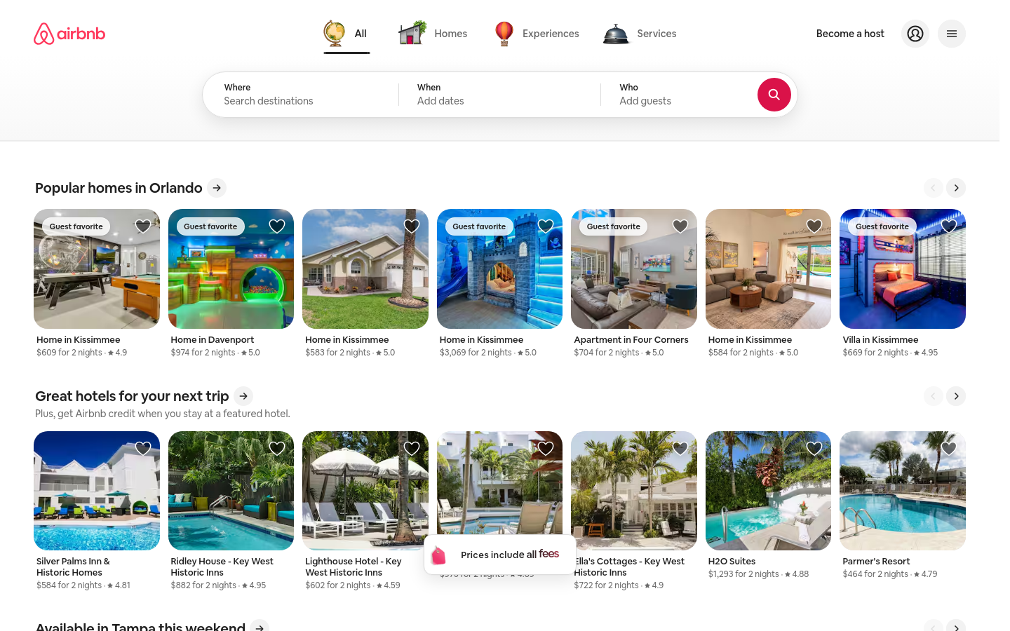
2. Look at every image in `design/airbnb.com-design-pack/screenshots/` and match the composition, density, whitespace and image treatment. Tokens do not carry those; the screenshots do.
3. Style everything with `design/airbnb.com-design-pack/tokens.css` (or `tailwind.css` if this project uses Tailwind v4). Do not invent colours, radii, shadows or font sizes that are not in the pack.
4. Load the fonts named in DESIGN.md. Where a font is not freely available, use the stand-in it names at the same sizes and weights.
5. Match the breakpoints and hover, focus and motion rules in BEHAVIOR.md. The site has no dark mode, so do not add one.

Now build: [describe the page or app you want]

When you are done, compare the result with the screenshots at desktop and phone widths, fix the biggest visual difference first, and repeat.Warna8 token
background
#ffffff
surface
#dddddd
surface-2
#f2f2f2
foreground
#222222
muted-foreground
#6c6c6c
primary
#da1249
on-primary
#ffffff
border
#ffffff
Jarakunit 4px
- Lebar konten
- fluid
- Breakpoint
- 743, 744, 950, 1128, 1440px
Radius
tombol 9999pxinput 0pxkartu 0pxgambar 0px
Bayangan2
1
2
Tipografi1 font family
Airbnb Cereal VFself-hosted, pengganti Inter
headline-displayQuick brown fox28px / 700 / lh 1.43
headline-lgQuick brown fox14px / 400 / lh 1.43
headline-mdQuick brown fox24px / 600 / lh 1.4
body-mdThe quick brown fox jumps over the lazy dog14px / 400 / lh 1.4
label-mdThe quick brown fox jumps over the lazy dog12px / 400 / lh 1.33
buttonThe quick brown fox jumps over the lazy dog14px / 500 / lh 1.29
Ukuran yang dipakai
111213142028
Komponen
Become a hostPelajari lebih lanjut
- tombol ghost
- teks #222222 di atas transparan di atas #ffffff, r 20px, h 40px, 14px/500
- tombol secondary
- teks #222222 di atas #f2f2f2, r 9999px, h 40px, 14px/400
- tautan
- #222222, tanpa garis bawah, 400
- header
- 96px, static, 5 tautan pada 14px
- h1
- 28px / 700, perataan start, maks 1px
- badge
- "Guest favorite": #ffffffcc on #222222, 14px/600, 26px tall, radius 14px, padding 5.5px 9.5px, border 1px #ffffff80
- formulir
- 1 forms, 1 inputs. Required markers: 0. Help texts: 3. Label placement: placeholder-only (1).
- ikon
- Icons: 62 inline SVGs, filled, sizes 24px/8px/12px/16px.
Screenshotlebar 1440 dan 390
Interaksi dan animasi
- button primary: tanpa perubahan hover
- button secondary: tanpa perubahan hover
- nav link "All": tanpa perubahan hover
- input: tanpa perubahan hover
- fokus button primary: no visible focus style measured (may rely on :focus-visible with keyboard only)
- fokus input: no visible focus style measured (may rely on :focus-visible with keyboard only)
- tooltip: Tooltip triggers exist (4 × aria-describedby, 2 × title) but none opened on hover in the first viewport; title attributes fall back to the browser's native tooltip.
- menu: Hover/click menus: below the trigger, 1352px gap, shifted left; transparent, radius 0px, padding 0px 0px, shadow none; appears instantly (no fade); stays open after the pointer leaves (click-away or hover-intent grace).
- animasi: 80 elements carry transitions; typical 0.25s with cubic-bezier(0.2, 0, 0, 1), mostly on transform, box-shadow, background-color. 1 running keyframe animations (kf-h0qfv9 0.15s 1). 14 sizable elements sit at opacity 0 before scrolling: scroll-reveal animations are in use (reveal on enter, fade + rise is the usual recipe).
Tema
No dark mode responded to prefers-color-scheme, a theme toggle, or a root class/attribute.
Responsif1440 / 1024 / 768 / 390 px
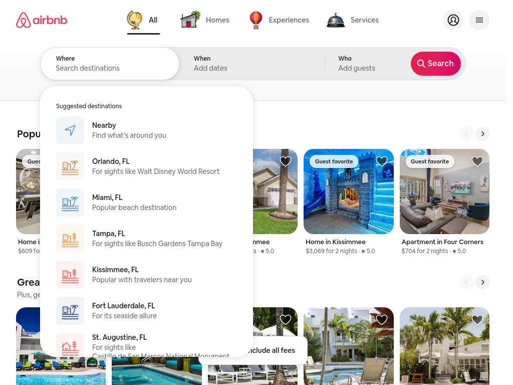
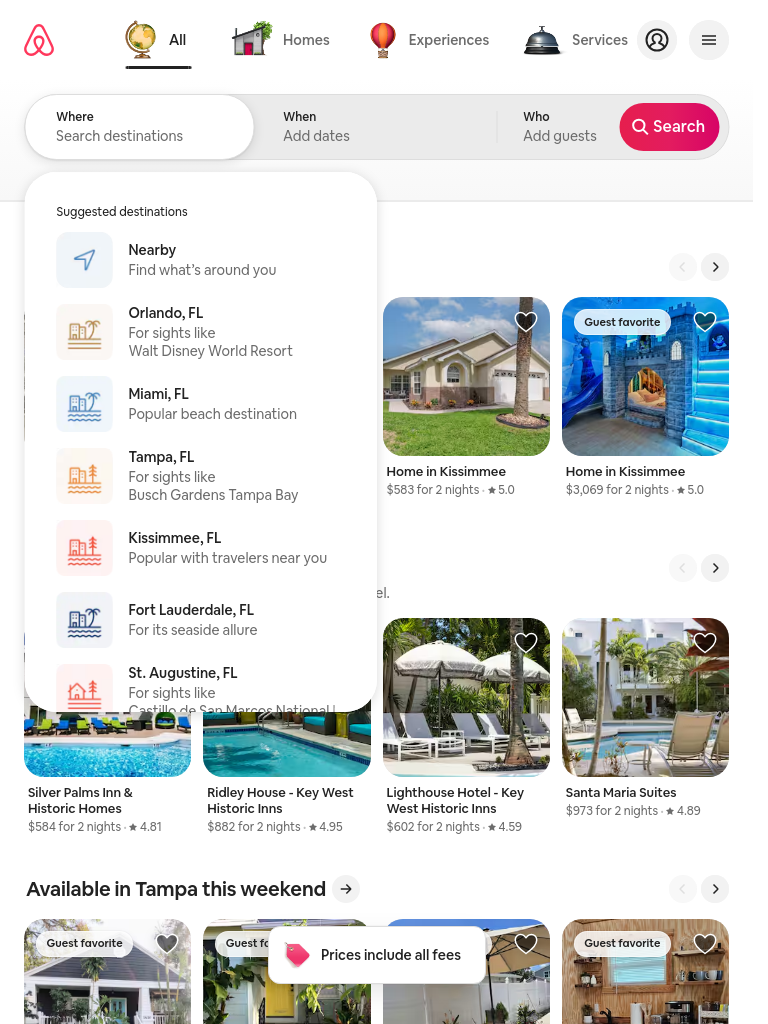
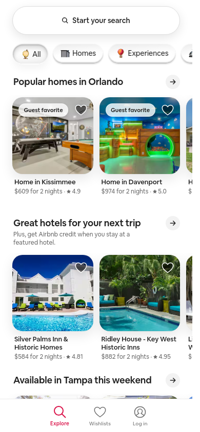
| Viewport | Konten | Gutter | Body | H1 | Header | Hero | Grid | Tombol |
|---|---|---|---|---|---|---|---|---|
| desktop 1440 | fluid | 50px | 14px | 28px, 0 lines, start | 96px, hamburger (Main navigation menu), 2 CTA | media below text | 3→3 col; 5→3 col; 2→1 col | content-width |
| laptop 1024 | fluid | 34px | 14px | 28px, 0 lines, start | 80px, hamburger (Main navigation menu), 2 CTA | media below text | 3→3 col; 4→3 col; 2→2 col | content-width |
| tablet 768 | fluid | 26px | 14px | 28px, 0 lines, start | 80px, hamburger (Main navigation menu), 2 CTA | text only | 4→3 col; 2→2 col; 2→1 col | content-width |
| phone 390 | fluid | 26px | 14px | 28px, 0 lines, start | 125px, 3 links | media below text | 2→1 col; 2→1 col; 2→1 col | 1 full-width |
- H1 goes 28px → 28px (100%), 0 → 0 lines.
- Nav never collapses to a hamburger (3 links still visible at 390px).
- Body text stays 14px at every width.
- Phone side gutter 26px.
- 1 buttons stretch full-width on phones.
File di dalam paket14 file
DESIGN.md
Format DESIGN.md dari Google; Stitch, Claude Code, dan Cursor membacanya
tokens.json
W3C Design Tokens (DTCG) untuk Style Dictionary dan plugin Figma
tokens.css
Nilai yang sama sebagai CSS custom property
tailwind.css
Blok @theme Tailwind v4
SKILL.md
Skill Claude Code / Cursor yang mengurutkan isi paket untuk agen
BEHAVIOR.md
Hover, fokus, tooltip, menu, animasi, scrolling, tabel, formulir, teks, responsif, mode gelap, stack
evidence.json
Pengukuran mentah di balik kedua dokumen (setiap viewport, probe, dan aturan)
screenshots/
desktop-1440-fold.png, desktop-1440-full.jpg, laptop-1024-fold.png, tablet-768-fold.png, phone-390-fold.png, phone-390-full.jpg
DESIGN.md211 baris
---
version: alpha
name: "airbnb.com"
description: "Design system extracted from https://www.airbnb.com/ on 2026-09-28"
colors:
  background: "#ffffff"
  surface: "#dddddd"
  surface-2: "#f2f2f2"
  foreground: "#222222"
  muted-foreground: "#6c6c6c"
  primary: "#da1249"
  on-primary: "#ffffff"
  border: "#ffffff"
typography:
  headline-display:
    fontFamily: "Airbnb Cereal VF"
    fontSize: "28px"
    fontWeight: 700
    lineHeight: "1.43"
  headline-lg:
    fontFamily: "Airbnb Cereal VF"
    fontSize: "14px"
    fontWeight: 400
    lineHeight: "1.43"
  headline-md:
    fontFamily: "Airbnb Cereal VF"
    fontSize: "24px"
    fontWeight: 600
    lineHeight: "1.4"
  body-md:
    fontFamily: "Airbnb Cereal VF"
    fontSize: "14px"
    fontWeight: 400
    lineHeight: "1.4"
  label-md:
    fontFamily: "Airbnb Cereal VF"
    fontSize: "12px"
    fontWeight: 400
    lineHeight: "1.33"
  button:
    fontFamily: "Airbnb Cereal VF"
    fontSize: "14px"
    fontWeight: 500
    lineHeight: "1.29"
rounded:
  none: "0px"
  full: "9999px"
  xl: "20px"
  lg: "14px"
  2xl: "32px"
spacing:
  unit: "4px"
  1: "4px"
  2: "8px"
  3: "12px"
  4: "16px"
  5: "24px"
  6: "44px"
  7: "48px"
components:
  button-ghost:
    backgroundColor: "#ffffff"
    textColor: "#222222"
    typography: "{typography.button}"
    rounded: "20px"
    height: "40px"
    padding: "11px 12px"
  button-secondary:
    backgroundColor: "#f2f2f2"
    textColor: "#222222"
    typography: "{typography.button}"
    rounded: "9999px"
    height: "40px"
    padding: "0px 0px"
---

# airbnb.com

## Overview

Airbnb | Vacation rentals, cabins, beach houses, & more: Get an Airbnb for every kind of trip → 8 million vacation rentals → 2 million Guest Favorites → 220+ countries and regions worldwide

Pill-shaped controls, layered shadows for depth, restrained display type at 28px / 700, a single red accent on neutrals. The site ships in light mode by default. Measured from 1625 rendered elements at 1440px wide on 2026-09-28.

Reference screenshots live beside this file; look at them before writing any layout, they carry the composition, density and image treatment that tokens cannot:

- `screenshots/desktop-1440-fold.png`: Desktop 1440, above the fold
- `screenshots/desktop-1440-full.jpg`: Desktop 1440, full page
- `screenshots/laptop-1024-fold.png`: Laptop 1024, above the fold
- `screenshots/tablet-768-fold.png`: Tablet 768, above the fold
- `screenshots/phone-390-fold.png`: Phone 390, above the fold
- `screenshots/phone-390-full.jpg`: Phone 390, full page

## Colors

| Token | Value | Use |
| --- | --- | --- |
| background | `#ffffff` | Page background |
| surface | `#dddddd` | Cards, panels, raised or recessed surfaces |
| surface-2 | `#f2f2f2` | Secondary surface |
| foreground | `#222222` | Primary text |
| muted-foreground | `#6c6c6c` | Secondary text, captions |
| primary | `#da1249` | Accent: primary buttons, links, focus |
| on-primary | `#ffffff` | Text on the accent |
| border | `#ffffff` | Hairlines, dividers, input borders |

Full painted palette by area (largest first): `#ffffff`, `#dddddd`, `#f2f2f2`, `#da1249`.

Gradients in use: `linear-gradient(rgb(255, 255, 255) 39.9%, rgb(248, 248, 248) 100%)`.

The accent `#da1249` is used sparingly: primary buttons, links and focus rings. Everything else stays neutral.

## Typography

- **Airbnb Cereal VF** for h1, h2, label, button: self-hosted webfont, not freely available; use **Inter** from Google Fonts as the stand-in.

| Role | Family | Size | Weight | Line height | Tracking |
| --- | --- | --- | --- | --- | --- |
| headline-display | Airbnb Cereal VF | 28px | 700 | 1.43 | normal |
| headline-lg | Airbnb Cereal VF | 14px | 400 | 1.43 | normal |
| headline-md | Airbnb Cereal VF | 24px | 600 | 1.4 | normal |
| body-md | Airbnb Cereal VF | 14px | 400 | 1.4 | normal |
| label-md | Airbnb Cereal VF | 12px | 400 | 1.33 | normal |
| button | Airbnb Cereal VF | 14px | 500 | 1.29 | normal |

Type scale in use: 11px, 12px, 13px, 14px, 20px, 28px. Base body size 14px.

The H1 renders at 28px / 700, start aligned, up to 1px wide. Sample: "Airbnb homepage".

## Layout

- Spacing unit: 4px. Scale in use: 4, 8, 12, 16, 24, 44, 48 (px).
- Flex and grid gaps: 4, 8, 12 px.
- Content max width: not detected (fluid).
- Breakpoints: 743px, 744px, 950px, 1128px, 1440px.
- Header: 96px tall, static, background `rgba(0, 0, 0, 0)`; 5 nav links at 14px / 400 (AllAll · HomesHomes · ExperiencesExperiences · ServicesServices).

## Elevation & Depth

Shadows in use, most common first:

- shadow-1: `color(srgb 0 0 0 / 0.02) 0px 0px 0px 1px, color(srgb 0 0 0 / 0.04) 0px 2px 6px 0px, color(srgb 0 0 0 / 0.1) 0px 4px 8px 0px`
- shadow-2: `color(srgb 0 0 0 / 0.02) 0px 0px 0px 1px, color(srgb 0 0 0 / 0.1) 0px 8px 24px 0px`

## Shapes

- Buttons: 9999px
- Inputs: 0px
- Cards and panels: 0px
- Images and media: 0px
- Radius scale: none 0px, full 9999px, xl 20px, lg 14px, 2xl 32px

## Components

### Button, ghost

Background transparent (it sits on `#ffffff`, so place it on that colour), text `#222222`, border none, radius 20px, height 40px, padding 11px 12px, 14px / 500. Sample label: "Become a host".

### Button, secondary

Background `#f2f2f2`, text `#222222`, border none, radius 9999px, height 40px, padding 0px 0px, 14px / 400.

### Link

Colour `#222222`, no underline at rest, weight 400.

## Dark Mode

No dark mode responded to prefers-color-scheme, a theme toggle, or a root class/attribute.

## Responsive Behavior

| Viewport | Content width | Gutter | Body | H1 | Header | Hero | Grids | Buttons |
| --- | --- | --- | --- | --- | --- | --- | --- | --- |
| desktop 1440px | fluid | 50px | 14px | 28px, 0 lines, start | 96px, hamburger (Main navigation menu), 2 CTA | media below text | 3→3 col; 5→3 col; 2→1 col | content-width |
| laptop 1024px | fluid | 34px | 14px | 28px, 0 lines, start | 80px, hamburger (Main navigation menu), 2 CTA | media below text | 3→3 col; 4→3 col; 2→2 col | content-width |
| tablet 768px | fluid | 26px | 14px | 28px, 0 lines, start | 80px, hamburger (Main navigation menu), 2 CTA | text only | 4→3 col; 2→2 col; 2→1 col | content-width |
| phone 390px | fluid | 26px | 14px | 28px, 0 lines, start | 125px, 3 links | media below text | 2→1 col; 2→1 col; 2→1 col | 1 full-width |

- H1 goes 28px → 28px (100%), 0 → 0 lines.
- Nav never collapses to a hamburger (3 links still visible at 390px).
- Body text stays 14px at every width.
- Phone side gutter 26px.
- 1 buttons stretch full-width on phones.

## Interaction & Motion

80 elements carry transitions; typical 0.25s with cubic-bezier(0.2, 0, 0, 1), mostly on transform, box-shadow, background-color. 1 running keyframe animations (kf-h0qfv9 0.15s 1).

- Hover on button-primary: no visible change; cursor pointer; transition transform | 0.25s | cubic-bezier(0.2, 0, 0, 1).
- Hover on button-secondary: no visible change; cursor pointer; transition transform | 0.25s | cubic-bezier(0.2, 0, 0, 1).
- Hover on nav-link ("All"): no visible change; cursor pointer.
- Hover on input: no visible change; cursor text.
- Focus on button-primary: no visible focus style measured (may rely on :focus-visible with keyboard only).
- Focus on input: no visible focus style measured (may rely on :focus-visible with keyboard only).
- Tooltip triggers exist (4 × aria-describedby, 2 × title) but none opened on hover in the first viewport; title attributes fall back to the browser's native tooltip.
- Hover/click menus: below the trigger, 1352px gap, shifted left; transparent, radius 0px, padding 0px 0px, shadow none; appears instantly (no fade); stays open after the pointer leaves (click-away or hover-intent grace).
- 14 sizable elements sit at opacity 0 before scrolling: scroll-reveal animations are in use (reveal on enter, fade + rise is the usual recipe).

Full detail (every overlay, table, form, scroll and text rule measured) is in `BEHAVIOR.md`; raw evidence in `evidence.json`.

## Do's and Don'ts

- Do use 4px multiples for every padding, margin and gap; the site does not use odd values.
- Do reserve `#da1249` for actions and focus; never paint large areas with it.
- Do keep body text at 14px in Airbnb Cereal VF.
- Do match corner radii per element class (buttons 9999px, cards 0px); do not pick one radius for everything.
- Do use the measured shadows above; do not invent heavier ones.
- Don't substitute a different accent hue or introduce gradients that are not listed above.
- Don't rebuild from the tokens alone; open the screenshots for composition, density and image treatment.