












silvertext.com
SaaS & produktivitasTerang + gelap
Gunakan kembali gaya
Pilih gaya yang ingin diterapkan pada situs Anda, lalu salin prompt.
Dari inspirasi ke antarmuka
Lihat bagaimana bahasa desain situs ini menjadi antarmuka orisinal. Gunakan prompt untuk membuat versi Anda sendiri.
Buat sesuatu seperti ini
Salin prompt awal ke agen pemrograman Anda, atau sesuaikan dengan ide Anda sendiri.
Use the silvertext.com design pack from Stylepack so what you build looks and behaves like https://silvertext.com/.
Use the silvertext.com design pack from Stylepack so what you build looks and behaves like https://silvertext.com/.

1. Download https://stylepack.ai/packs/silvertext.com/pack.zip?v=bzs7gpqsruxr and unzip it so the pack sits at `design/silvertext.com-design-pack/` (for example: curl -fsSL --http1.1 --retry 3 --retry-max-time 240 --connect-timeout 15 --max-time 120 --cookie "" 'https://stylepack.ai/packs/silvertext.com/pack.zip?v=bzs7gpqsruxr' -o pack.zip && unzip -oq pack.zip -d design && rm pack.zip).
2. Read `design/silvertext.com-design-pack/START_HERE.md` and follow it: it says which files and screenshots to open, in what order, and how to check the result. Build both themes.

Build: Halaman utama orisinal dengan bagian hero, kartu fitur, dan ajakan bertindak.

When you are done, compare the result with the desktop and phone screenshots in `design/silvertext.com-design-pack/screenshots/`, fix the biggest visual difference first, and repeat.
Warna
9 warnaKomponen
Sign upGet startedCheck my writingYour privacy choices
- tombol secondary
- teks #17171c di atas #ffffff, r 6px, h 31px, 14px/500
- tombol primary
- teks #ffffff di atas #5b4dee, r 10px, h 48px, 16px/500
- tombol ghost
- teks #9d90ff di atas transparan di atas #090910, r 0px, h 24px, 12.5px/550
- kartu
- #ffffff, 1px solid #e7e7ee, r 16px, bayangan
- tautan
- #17171c, tanpa garis bawah, 450
- header
- 69px, fixed, 12 tautan pada 16px
- judul utama
- 84.96px / 900, perataan center, maks 678px
- badge
- "14": #efecfe on #4534c9, 10px/600, 21px tall, radius 3.35544e+07px, padding 2px 7px, uppercase
- badge
- "92% match": #fdeaea on #b93838, 10px/600, 23px tall, radius 3.35544e+07px, padding 3px 8px
- avatar
- Avatar 28px, radius 50%, border 0px rgb(34, 51, 89)
- formulir
- 0 forms, 0 inputs. Required markers: 0. Help texts: 0. Label placement: no labelled inputs.
- ikon
- Icons: 44 inline SVGs, outline/stroke, sizes 12px/14px/13px/15px, stroke 2px/1.7px/2.2px; icon font classes lucide.
Interaksi dan animasi
- button primary "Sign upGet started": background #ffffff → #fafafa, gradient changes
- button secondary "Check my writing": background #5b4dee → #574ae4, gradient changes
- nav link "silvertext.": tanpa perubahan hover
- fokus button primary: outline 2px solid rgb(139, 129, 243), offset 3px
- tooltip: Tooltip triggers exist (2 × title) but none opened on hover in the first viewport; title attributes fall back to the browser's native tooltip.
- menu: No dropdown menus found in the header.
- animasi: 81 elements carry transitions; typical 0.15s with cubic-bezier(0.4, 0, 0.2, 1), mostly on background-color, color, border-color. 10 running keyframe animations (os-spin 3.2s infinite; os-shine 3.2s infinite; os-twinkle 3.8s infinite). 4 sizable elements sit at opacity 0 before scrolling: scroll-reveal animations are in use (reveal on enter, fade + rise is the usual recipe).
Tipografi
1 font familymulishLatinDihosting sendiri
headline-displayQuick brown fox84.96px / 900 / lh 84.96px / -3.8232px
headline-lgQuick brown fox51.84px / 650 / lh 58.0608px / -1.296px
headline-mdQuick brown fox18px / 650 / lh 28px / -0.27px
body-mdThe quick brown fox jumps over the lazy dog12.5px / 450 / lh 23.75px / -0.08px
label-mdThe quick brown fox jumps over the lazy dog12px / 600 / lh 1.5 / -0.08px
buttonThe quick brown fox jumps over the lazy dog12.5px / 550 / lh 12.5px / -0.08px
Ukuran yang dipakai
Jarak
unit 4px- Lebar konten
- 1080px
- Breakpoint
- 640, 768, 1024, 1280, 1536px
Radius
tombol 6pxinput 6pxkartu 16pxgambar 9999px
Bayangan
4Tema gelap
Dicapai lewat data-theme=dark. Terang → gelap:
background#ffffff → #1f1f27
surface#efecfe → #0e0e15
surface-2#faefe1 → #33333e
foreground#17171c → #f0f0f4
muted-foreground#3a3a44 → #9c9caa
primary#5b4dee → #5b4dee
on-primary#ffffff → #ffffff
secondary#16a34a → #15803d
border#e7e7ee → #e7e7ee
Bayangan mode gelap: rgba(30, 25, 90, 0.15) 0px 16px 36px 0px; rgba(20, 20, 30, 0.04) 0px 2px 6px 0px, rgba(20, 20, 30, 0.06) 0px 18px 44px 0px
Logo dan ikon
7 referensiInventaris komponen
17 dari 87 jenis · 39 varian · 29 status · 1 overlayDi situsPro
Buka dengan ProLihat setiap komponen dalam konteks halaman aslinya.
Button, secondary#3a3a44 text on rgba(255, 255, 255, 0.94), border 1px solid rgba(255, 255, 255, 0.96), radius 999px, h 40px, padding 8px 12px 8px 10px, 12.5px/650, tracking -0.08px, shadow rgba(30, 25, 90, 0.15) 0px 16px 36px 0px
Button, secondary-icon-right (sm)#17171c text on #ffffff, border 1px solid rgba(24, 24, 27, 0.1), radius 6.2px, h 31px, padding 6px 13px 6px 13px, 14px/500, shadow rgba(255, 255, 255, 0.7) 0px 1px 0.5px 0px inset, rgba(24, 24, 27, 0.05) 0px 2px 2px -1px, rgba(24, 24, 27, 0.05) 0px 4px 4px -2px, icon right 14px
Button, primary-icon-right#ffffff text on #5b4dee, border 1px solid #493ebe, radius 9.6px, h 48px, padding 0px 28px 0px 28px, 16px/500, shadow rgba(255, 255, 255, 0.12) 0px 1px 0px 0px inset, rgba(24, 24, 27, 0.08) 0px 1px 1px 0px, icon right 16px
Button, primary-icon-right · main#ffffff text on #5b4dee, radius 999px, h 48px, padding 8px 16px 8px 16px, 12px/450, tracking -0.08px, shadow rgba(31, 27, 73, 0.16) 0px 4px 10px -4px, rgba(31, 27, 73, 0.06) 0px 1px 2px 0px, icon right 17px
active (pressed): tidak ada perubahan
Button, secondary · nav#3a3a44 text on rgba(255, 255, 255, 0.94), border 1px solid rgba(255, 255, 255, 0.96), radius 999px, h 36px, padding 8px 12px 8px 10px, 12.5px/650, tracking -0.08px, shadow rgba(30, 25, 90, 0.15) 0px 16px 36px 0px
Button, secondary-icon-right#151329 text on rgba(255, 255, 255, 0.97), border 1px solid rgba(23, 23, 28, 0.09), radius 999px, h 42px, padding 0px 22px 0px 26px, 15.5px/650, tracking -0.093px, shadow rgba(255, 255, 255, 0.9) 0px 1px 0px 0px inset, rgba(20, 20, 30, 0.05) 0px 1px 2px 0px, rgba(30, 25, 90, 0.1) 0px 10px 24px 0px, rgba(30, 25, 90, 0.14) 0px 28px 64px 0px, icon right 14px
disabled: tidak ada perubahan
Button, filled-icon-right#ffffff text on gradient linear-gradient(rgb(106, 94, 240), rgb(91, 77, 238)), border 1px solid rgba(0, 0, 0, 0.3), radius 8.4px, h 42px, padding 12px 26px 12px 26px, 15.5px/600, tracking -0.08px, shadow rgba(255, 255, 255, 0.16) 0px 1px 0px 0px inset, rgba(0, 0, 0, 0.4) 0px 1px 2px 0px, rgba(91, 77, 238, 0.45) 0px 8px 24px 0px, icon right 15px
Tersedia dengan ProDi situs

hover: tidak ada perubahan
Button, ghost-primary-with-icon (sm)#9d90ff text on transparent, radius 0px, h 24px, padding 0px 0px 0px 0px, 12.5px/550, tracking -0.08px, icon left 30px
Tangkapan ini tidak memiliki pratinjau situs. Coba ekstraksi baru.Di situs
hover, focus (keyboard), disabled: belum diverifikasi langsung
Icon button, ghost#3a3a44 text on transparent, radius 0px, h 60px, padding 22px 0px 22px 15px, 15.5px/600, tracking -0.08px, icon only 16px
hover, active (pressed): tidak ada perubahan
Header / navbarh 69px, fixed, bg transparent, 21 links, CTAs: Everything Silvertext Checks, All at OnceSee how a check wor, Talk to a HumanQuestions, press, partnerships, Get an API KeyFree credits with your first key, inner 1320px, logo left
Tangkapan ini tidak memiliki pratinjau situs. Coba ekstraksi baru.Di situs
rest: pratinjau tidak tersedia
Navigation link, plain#3a3a44, no underline, 15.5px/600
hover: tidak ada perubahan
Navigation link, plain · header#17171c, no underline, 16px/450
hover: tidak ada perubahan
Navigation link, plain · header · 3#17171c, no underline, 14.5px/550
hover: tidak ada perubahan
Footerh 927px, bg #0e0e15, 4 link columns, 19 links, headings: Start turning inclean writing today
Tangkapan ini tidak memiliki pratinjau situs. Coba ekstraksi baru.Di situs
rest: pratinjau tidak tersedia
Footer link, plain#c4c6d0, no underline, 13.5px/550
Tersedia dengan ProDi situs

hover: tidak ada perubahan
Badge / pill / tag, subtle-pill#157a55 on #e4f5ee, radius 3.35544e+07px, h 23px, padding 3px 9px 3px 9px, 11px/600, tracking -0.08px
Tersedia dengan ProDi situs

hover: tidak ada perubahan
Badge / pill / tag, subtle-pill · main#4534c9 on #efecfe, radius 3.35544e+07px, h 21px, padding 2px 7px 2px 7px, 10px/600, uppercase
Tangkapan ini tidak memiliki pratinjau situs. Coba ekstraksi baru.Di situs
rest: pratinjau tidak tersedia
Badge / pill / tag, subtle-pill · main · 3#b93838 on #fdeaea, radius 3.35544e+07px, h 23px, padding 3px 8px 3px 8px, 10px/600, tracking -0.08px
Tangkapan ini tidak memiliki pratinjau situs. Coba ekstraksi baru.Di situs
rest: pratinjau tidak tersedia
Badge / pill / tag, subtle-pill · main · 4#b93838 on #fdeaea, radius 3.35544e+07px, h 22px, padding 3px 10px 3px 10px, 10.5px/600, tracking -0.08px
Tersedia dengan ProDi situs
hover: tidak ada perubahan
Badge / pill / tag, subtle-pill · main · 5#a3701a on #fff4dd, radius 3.35544e+07px, h 23px, padding 3px 9px 3px 9px, 11px/600, tracking -0.08px
Tangkapan ini tidak memiliki pratinjau situs. Coba ekstraksi baru.Di situs
rest: pratinjau tidak tersedia
Skeleton / shimmer160×50px, bg gradient linear-gradient(100deg, rgb(23, 23, 28) 0px, rgb(23, 23, 28), #17171c, border none, radius 0px, padding 0px 0px 0px 0px
Tersedia dengan ProDi situs

Card, elevatedbg #ffffff, border 1px solid #e7e7ee, radius 10px, padding 0px 0px 0px 0px, shadow rgba(20, 20, 30, 0.04) 0px 1px 2px 0px, about 259×180px, body 11px #55555f, 1 per row
Tangkapan ini tidak memiliki pratinjau situs. Coba ekstraksi baru.Di situs
rest: pratinjau tidak tersedia
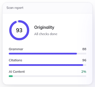
Card, elevated · mainbg #ffffff, border 1px solid #e7e7ee, radius 16px, padding 0px 0px 0px 0px, shadow rgba(20, 20, 30, 0.05) 0px 2px 6px 0px, rgba(20, 20, 30, 0.09) 0px 22px 50px 0px, about 320×289px, body 14.5px #17171c, 1 per row
Tersedia dengan ProDi situs
hover: tidak ada perubahan
Card, elevated · main · 3bg #ffffff, border 1px solid rgba(23, 23, 28, 0.1), radius 16px, padding 0px 0px 0px 0px, shadow rgba(20, 20, 30, 0.06) 0px 1px 2px 0px, rgba(20, 20, 30, 0.1) 0px 6px 16px 0px, about 900×640px, body 16.5px #17171c, 1 per row
Tangkapan ini tidak memiliki pratinjau situs. Coba ekstraksi baru.Di situs
rest: pratinjau tidak tersedia
Card, filledbg #f5f5f8, border none, radius 8px, padding 8px 10px 8px 10px, no shadow, about 230×92px, 1 per row
Tangkapan ini tidak memiliki pratinjau situs. Coba ekstraksi baru.Di situs
rest: pratinjau tidak tersedia
Card, elevated · main · 4bg #ffffff, border 1px solid rgba(23, 23, 28, 0.11), radius 11px, padding 0px 0px 0px 0px, shadow rgba(20, 20, 30, 0.05) 0px 1px 2px 0px, rgba(30, 25, 90, 0.14) 0px 14px 34px 0px, rgba(30, 25, 90, 0.1) 0px 34px 70px 0px, about 256×194px, body 12.5px #17171c, 1 per row
Tangkapan ini tidak memiliki pratinjau situs. Coba ekstraksi baru.Di situs
rest: pratinjau tidak tersedia
Card, flatbg transparent, border none, radius 0px, padding 11px 12px 13px 12px, no shadow, about 254×155px, body 12.5px #17171c, 1 per row
Tangkapan ini tidak memiliki pratinjau situs. Coba ekstraksi baru.Di situs
rest: pratinjau tidak tersedia
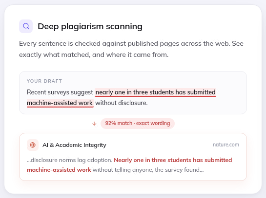
Feature item (icon + title + text), elevatedbg #ffffff, border 1px solid #e7e7ee, radius 20px, padding 30px 30px 26px 30px, shadow rgba(20, 20, 30, 0.04) 0px 2px 6px 0px, rgba(20, 20, 30, 0.06) 0px 18px 44px 0px, about 529×390px, h3 18px/650, body 14px #55555f, 1 per row
Tersedia dengan ProDi situs
hover: tidak ada perubahan
Avatar, 28px-round28px, radius 50%
Tersedia dengan ProDi situs

Avatar, 28px-round · main28px, radius 50%
Tersedia dengan ProDi situs

Icon, outline-15px15×15px, outline, stroke 1.9px #5b4dee
Tersedia dengan ProDi situs

Icon, outline-12px12×12px, outline, stroke 2px #9296a6
Tersedia dengan ProDi situs

Icon, outline-36px36×36px, outline, stroke 1.7px #3a3a44
Tersedia dengan ProDi situs

Eyebrow / kicker#6a6a76 on transparent, radius 0px, h 18px, padding 0px 0px 0px 0px, 12px/650, uppercase, tracking 1.68px
Tersedia dengan ProDi situs

Eyebrow / kicker · main#ffffff on transparent, radius 0px, h 17px, padding 0px 0px 0px 0px, 10px/750, uppercase, tracking 1.26px
Tangkapan ini tidak memiliki pratinjau situs. Coba ekstraksi baru.Di situs
rest: pratinjau tidak tersedia
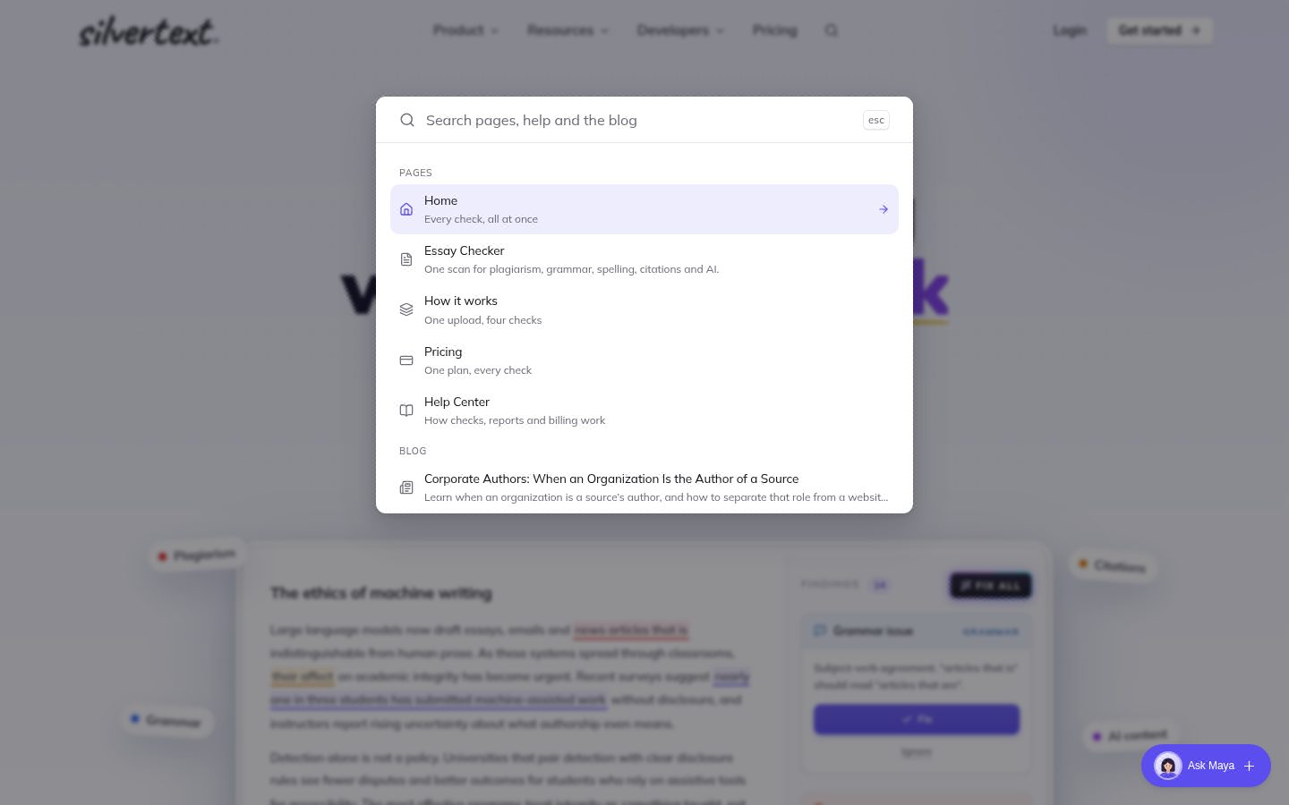
Dialog / modal 1600×466px, top centered, bg #ffffff, text #17171c 16px, radius 11px, padding 0px 0px 0px 0px, shadow rgba(20, 20, 30, 0.08) 0px 2px 4px 0px, rgba(20, 20, 30, 0.13) 0px 8px 20px 0px, rgba(20, 20, 30, 0.12) 0px 20px 48px 0px, backdrop rgba(12, 13, 19, 0.46) + blur(2px), 8 items 56px tall, with icons, 1 input(s), st-spot-in 0.18s, closes on Escape
Tersedia dengan ProDi situs
Tidak ada di halaman ini: Toggle / segmented control, Button group, Text link, Floating action button, Close / dismiss button, Text input, Search field, Textarea, Select (native), Combobox / custom select, Checkbox, Radio, Switch / toggle, Range slider, File input / dropzone, Date / time input, Input with attached button or addon, Field label, Help / hint text, Validation error text, Fieldset / form section, Menu / dropdown trigger, Breadcrumb, Tabs, Pagination, Stepper / progress steps, Sidebar navigation, Skip link, Back to top, Social icon links, Theme toggle, Language / region switch, Tooltip, Popover, Dropdown menu, Drawer / sheet / off-canvas, Toast / snackbar, Banner / announcement bar, Cookie / consent notice, Lightbox / media viewer, Chip (removable / selectable tag), Alert / callout, Progress bar, Spinner / loader, Counter / notification dot, Empty state, Rating / stars, Pricing card / plan, Testimonial / quote card, Stat / metric, Styled list, List row / menu row, Table, Table row, Accordion / disclosure, Avatar stack, Divider, Code block / inline code, Keyboard key, Blockquote, Image / figure, Video / media embed, Carousel / slider, Logo strip, FAQ block, Call-to-action band, Newsletter / signup form, Search results / listing row, Grid of items, Sticky bar.
Responsif
1440 / 1024 / 768 / 390 px| Viewport | Konten | Gutter | Body | Judul | Header | Hero | Grid | Tombol |
|---|---|---|---|---|---|---|---|---|
| desktop 1440 | 1080px | 381px | 16px | 85px, 2 lines, center | 69px, 7 links, 1 CTA | media below text | 2→2 col; 2→1 col; 2→1 col | content-width |
| laptop 1024 | 976px | 271px | 16px | 60.4px, 2 lines, center | 69px, 7 links, 1 CTA | media below text | 2→1 col; 2→2 col; 2→2 col | content-width |
| tablet 768 | 720px | 203px | 16px | 45.3px, 2 lines, center | 69px, hamburger (Open menu), 2 CTA | media below text | 2→1 col; 2→2 col; 3→1 col | content-width |
| phone 390 | 342px | 24px | 16px | 44px, 3 lines, center | 69px, hamburger (Open menu), 2 CTA | media below text | 2→1 col; 2→1 col; 2→1 col | content-width |
- H1 goes 85px → 44px (52%), 2 → 3 lines.
- Nav collapses to a hamburger by 390px (first seen at 768px); header 69px → 69px.
- Card grids: 2 columns → 1 column on phones (gap 36px → 20px).
- Body text is 16px at the sampled desktop and phone widths.
- Phone side gutter 24px.
- Section top padding 68px → 68px.
File di dalam paket
138 fileMulai dengan 54 kB teks panduan. Seluruh teks paket berukuran 1,2 MB; buka file detail saat diperlukan. Gambar terpisah.
START_HERE.md96 baris
# Start here: silvertext.com

Observed 2026-11-04T23:06:09.834Z; default light theme. This is a compact handoff, not the full evidence archive: everything you need to start is here, the detailed files are one step away.

## How to use this pack

1. Read `START_HERE.md` and `tokens.css` first: the priority values. Keep observed values; a value marked inferred or fallback is a suggestion to resolve against the screenshots.
2. Open `screenshots/desktop-1440-fold.png` and `screenshots/phone-390-fold.png` and match the composition, density, whitespace and image treatment; the values do not carry those. Treat the inside of an image or canvas as a visual inference, not measured DOM.
3. Read `MEDIA.md` before choosing or generating imagery. Preserve the reference's art direction while adapting the subject to the new product. Inspect actual candidate images against the reference and check their desktop and phone crops in the rendered UI. Photography must not silently become geometric illustration; unresolved assets must be reported.
4. Read `FONTS.md` and load `fonts.css` before `tokens.css`. Keep exact weights and variable-font settings and verify the fonts that actually render. If a font is unavailable, name the substitute and compare its width and apparent weight before touching the type scale.
5. Before drawing any logo or icon, read `BRAND.md` and open `screenshots/brand-logo.png`, `screenshots/brand-symbol.png`, `screenshots/brand-icon-1.png`: for a new product, create an original mark with the observed proportions and treatment; never guess a shape from a label.
6. Before building any control, read `COMPONENTS.md` (every variant and measured state, with a crop of each), use `components.css` for the CSS and `demos/` for a live copy of each component. A component listed as not found was not detected in this capture; do not invent a source measurement.
7. Read `REGIONS.md` and inspect its context, detail and icon crops: reconstruct outer and inner surfaces, per-layer gradients and shadows and group spacing (`regions.css` has the recipes), then check the whole page again.
8. Read `BEHAVIOR.md` for hover, focus, tooltips, menus, motion, scrolling, tables, forms, text and each breakpoint, and reproduce the behaviour, not only the colours. Build both themes; `DESIGN.md` pairs the colours.
9. `layout.html` is a generic page composed only from this pack's measured values, with placeholder copy (`layout-alt.html` in the other theme): open it to see the colours, type, recipes and spacing working together and to check your own wiring of the fonts and tokens against it. It is not the site's composition; the screenshots are.
10. `DESIGN.md` has the whole system when a value is missing above. `evidence.json` is diagnostic data: never in the first read.
11. When done, render at desktop, 390px and 320px, compare with the screenshots, fix the biggest visible mismatch first (usually type size, whitespace or image treatment), recheck keyboard focus, overflow, navigation and forms, and repeat.
12. For another site's design, use the enabled Stylepack MCP tools: query_components for specific controls or get_design_pack for broader visual context. Without MCP, fetch https://stylepack.ai/packs/<host>/pack.zip; one question at a time is at https://stylepack.ai/packs/<host>/fonts, /colors and /buttons. Preserve explicit source pages and report missing evidence.

## Priority values and evidence

Values labeled fallback were not observed for that role; inferred-role means a visible heading was mapped to a display role. Keep observed values, but treat fallbacks as suggestions.
Keep measured sizes, tracking, radii and colors unless the new content requires an explicit adaptation. Do not enlarge the headline simply to fill a different line length.
Content width: 1080px. Inferred spacing base: 4px; sampled scale: 4, 8, 12, 16, 20, 24, 28, 32, 40px. Observed CSS breakpoints: 640, 768, 1024, 1280, 1536px.
Colors: background=#ffffff; surface=#efecfe; surface-2=#faefe1; foreground=#17171c; muted-foreground=#3a3a44; primary=#5b4dee; on-primary=#ffffff; secondary=#16a34a; border=#e7e7ee.
- primary: Selected from measured button, link, text, painted-area and theme colors. It is not proof of a filled primary button; follow the observed component recipes.
Radii: button 6px, card 16px, input 6px, image 9999px.
Shadows: rgba(30, 25, 90, 0.15) 0px 16px 36px 0px; rgba(20, 20, 30, 0.04) 0px 2px 6px 0px, rgba(20, 20, 30, 0.06) 0px 18px 44px 0px; rgba(91, 77, 238, 0.35) 0px 2px 8px 0px, rgba(167, 139, 250, 0.26) 0px 0px 16px 0px.

## Typography

Load fonts.css before applying tokens.css. FONTS.md contains the observed face/weight inventory and rendered-font checks. A CSS family name alone does not load a font.
Copy the supplied @font-face sources verbatim; do not replace a captured face with Google Fonts merely because its name looks similar. Keep fonts.css linked (or inline it verbatim for a single HTML deliverable). It includes measured semantic font defaults; tokens.css supplies scale and spacing. Use each role as a complete recipe: family, exact numeric weight, size, line height, tracking, font-feature-settings (including cv/ss stylistic sets), optical sizing and variable-font settings. A font shorthand resets feature settings; reapply the supplied longhands after it. Do not round 510 to 500/600, or turn a measured light style into a bold heading.
Use the captured family first. Self-hosted is a hosting location, not an availability verdict. An unverified probe is not evidence of failure; do not choose the optional fallback merely because it is familiar. Substitute only after an actual failed destination request or missing licensed source; record that reason and the replacement. A transient network error merits a retry before redesigning the typography.
Fallback roles are unmeasured suggestions. If a role is absent, start from the nearest observed text treatment; do not assume headings must be bold.
- mulishLatin: observed weights 450, 550, 600, 650, 900; source loading recipe in fonts.css.
- mulishLatin delivery by face: confirmed 200 1000 normal; failed none; unverified none. Confirmation is from one isolated-origin check, not every deployment. Keep confirmed faces; attempt unverified faces. A failed unused face does not invalidate a working regular/bold face.
After loading, inspect the browser's Rendered Fonts for the headline, body and button. Computed font-family/font-weight and document.fonts.check() alone do not prove which face drew the glyphs.

- headline-display: mulishLatin; 84.96px/84.96px; weight 900; tracking -3.8232px; observed, source h1.
- headline-lg: mulishLatin; 51.84px/58.0608px; weight 650; tracking -1.296px; observed, source h2.
- headline-md: mulishLatin; 18px/28px; weight 650; tracking -0.27px; observed, source h3.
- body-md: mulishLatin; 12.5px/23.75px; weight 450; tracking -0.08px; observed, source body.
- label-md: mulishLatin; 12px/1.5; weight 600; tracking -0.08px; observed, source label.
- button: mulishLatin; 12.5px/12.5px; weight 550; tracking -0.08px; observed, source button.
- Font mulishLatin: self-hosted; use its captured loader first. Self-hosted does not imply unavailable or licensed for reuse; substitution is conditional, not a second design choice.

## Regional composition

Read REGIONS.md and open the referenced context, detail and icon crops before drawing complex previews. Build outer shell, inset content panel and internal groups as distinct layers where observed. Preserve which surface owns each gradient, border and shadow; do not apply one generic card treatment to every layer.
For images, canvas, video and external SVG, use the rendered crops to infer visible internal groupings. Keep those inferences separate from measured DOM facts. Do not treat an illustration as a functional app or paste the screenshot as the finished UI. Return to the whole-page screenshots to match scale and placement.
- r1: 1440×1300px at page (0, 0); 24 measured layers, 7 icon samples, 0 opaque media layers. screenshots/region-r1-context.jpg, screenshots/region-r1-detail.png, screenshots/region-r1-icons.png
- r2: 1440×896.5px at page (0, 1210); 20 measured layers, 8 icon samples, 0 opaque media layers. screenshots/region-r2-context.jpg, screenshots/region-r2-detail.png, screenshots/region-r2-icons.png
- r3: 1440×1257.4px at page (0, 2106.5); 23 measured layers, 12 icon samples, 0 opaque media layers. screenshots/region-r3-context.jpg, screenshots/region-r3-detail.png, screenshots/region-r3-icons.png

## Component recipes

- secondary button: bg #ffffff; text #17171c; border 1px solid #18181b1a; radius 6px; height 31px; padding 6px 13px; type 14px/500; shadow rgba(255, 255, 255, 0.7) 0px 1px 0.5px 0px inset, rgba(24, 24, 27, 0.05) 0px 2px 2px -1px, rgba(24, 24, 27, 0.05) 0px 4px 4px -2px.
- primary button: bg #5b4dee; text #ffffff; border 1px solid #493ebe; radius 10px; height 48px; padding 0px 28px; type 16px/500; shadow rgba(255, 255, 255, 0.12) 0px 1px 0px 0px inset, rgba(24, 24, 27, 0.08) 0px 1px 1px 0px.
- ghost button: bg transparent; text #9d90ff; border none; radius 0px; height 24px; padding 0px 37px; type 12.5px/550; shadow none.
- Card: {"bg":"#ffffff","border":"1px solid #e7e7ee","radius":"16px","padding":"0px","shadow":"rgba(0, 0, 0, 0) 0px 0px 0px 0px, rgba(0, 0, 0, 0) 0px 0px 0px 0px, rgba(0, 0, 0, 0) 0px 0px 0px 0px, rgba(0, 0, 0, 0) 0px 0px 0px 0px, rgba(20, 20, 30, 0.05) 0px 2px 6px 0px, rgba(20, 20, 30, 0.09) 0px 22px 50px 0px","w":320,"h":250}.

## Responsive and interaction evidence

- desktop 1440px: content 1080px, gutter 381px, H1 85px, 2 lines, center, header 69px, 7 links, 1 CTA, grids 2→2 col; 2→1 col; 2→1 col.
- laptop 1024px: content 976px, gutter 271px, H1 60.4px, 2 lines, center, header 69px, 7 links, 1 CTA, grids 2→1 col; 2→2 col; 2→2 col.
- tablet 768px: content 720px, gutter 203px, H1 45.3px, 2 lines, center, header 69px, hamburger (Open menu), 2 CTA, grids 2→1 col; 2→2 col; 3→1 col.
- phone 390px: content 342px, gutter 24px, H1 44px, 3 lines, center, header 69px, hamburger (Open menu), 2 CTA, grids 2→1 col; 2→1 col; 2→1 col.
H1 goes 85px → 44px (52%), 2 → 3 lines.
Nav collapses to a hamburger by 390px (first seen at 768px); header 69px → 69px.
Card grids: 2 columns → 1 column on phones (gap 36px → 20px).
Body text is 16px at the sampled desktop and phone widths.
- Hover button-primary: background #ffffff → #fafafa, gradient changes.
- Hover button-secondary: background #5b4dee → #574ae4, gradient changes.
- Hover nav-link: no visible change.
- Focus button-primary: outline 2px solid rgb(139, 129, 243), offset 3px.
81 elements carry transitions; typical 0.15s with cubic-bezier(0.4, 0, 0.2, 1), mostly on background-color, color, border-color. 10 running keyframe animations (os-spin 3.2s infinite; os-shine 3.2s infinite; os-twinkle 3.8s infinite).
Alternate dark theme observed; use DESIGN.md for paired colors.

## Logo and icons

Logo lockup: 121×31px, outline/stroke. See BRAND.md and its crops for shape evidence.
Icon: 13×13px; outline/stroke; stroke 2px, caps round.
Icon: 16×16px; outline/stroke; stroke 2px, caps round.

## First images to open

- screenshots/desktop-1440-fold.png: Desktop 1440, above the fold
- screenshots/brand-logo.png: primary logo lockup
- screenshots/brand-symbol.png: possible standalone brand symbol
- screenshots/phone-390-fold.png: Phone 390, above the fold

## Verify the build

Render at desktop, 390px and 320px. Inspect the result, compare against the supplied references, fix the largest visible mismatch, and recheck keyboard focus, overflow, navigation and form behavior. Match the visual language while following the requested product content.
Page background comes from body; large surface colors remain in the palette.


