















Design system tailwindcss.com
Tailwind CSS - Rapidly build modern websites without ever leaving your HTML.
Alat developerTerang + terang2.349 elemen diukur, diukur 2 jam yang lalu
tailwindcss.com memakai inter, plexMono untuk tipografi dan #000000 sebagai warna aksennya. Diukur pada 28 September 2026.
Pakai dengan AI Anda
juga ada di dalam zip sebagai README.md dan PROMPT.md- .
- Unzip paket ke dalam proyek Anda sehingga foldernya berada di
design/tailwindcss.com-design-pack/. - Opsional: salin juga folder ke
.claude/skills/tailwindcss-com-design/. SKILL.md di dalamnya membuat Claude Code memuat paket dengan sendirinya setiap kali membangun UI. - Tempel prompt di bawah ke Claude Code dan isi apa yang ingin Anda bangun.
Prompt
Prompt tetap dalam bahasa Inggris: prompt itu menyebut nama file di dalam paket, dan AI Anda bisa membacanya dalam bahasa apa pun.
Use the design pack in `design/tailwindcss.com-design-pack/` as the source of truth for how the UI looks and behaves. It was measured from https://tailwindcss.com/.

1. Read DESIGN.md (colours, type, spacing, radii, shadows, components) and BEHAVIOR.md (hover, focus, tooltips, menus, motion, scrolling, forms, responsive rules, dark mode) before writing any code.
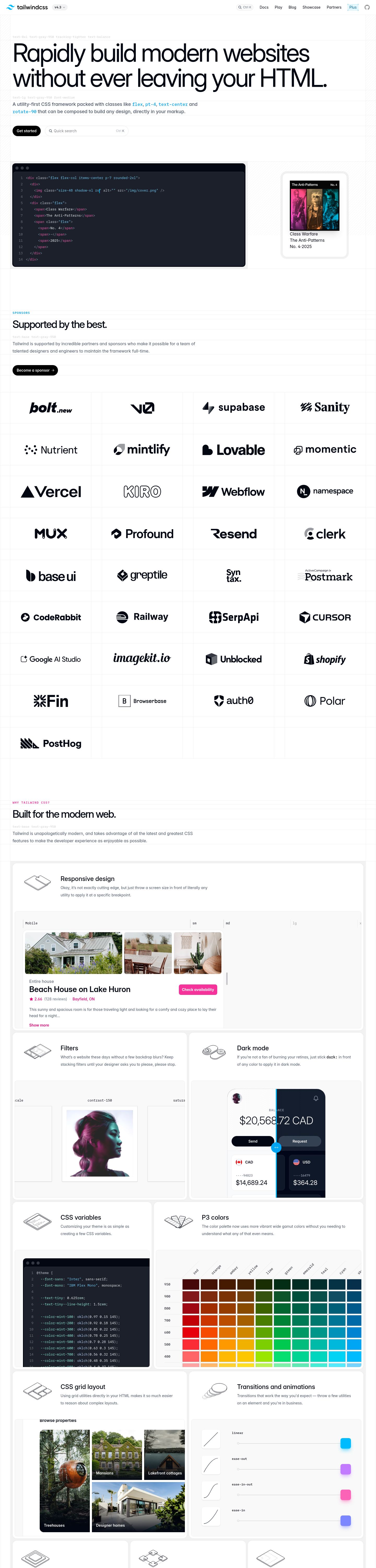
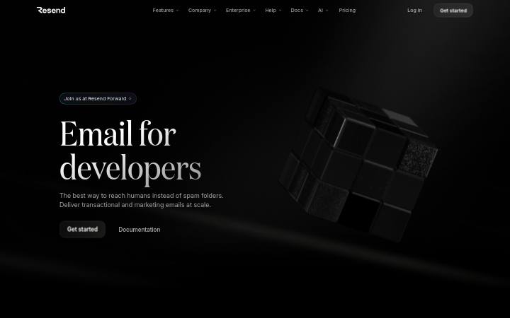
2. Look at every image in `design/tailwindcss.com-design-pack/screenshots/` and match the composition, density, whitespace and image treatment. Tokens do not carry those; the screenshots do.
3. Style everything with `design/tailwindcss.com-design-pack/tokens.css` (or `tailwind.css` if this project uses Tailwind v4). Do not invent colours, radii, shadows or font sizes that are not in the pack.
4. Load the fonts named in DESIGN.md. Where a font is not freely available, use the stand-in it names at the same sizes and weights.
5. Match the breakpoints and hover, focus and motion rules in BEHAVIOR.md. Build both themes.

Now build: [describe the page or app you want]

When you are done, compare the result with the screenshots at desktop and phone widths, fix the biggest visual difference first, and repeat.
Warna
5 tokenKomponen
v4.3Get startedAlamat email
- tombol ghost
- teks #000000 di atas transparan di atas #ffffff, r 16px, h 24px, 12px/500
- tombol primary
- teks #ffffff di atas #000000, r 32px, h 40px, 14px/600
- input
- h 24px, 0px solid #000000, r 0px
- kartu
- transparent, none, r 8px, bayangan
- tautan
- #000000, tanpa garis bawah, 400
- h1
- 96px / 400, perataan start, maks 1360px
- kode
- pre: plexMono 13px, oklab(0.999994 0.0000455678 0.0000200868 / 0.1) bg, lab(1.90334 0.278696 -5.48866) text, radius 8px, padding 12px 12px
- formulir
- 0 forms, 1 inputs. Required markers: 0. Help texts: 0. Label placement: none (1).
- ikon
- Icons: 64 inline SVGs, filled, sizes 16px/28px/10px/15px.
Interaksi dan animasi
- button primary "Get started": tanpa perubahan hover
- fokus button primary: outline 1px auto rgb(16, 16, 16), offset 1px
- tooltip: No tooltip could be triggered from the first viewport, but the stylesheet defines tooltip rules (.group-data-\[tooltip-hover\=true\]\:opacity-100:is(:where(.group)[data-tooltip-hover="true"] *)): opacity: 1.
- menu: 1 aria-haspopup triggers exist; none opened on hover (click-to-open menus).
- animasi: 258 elements carry transitions; typical 0.15s with cubic-bezier(0.4, 0, 0.2, 1), mostly on opacity, color, background-color. 1 running keyframe animations (ping 1s infinite). No scroll-reveal: content is visible without scrolling into view.
Tipografi
2 font familyinterGoogle FontsplexMonoself-hosted, pengganti Inter
headline-displayQuick brown fox96px / 400 / lh 1 / -4.8px
headline-lgQuick brown fox40px / 500 / lh 1 / -2px
headline-mdQuick brown fox36px / 600 / lh 1.33
body-mdThe quick brown fox jumps over the lazy dog14px / 400 / lh 2
label-mdThe quick brown fox jumps over the lazy dog12px / 400 / lh 2
buttonThe quick brown fox jumps over the lazy dog14px / 400 / lh 1.71
codeconst pack = extract(url)12px / 400 / lh 1.33
Ukuran yang dipakai
1213141618364096
Jarak
unit 8px- Lebar konten
- 1360px
- Breakpoint
- 640, 768, 1024, 1280, 1536px
Radius
tombol 32pxinput 0pxkartu 8pxgambar 0px
Bayangan
41
2
3
4
Tema terang
Dicapai lewat data-theme=light. Terang → gelap:
background#ffffff → #ffffff
foreground#ffffff → #ffffff
Bayangan mode terang: oklab(0.999994 0.0000455678 0.0000200868 / 0.1) 0px 0px 0px 1px inset; oklab(0.999994 0.0000455678 0.0000200868 / 0.05) 0px 0px 0px 1px inset
Inventaris komponen
24 dari 87 jenis · 44 varian · 12 status · 1 overlayButton, secondary#ffffff text on rgba(255, 255, 255, 0.1), radius 4px, h 28px, padding 4px 8px 4px 8px, 12px/400, shadow rgba(255, 255, 255, 0.051) 0px 0px 0px 1px inset
Button, ink (lg)#ffffff text on #000000, radius 32px, h 40px, padding 8px 16px 8px 16px, 14px/600
Button, ghost#ffffff text on transparent, radius 4px, h 28px, padding 4px 8px 4px 8px, 12px/400
Button, ghost-with-icon#000000 text on transparent, radius 3.35544e+07px, h 24px, padding 4px 8px 4px 8px, 16px/400, shadow rgba(0, 0, 13, 0.078) 0px 0px 0px 1px inset, icon left 16px
Button, ghost-with-icon (lg)rgba(2, 6, 18, 0.5) text on transparent, radius 3.35544e+07px, h 40px, padding 8px 16px 8px 16px, 14px/400, shadow rgba(0, 0, 13, 0.078) 0px 0px 0px 1px inset, icon left 16px
Text link, plain#030712, no underline, 16px/400
Text link, plain · main#030712, no underline, 14px/400
Text link, plain · main · 3#00598a, no underline, 14px/400
Text link, plain · main · 4#364153, no underline, 14px/400
Text input, outlinedh 24px, bg transparent, border none, radius 0px, padding 0px 0px 0px 0px, 16px text #000000, placeholder #000000
hanya diam
Radio, customauthor-drawn (appearance none), size 28x28
Radio, custom · mainauthor-drawn (appearance none), size 28x28
Header / navbarh 57px, fixed, bg transparent, bottom border 1px solid rgba(0, 0, 0, 0.05), 8 links, CTAs: v4.3, ⌘KCtrl K, logo left
hanya diam
Menu / dropdown trigger, secondary#030712 text on rgba(0, 0, 0, 0.05), radius 16px, h 24px, padding 2px 6px 2px 10px, 12px/500, icon right 16px
Footerh 284px, bg #ffffff, 6 link columns, 20 links, headings: Tailwind CSS, Resources, Community, Tailwind CSS, social links
hanya diam
Footer link, plain#030712, no underline, 14px/400
 resthover: tidak ada perubahan
Social icon links1 icons at 20px, #000000, gap 24px
 resthover: tidak ada perubahan
Theme toggle#ffffff text on #f6339a, radius 8px, h 40px, padding 8px 12px 8px 12px, 14px/700
 resthover: tidak ada perubahan
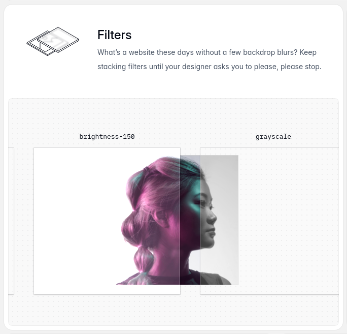
Card, filled-with-mediabg #ffffff, border none, radius 16px, padding 8px 8px 8px 8px, no shadow, about 668×640px, media inside 256×256, radius 0px, body 14px #4a5565, 30 per row
 resthover: tidak ada perubahan
Card, filled-with-media · mainbg gradient radial-gradient(rgba(0, 0, 0, 0.051) 1px, rgba(0, 0, 0, 0) 0, border none, radius 8px, padding 32px 32px 32px 32px, no shadow, about 652×448px, media inside 375×621, radius 0px, 1 per row
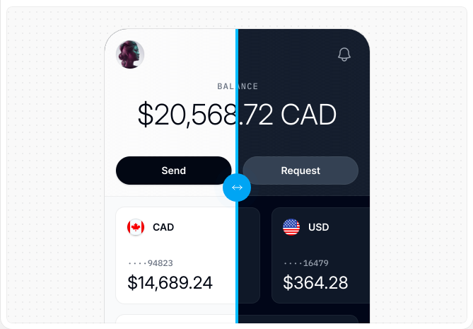 resthover: tidak ada perubahan
Card, filled-with-media · main · 3bg gradient radial-gradient(rgba(0, 0, 0, 0.051) 1px, rgba(0, 0, 0, 0) 0, border none, radius 8px, padding 0px 0px 0px 0px, no shadow, about 652×448px, media inside 256×256, radius 0px, 1 per row
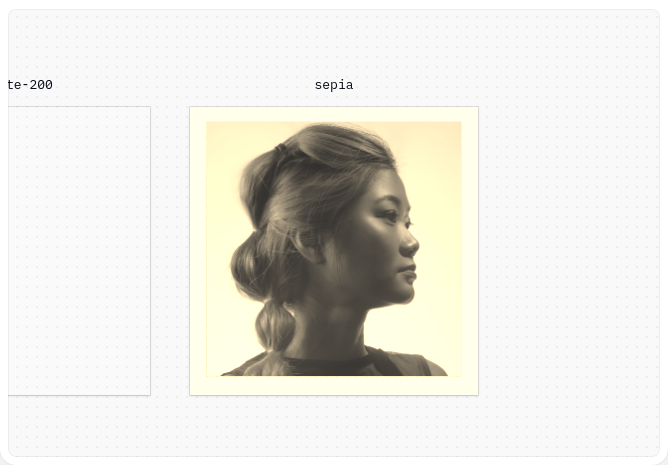 resthover: tidak ada perubahan
Card, elevatedbg rgba(255, 255, 255, 0.1), border none, radius 8px, padding 0px 0px 0px 0px, shadow rgba(255, 255, 255, 0.051) 0px 0px 0px 1px inset, about 833×342px, 1 per row
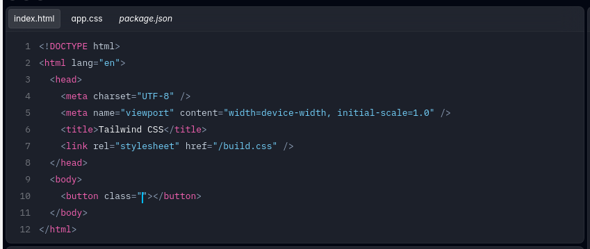 resthover: tidak ada perubahan
Card, elevated-with-mediabg #ffffff, border none, radius 0px, padding 64px 64px 64px 64px, shadow rgba(0, 0, 0, 0.051) 0px 0px 0px 1px, about 652×568px, media inside 192×392, radius 0px, h3 16px/600, 1 per row
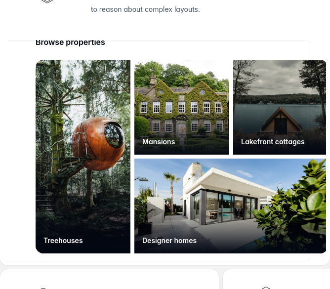 resthover: tidak ada perubahan
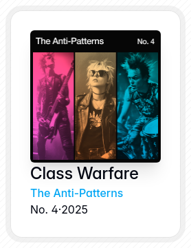
Card, filled-with-media · main · 4bg rgba(0, 0, 0, 0.05), border none, radius 24px, padding 8px 8px 8px 8px, no shadow, about 262×336px, media inside 190×192, radius 6px, 1 per row
 resthover: tidak ada perubahan
Styled list33 items, marker none, icon per item, gap 40px, item padding 0px 0px
hanya diam
Avatar, 48px-round48px, radius 3.35544e+07px
Code block / inline code, blockblock, plexMono 13px, #f8fafc on rgba(255, 255, 255, 0.1), radius 8px, padding 12px 12px 12px 12px
Code block / inline code, block · mainblock, plexMono 13px, #f8fafc on transparent, radius 8px, padding 8px 12px 8px 12px
Keyboard key12px #6a7282 on transparent, border none, padding 0px 0px 0px 0px, radius 0px
Image / figure, aspect-1.14-rounded182×160px, aspect 1.14, radius 8px, object-fit cover
 resthover: tidak ada perubahan
Image / figure, aspect-0.6375×621px, aspect 0.6, radius 0px, object-fit fill
hanya diam
Image / figure, aspect-1192×192px, aspect 1, radius 0px, object-fit fill
hanya diam
Icon, outline-28px28×28px, outline, stroke 1px none
Icon, filled-16px16×16px, filled, fill #e60076
Icon, outline-15px15×8px, outline, stroke 1px none
Eyebrow / kicker#00a6f4 on transparent, radius 0px, h 16px, padding 0px 8px 0px 8px, 12px/600, uppercase, tracking 1.2px
Eyebrow / kicker · main#f6339a on transparent, radius 0px, h 16px, padding 0px 8px 0px 8px, 12px/600, uppercase, tracking 1.2px
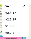
Dropdown menu 1112×148px, below, 8px from the trigger, bg #ffffff, text #030712 12px, radius 12px, padding 4px 4px 4px 4px, shadow rgba(0, 0, 0, 0.051) 0px 0px 0px 1px, rgba(0, 0, 0, 0.1) 0px 1px 3px 0px, rgba(0, 0, 0, 0.1) 0px 1px 2px -1px, 5 items 28px tall, with icons, page scroll locked, closes on Escape
Tidak ada di halaman ini: Icon button, Toggle / segmented control, Button group, Floating action button, Close / dismiss button, Search field, Textarea, Select (native), Combobox / custom select, Checkbox, Switch / toggle, Range slider, File input / dropzone, Date / time input, Input with attached button or addon, Field label, Help / hint text, Validation error text, Fieldset / form section, Navigation link, Breadcrumb, Tabs, Pagination, Stepper / progress steps, Sidebar navigation, Skip link, Back to top, Language / region switch, Tooltip, Popover, Dialog / modal, Drawer / sheet / off-canvas, Toast / snackbar, Banner / announcement bar, Cookie / consent notice, Lightbox / media viewer, Badge / pill / tag, Chip (removable / selectable tag), Alert / callout, Progress bar, Spinner / loader, Skeleton / shimmer, Counter / notification dot, Empty state, Rating / stars, Pricing card / plan, Feature item (icon + title + text), Testimonial / quote card, Stat / metric, List row / menu row, Table, Table row, Accordion / disclosure, Avatar stack, Divider, Blockquote, Video / media embed, Carousel / slider, Logo strip, FAQ block, Call-to-action band, Newsletter / signup form, Search results / listing row.
Responsif
1440 / 1024 / 768 / 390 px| Viewport | Konten | Gutter | Body | H1 | Header | Hero | Grid | Tombol |
|---|---|---|---|---|---|---|---|---|
| desktop 1440 | 1360px | 40px | 16px | 96px, 2 lines, start | text only | 2→2 col; 4→4 col; 2→2 col | content-width | |
| laptop 1024 | 944px | 40px | 16px | 60px, 2 lines, start | text only | 2→2 col; 3→3 col; 2→1 col | content-width | |
| tablet 768 | 720px | 24px | 16px | 48px, 2 lines, start | text only | 2→2 col; 2→1 col; 2→2 col | content-width | |
| phone 390 | 358px | 0px | 16px | 36px, 3 lines, start | text only | 2→2 col; 2→1 col; 3→1 col | 1 full-width |
- H1 goes 96px → 36px (38%), 2 → 3 lines.
- Card grids: 4 columns → 2 columns on phones (gap 40px → 20px).
- Body text stays 16px at every width.
- Phone side gutter 0px.
- 1 buttons stretch full-width on phones.
File di dalam paket
64 fileDESIGN.md311 baris
---
version: alpha
name: "tailwindcss.com"
description: "Design system extracted from https://tailwindcss.com/ on 2026-09-28"
colors:
  background: "#ffffff"
  foreground: "#ffffff"
  muted-foreground: "#000000"
  primary: "#000000"
  on-primary: "#ffffff"
typography:
  headline-display:
    fontFamily: "inter"
    fontSize: "96px"
    fontWeight: 400
    lineHeight: "1"
    letterSpacing: "-4.8px"
  headline-lg:
    fontFamily: "inter"
    fontSize: "40px"
    fontWeight: 500
    lineHeight: "1"
    letterSpacing: "-2px"
  headline-md:
    fontFamily: "inter"
    fontSize: "36px"
    fontWeight: 600
    lineHeight: "1.33"
  body-md:
    fontFamily: "inter"
    fontSize: "14px"
    fontWeight: 400
    lineHeight: "2"
  label-md:
    fontFamily: "plexMono"
    fontSize: "12px"
    fontWeight: 400
    lineHeight: "2"
  button:
    fontFamily: "inter"
    fontSize: "14px"
    fontWeight: 400
    lineHeight: "1.71"
  code:
    fontFamily: "inter"
    fontSize: "12px"
    fontWeight: 400
    lineHeight: "1.33"
rounded:
  none: "0px"
  2xl: "32px"
  md: "8px"
  full: "9999px"
  xl: "16px"
spacing:
  unit: "8px"
  1: "8px"
  2: "16px"
  3: "24px"
  4: "32px"
  5: "40px"
  6: "64px"
components:
  button-ghost:
    backgroundColor: "#ffffff"
    textColor: "#000000"
    typography: "{typography.button}"
    rounded: "16px"
    height: "24px"
    padding: "2px 6px"
  button-primary:
    backgroundColor: "{colors.primary}"
    textColor: "{colors.on-primary}"
    typography: "{typography.button}"
    rounded: "32px"
    height: "40px"
    padding: "8px 16px"
  input:
    backgroundColor: "transparent"
    rounded: "0px"
    height: "24px"
  card:
    backgroundColor: "transparent"
    rounded: "8px"
    padding: "12px"
---

# tailwindcss.com

## Overview

Tailwind CSS - Rapidly build modern websites without ever leaving your HTML.: Tailwind CSS is a utility-first CSS framework for rapidly building modern websites without ever leaving your HTML.

Soft, well-rounded controls, layered shadows for depth, large display type at 96px / 400, a single neutral accent on neutrals. The site ships in light mode by default. Measured from 2349 rendered elements at 1440px wide on 2026-09-28.

Reference screenshots live beside this file; look at them before writing any layout, they carry the composition, density and image treatment that tokens cannot:

- `screenshots/desktop-1440-fold.png`: Desktop 1440, above the fold
- `screenshots/desktop-1440-full.jpg`: Desktop 1440, full page
- `screenshots/desktop-1440-light.png`: Desktop 1440, light mode
- `screenshots/laptop-1024-fold.png`: Laptop 1024, above the fold
- `screenshots/tablet-768-fold.png`: Tablet 768, above the fold
- `screenshots/phone-390-fold.png`: Phone 390, above the fold
- `screenshots/phone-390-full.jpg`: Phone 390, full page
- `screenshots/phone-390-menu.png`: Phone 390, navigation menu open
- `screenshots/c-button-1--rest.png`: Button 1 ("index.html"), rest
- `screenshots/c-button-1--focus.png`: Button 1 ("index.html"), focus
- `screenshots/c-link-1--rest.png`: Text link 1 ("openai.com"), rest
- `screenshots/c-link-1--focus.png`: Text link 1 ("openai.com"), focus
- `screenshots/c-radio-1--rest.png`: Radio 1, rest
- `screenshots/c-radio-1--focus.png`: Radio 1, focus
- `screenshots/c-radio-1--checked.png`: Radio 1, checked
- `screenshots/c-menu-button-1--rest.png`: Menu / dropdown trigger 1 ("v4.3"), rest
- `screenshots/c-dropdown-menu-1--open.png`: Dropdown menu 1 opened by menu-button "v4.3"
- `screenshots/c-menu-button-1--open.png`: Menu / dropdown trigger 1 ("v4.3"), open (trigger)
- `screenshots/c-footer-link-1--rest.png`: Footer link 1 ("Documentation"), rest
- `screenshots/c-social-links-1--rest.png`: Social icon links 1, rest
- `screenshots/c-theme-toggle-1--rest.png`: Theme toggle 1 ("Check availability"), rest
- `screenshots/c-card-1--rest.png`: Card 1 ("FiltersWhat’s a website "), rest
- `screenshots/c-avatar-1--rest.png`: Avatar 1, rest
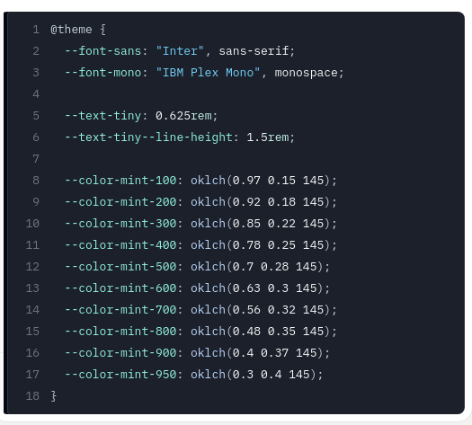
- `screenshots/c-code-1--rest.png`: Code block / inline code 1 ("@theme { --font-sans: "I"), rest
- `screenshots/c-kbd-1--rest.png`: Keyboard key 1 ("Ctrl K"), rest
- `screenshots/c-image-1--rest.png`: Image / figure 1, rest
- `screenshots/c-icon-1--rest.png`: Icon 1, rest
- `screenshots/c-heading-eyebrow-1--rest.png`: Eyebrow / kicker 1 ("Sponsors"), rest
- `screenshots/c-button-2--rest.png`: Button 2 ("Get started"), rest
- `screenshots/c-button-2--focus.png`: Button 2 ("Get started"), focus
- `screenshots/c-link-2--rest.png`: Text link 2 ("Docs"), rest
- `screenshots/c-link-2--focus.png`: Text link 2 ("Docs"), focus
- `screenshots/c-radio-2--rest.png`: Radio 2, rest
- `screenshots/c-radio-2--focus.png`: Radio 2, focus
- `screenshots/c-radio-2--checked.png`: Radio 2, checked
- `screenshots/c-card-2--rest.png`: Card 2 ("@theme { --font-sans: "I"), rest
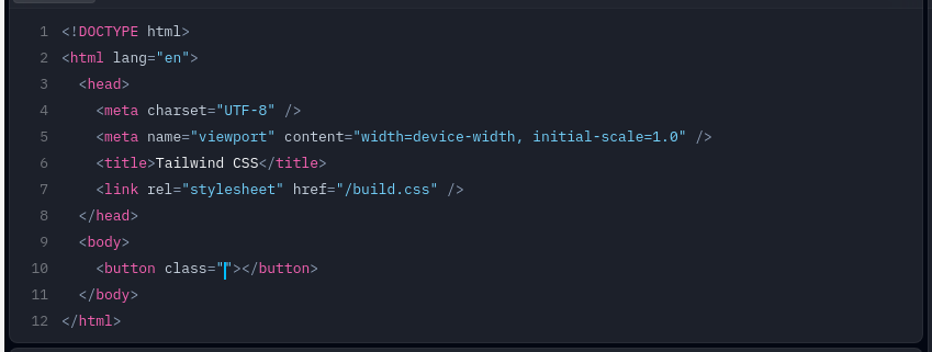
- `screenshots/c-code-2--rest.png`: Code block / inline code 2 ("<!DOCTYPE html><html lan"), rest
- `screenshots/c-icon-2--rest.png`: Icon 2, rest
- `screenshots/c-heading-eyebrow-2--rest.png`: Eyebrow / kicker 2 ("Why Tailwind CSS?"), rest
- `screenshots/c-button-3--rest.png`: Button 3 ("app.css"), rest
- `screenshots/c-button-3--focus.png`: Button 3 ("app.css"), focus
- `screenshots/c-link-3--rest.png`: Text link 3 ("Plus"), rest
- `screenshots/c-link-3--focus.png`: Text link 3 ("Plus"), focus
- `screenshots/c-card-3--rest.png`: Card 3 ("blur-smbrightness-150gra"), rest
- `screenshots/c-icon-3--rest.png`: Icon 3, rest
- `screenshots/c-button-4--rest.png`: Button 4 ("⌘KCtrl K"), rest
- `screenshots/c-button-4--focus.png`: Button 4 ("⌘KCtrl K"), focus
- `screenshots/c-link-4--rest.png`: Text link 4 ("Trademark Policy"), rest
- `screenshots/c-link-4--focus.png`: Text link 4 ("Trademark Policy"), focus
- `screenshots/c-card-4--rest.png`: Card 4 ("index.htmlapp.csspackage"), rest
- `screenshots/c-button-5--rest.png`: Button 5 ("Quick search⌘KCtrl K"), rest
- `screenshots/c-button-5--focus.png`: Button 5 ("Quick search⌘KCtrl K"), focus
- `screenshots/c-card-5--rest.png`: Card 5 ("Browse propertiesTreehou"), rest
- `screenshots/c-card-6--rest.png`: Card 6 ("Class WarfareThe Anti-Pa"), rest

## Colors

| Token | Value | Use |
| --- | --- | --- |
| background | `#ffffff` | Page background |
| foreground | `#ffffff` | Primary text |
| muted-foreground | `#000000` | Secondary text, captions |
| primary | `#000000` | Accent: primary buttons, links, focus |
| on-primary | `#ffffff` | Text on the accent |

Full painted palette by area (largest first): `#ffffff`, `#000000`.

Gradients in use: `radial-gradient(oklab(0.129999 -0.00404751 -0.027702 / 0.05) 1px, rgba(0, 0, 0, 0) 0px)`; `repeating-linear-gradient(315deg, oklab(0 0 0 / 0.05) 0px, oklab(0 0 0 / 0.05) 1px, rgba(0, 0, 0, 0) 0px, rgba(0, 0, 0, 0) 50%)`; `linear-gradient(rgba(0, 0, 0, 0) 0%, rgba(0, 0, 0, 0) 50%, lab(1.90334 0.278696 -5.48866) 100%)`.

The accent `#000000` is used sparingly: primary buttons, links and focus rings. Everything else stays neutral.

## Typography

- **inter** for h1, h2, h3, body, button, code: Google Fonts (inter).
- **plexMono** for label: self-hosted webfont, not freely available; use **Inter** from Google Fonts as the stand-in.

| Role | Family | Size | Weight | Line height | Tracking |
| --- | --- | --- | --- | --- | --- |
| headline-display | inter | 96px | 400 | 1 | -4.8px |
| headline-lg | inter | 40px | 500 | 1 | -2px |
| headline-md | inter | 36px | 600 | 1.33 | normal |
| body-md | inter | 14px | 400 | 2 | normal |
| label-md | plexMono | 12px | 400 | 2 | normal |
| button | inter | 14px | 400 | 1.71 | normal |
| code | inter | 12px | 400 | 1.33 | normal |

Type scale in use: 12px, 13px, 14px, 16px, 18px, 36px, 40px, 96px. Base body size 14px.

The H1 renders at 96px / 400, start aligned, up to 1360px wide, tracking -4.8px. Sample: "Rapidly build modern websites without ever leaving your HTML.".

## Layout

- Spacing unit: 8px. Scale in use: 8, 16, 24, 32, 40, 64 (px).
- Flex and grid gaps: 8, 16, 24, 32, 40, 48 px.
- Content max width: 1360px, centred.
- Breakpoints: 640px, 768px, 1024px, 1280px, 1536px.

## Elevation & Depth

Shadows in use, most common first:

- shadow-1: `oklab(0.129999 -0.00404751 -0.027702 / 0.1) 0px 0px 0px 1px inset`
- shadow-2: `oklab(0.999994 0.0000455678 0.0000200868 / 0.05) 0px 0px 0px 1px inset`
- shadow-3: `oklab(0.999994 0.0000455678 0.0000200868 / 0.1) 0px 0px 0px 1px inset`
- shadow-4: `oklab(0.129999 -0.00404751 -0.027702 / 0.05) 0px 0px 0px 1px`

## Shapes

- Buttons: 32px
- Inputs: 0px
- Cards and panels: 8px
- Images and media: 0px
- Radius scale: none 0px, 2xl 32px, md 8px, full 9999px, xl 16px

## Components

### Button, ghost

Background transparent (it sits on `#ffffff`, so place it on that colour), text `#000000`, border none, radius 16px, height 24px, padding 2px 6px, 12px / 500. Sample label: "v4.3".

### Button, primary

Background `#000000`, text `#ffffff`, border none, radius 32px, height 40px, padding 8px 16px, 14px / 600. Sample label: "Get started".

### Input

Height 24px, background `transparent`, border 0px solid #000000, radius 0px, 16px text, padding 0px 0px.

### Card

Background `transparent`, border none, radius 8px, padding 12px, shadow `rgba(0, 0, 0, 0) 0px 0px 0px 0px, oklab(0.999994 0.0000455678 0.0000200868 / 0.1) 0px 0px 0px 1px inset, rgba(0, 0, 0, 0) 0px 0px 0px 0px, rgba(0, 0, 0, 0) 0px 0px 0px 0px, rgba(0, 0, 0, 0) 0px 0px 0px 0px`. Typical size about 419×504px.

### Link

Colour `#000000`, no underline at rest, weight 400.

### Full inventory

`COMPONENTS.md` carries every component kind found on the page (24 of 87 in the checklist, 44 variants) with each state that was measured live (hover, keyboard focus, pressed, disabled, checked, filled, invalid, open: 12 state changes, 1 overlays opened) and a cropped screenshot of each; `components.css` is the same as a stylesheet. Read it before building any control. Summary:

| Component | Variants | States measured | Sample |
| --- | --- | --- | --- |
| Button | secondary, ink lg, ghost, ghost-with-icon, ghost-with-icon lg | focus | "index.html" |
| Text link | plain, plain, plain, plain | focus | "openai.com" |
| Text input | outlined | rest only |  |
| Radio | custom, custom | focus |  |
| Header / navbar | default | rest only | "v4.3⌘KCtrl KDocsPlayBlogShowca" |
| Menu / dropdown trigger | secondary | open | "v4.3" |
| Footer | default | rest only | "Tailwind CSSDocumentationPlayg" |
| Footer link | plain | rest only | "Documentation" |
| Social icon links | default | rest only |  |
| Theme toggle | default | rest only | "Check availability" |
| Card | filled-with-media, filled-with-media, filled-with-media, elevated, elevated-with-media, filled-with-media | rest only | "FiltersWhat’s a website these " |
| Styled list | default | rest only |  |
| Avatar | 48px-round | rest only |  |
| Code block / inline code | block, block | rest only | "@theme { --font-sans: "Inter"," |
| Keyboard key | default | rest only | "Ctrl K" |
| Image / figure | aspect-1.14-rounded, aspect-0.6, aspect-1 | rest only |  |
| Icon | outline-28px, filled-16px, outline-15px | rest only |  |
| Eyebrow / kicker | default, default | rest only | "Sponsors" |

Not on this page (do not invent them; if the build needs one, derive it from the nearest kind above): Icon button, Toggle / segmented control, Button group, Floating action button, Close / dismiss button, Search field, Textarea, Select (native), Combobox / custom select, Checkbox, Switch / toggle, Range slider, File input / dropzone, Date / time input, Input with attached button or addon, Field label, Help / hint text, Validation error text, Fieldset / form section, Navigation link, Breadcrumb, Tabs, Pagination, Stepper / progress steps, Sidebar navigation, Skip link, Back to top, Language / region switch, Tooltip, Popover, Dialog / modal, Drawer / sheet / off-canvas, Toast / snackbar, Banner / announcement bar, Cookie / consent notice, Lightbox / media viewer, Badge / pill / tag, Chip (removable / selectable tag), Alert / callout, Progress bar, Spinner / loader, Skeleton / shimmer, Counter / notification dot, Empty state, Rating / stars, Pricing card / plan, Feature item (icon + title + text), Testimonial / quote card, Stat / metric, List row / menu row, Table, Table row, Accordion / disclosure, Avatar stack, Divider, Blockquote, Video / media embed, Carousel / slider, Logo strip, FAQ block, Call-to-action band, Newsletter / signup form, Search results / listing row.

## Dark Mode

Both themes exist; the default render is light and the light theme was reached via data-theme=light. Token pairs, light → dark:

| Token | Light | Dark |
| --- | --- | --- |
| background | `#ffffff` | `#ffffff` |
| foreground | `#ffffff` | `#ffffff` |

Light-theme shadows: `oklab(0.999994 0.0000455678 0.0000200868 / 0.1) 0px 0px 0px 1px inset`; `oklab(0.999994 0.0000455678 0.0000200868 / 0.05) 0px 0px 0px 1px inset`; `oklab(0.999994 0.0000455678 0.0000200868 / 0.2) 0px 0px 0px 1px inset, oklab(0.129999 -0.00404751 -0.027702 / 0.1) 0px 0px 0px 1px, rgba(0, 0, 0, 0.1) 0px 1px 3px 0px, rgba(0, 0, 0, 0.1) 0px 1px 2px -1px`; `oklab(0.999994 0.0000455678 0.0000200868 / 0.1) 0px 0px 0px 1px`

## Responsive Behavior

| Viewport | Content width | Gutter | Body | H1 | Header | Hero | Grids | Buttons |
| --- | --- | --- | --- | --- | --- | --- | --- | --- |
| desktop 1440px | 1360px | 40px | 16px | 96px, 2 lines, start |  | text only | 2→2 col; 4→4 col; 2→2 col | content-width |
| laptop 1024px | 944px | 40px | 16px | 60px, 2 lines, start |  | text only | 2→2 col; 3→3 col; 2→1 col | content-width |
| tablet 768px | 720px | 24px | 16px | 48px, 2 lines, start |  | text only | 2→2 col; 2→1 col; 2→2 col | content-width |
| phone 390px | 358px | 0px | 16px | 36px, 3 lines, start |  | text only | 2→2 col; 2→1 col; 3→1 col | 1 full-width |

- H1 goes 96px → 36px (38%), 2 → 3 lines.
- Card grids: 4 columns → 2 columns on phones (gap 40px → 20px).
- Body text stays 16px at every width.
- Phone side gutter 0px.
- 1 buttons stretch full-width on phones.

## Interaction & Motion

258 elements carry transitions; typical 0.15s with cubic-bezier(0.4, 0, 0.2, 1), mostly on opacity, color, background-color. 1 running keyframe animations (ping 1s infinite).

- Hover on button-primary ("Get started"): no visible change; cursor pointer.
- Focus on button-primary: outline 1px auto rgb(16, 16, 16), offset 1px.
- No tooltip could be triggered from the first viewport, but the stylesheet defines tooltip rules (.group-data-\[tooltip-hover\=true\]\:opacity-100:is(:where(.group)[data-tooltip-hover="true"] *)): opacity: 1.
- 1 aria-haspopup triggers exist; none opened on hover (click-to-open menus).
- No scroll-reveal: content is visible without scrolling into view.
- Overlay library detected: headlessui.

Full detail (every overlay, table, form, scroll and text rule measured) is in `BEHAVIOR.md`; raw evidence in `evidence.json`.

## Do's and Don'ts

- Do use 8px multiples for every padding, margin and gap; the site does not use odd values.
- Do reserve `#000000` for actions and focus; never paint large areas with it.
- Do keep body text at 14px in inter.
- Do match corner radii per element class (buttons 32px, cards 8px); do not pick one radius for everything.
- Do use the measured shadows above; do not invent heavier ones.
- Don't substitute a different accent hue or introduce gradients that are not listed above.
- Don't rebuild from the tokens alone; open the screenshots for composition, density and image treatment.
- Note: The primary action colour is the ink colour (monochrome palette); chromatic colours appear only as small accents.
- Note: Body text contrast is 1.0:1 against the page background (below 4.5:1).
The primary action colour is the ink colour (monochrome palette); chromatic colours appear only as small accents.
Body text contrast is 1.0:1 against the page background (below 4.5:1).