
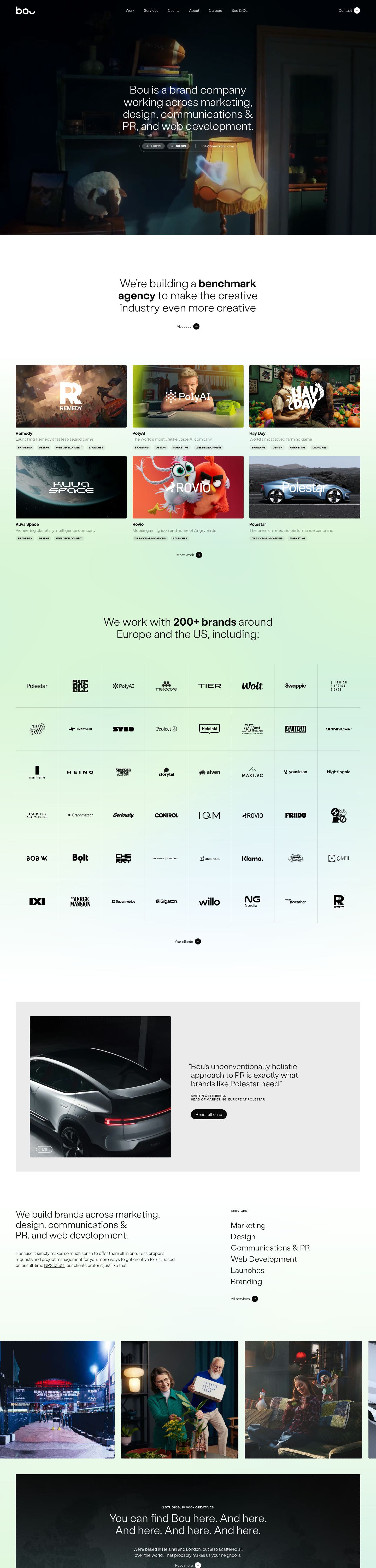


































wearebou.com
Agensi & portofolioTerang
Halaman umum yang hanya disusun dari hasil ukur paket ini: teks contoh dengan warna, tipografi, tombol, dan jarak situsnya.
Contoh situs
1440 pxWarna
7 warnaKomponen
HelsinkiRead full case
- tombol secondary
- teks #ffffff di atas #ffffff40, r 100px, h 22px, 10px/600
- tombol primary
- teks #ffffff di atas #0a0a0a, r 9999px, h 39px, 16px/300
- kartu
- transparent, 1px solid #ffffff26, r 4px
- tautan
- #ffffff, tanpa garis bawah, 300
- header
- 80px, fixed, 8 tautan pada 14px
- judul utama
- 42.048px / 300, perataan center, maks 705px
- badge
- "Branding": #0000000d on #0a0a0a, 10px/600, 21px tall, radius 100px, padding 3.024px 9.072px, uppercase
- badge
- "Design": #0000000d on #0a0a0a, 10px/600, 21px tall, radius 100px, padding 3.024px 9.072px, uppercase
- formulir
- 0 forms, 3 inputs. Required markers: 0. Help texts: 0. Label placement: no labelled inputs.
- ikon
- Icons: 91 inline SVGs, filled/mixed; inspect brand references, sizes 14px/21px/19px/8px, stroke 1.11364px/1.5px/1px; icon font classes icon-.
Interaksi dan animasi
- tooltip: Tooltip triggers exist (1 × data-tooltip, 1 × aria-describedby, 3 × title, 1 × data-tooltip-content) but none opened on hover in the first viewport; title attributes fall back to the browser's native tooltip.
- menu: 1 aria-haspopup triggers exist; none opened on hover (click-to-open menus).
- animasi: 218 elements carry transitions; typical 0.3s with ease-out, mostly on all, opacity, color. 1 running keyframe animations (fadeInUp 0.3s 1). 30 sizable elements sit at opacity 0 before scrolling: scroll-reveal animations are in use (reveal on enter, fade + rise is the usual recipe).
Tipografi
1 font familyStabilGroteskDihosting sendiri
headline-displayQuick brown fox42.048px / 300 / lh 46.2528px
headline-lgQuick brown fox42.048px / 300 / lh 46.2528px
headline-mdQuick brown fox20px / 500 / lh 26px
body-mdThe quick brown fox jumps over the lazy dog16.56px / 300 / lh 23.184px
label-mdThe quick brown fox jumps over the lazy dog12px / 500 / lh 14.4px / 0.72px
buttonThe quick brown fox jumps over the lazy dog13px / 300 / lh 13px
Ukuran yang dipakai
Jarak
unit 4px- Lebar konten
- 1320px
- Breakpoint
- 460, 576, 640, 960, 1280px
Radius
tombol 100pxinput 100pxkartu 4pxgambar 0px
Bayangan
1Tema
No dark mode responded to prefers-color-scheme, a theme toggle, or a root class/attribute.
Logo dan ikon
6 referensiInventaris komponen
19 dari 87 jenis · 35 varian · 24 status · 0 overlayButton, ink (lg)#ffffff text on #0a0a0a, border 1px solid #0a0a0a, radius 1600px, h 39px, padding 10.4px 17.6px 10.4px 17.6px, 16px/300
active (pressed), disabled: tidak ada perubahan
Button, ghost#0a0a0a text on transparent, radius 1400px, h 24px, padding 0px 0px 0px 9.8px, 14px/300
active (pressed), disabled: tidak ada perubahan
Button, outline (lg)#0a0a0a text on transparent, border 1px solid rgba(10, 10, 10, 0.15), radius 1600px, h 39px, padding 10.4px 17.6px 10.4px 17.6px, 16px/300
active (pressed), disabled: tidak ada perubahan
Button, ghost · header#ffffff text on transparent, radius 1400px, h 24px, padding 0px 0px 0px 9.8px, 14px/300
active (pressed), disabled: tidak ada perubahan
Button, secondary#ffffff text on rgba(255, 255, 255, 0.25), radius 100px, h 22px, padding 4px 14px 4px 14px, 10px/600, uppercase
active (pressed), disabled: tidak ada perubahan
Button, link (sm)#ffffff text on transparent, radius 0px, h 13px, padding 0px 0px 0px 0px, 13px/300
active (pressed), disabled: tidak ada perubahan
Icon button, ghost#ffffff text on transparent, radius 0px, h 23px, padding 6.048px 6.048px 6.048px 6.048px, 12px/400, icon only 8px
hover, active (pressed), disabled: tidak ada perubahan
Text link, plain#0a0a0a, no underline, 16px/300
active (pressed): tidak ada perubahan
Header / navbarh 80px, fixed, bg transparent, 8 links, CTAs: Contact, logo left
rest: pratinjau tidak tersedia
Footerh 823px, bg #ffffff, 14 link columns, 43 links, headings: Helsinki, London, Company, Work, social links
rest: pratinjau tidak tersedia
Badge / pill / tag, subtle-pill#0a0a0a on rgba(0, 0, 0, 0.05), radius 100px, h 21px, padding 3.024px 9.072px 3.024px 9.072px, 10px/600, uppercase
rest: pratinjau tidak tersedia
Card, elevated-with-mediabg transparent, border none, radius 0px, padding 0px 33px 0px 33px, shadow rgba(10, 10, 10, 0.15) 1px 0px 0px 0px, rgba(10, 10, 10, 0.15) 0px 1px 0px 0px, about 165×165px, media inside 79×18, radius 0px, 8 per row
hover: tidak ada perubahan
Card, outlinedbg transparent, border 1px solid rgba(255, 255, 255, 0.15), radius 4px, padding 18px 18px 18px 18px, no shadow, about 228×150px, h3 20px/500, 20 per row
rest: pratinjau tidak tersedia
Card, filled-media-topbg #ebebeb, border none, radius 4px, padding 0px 0px 0px 0px, no shadow, about 425×239px, media on top 436×245, radius 0px, 1 per row
rest: pratinjau tidak tersedia
Blockquote16px #0a0a0a on transparent, border none, padding 0px 0px 0px 0px, radius 0px
Image / figure, aspect-1541×541px, aspect 1, radius 0px, object-fit fill
hover: tidak ada perubahan
Image / figure, aspect-1.78436×245px, aspect 1.78, radius 0px, object-fit fill
rest: pratinjau tidak tersedia
Image / figure, aspect-1-rounded541×541px, aspect 1, radius 4px, object-fit cover
hover: tidak ada perubahan
Video / media embed1440×900px, radius 0px, no controls, autoplay
rest: pratinjau tidak tersedia
Icon, outline-14px14×14px, outline, stroke 1px none
rest: pratinjau tidak tersedia
Eyebrow / kicker#0a0a0a on transparent, radius 0px, h 14px, padding 0px 0px 0px 0px, 12px/500, uppercase, tracking 0.72px
Eyebrow / kicker · main#ffffff on transparent, radius 0px, h 14px, padding 0px 0px 0px 0px, 12px/500, uppercase, tracking 0.72px
Tidak ada di halaman ini: Toggle / segmented control, Button group, Floating action button, Close / dismiss button, Text input, Search field, Textarea, Select (native), Combobox / custom select, Checkbox, Radio, Switch / toggle, Range slider, File input / dropzone, Date / time input, Input with attached button or addon, Field label, Help / hint text, Validation error text, Fieldset / form section, Menu / dropdown trigger, Breadcrumb, Tabs, Stepper / progress steps, Sidebar navigation, Skip link, Back to top, Social icon links, Theme toggle, Language / region switch, Tooltip, Popover, Dropdown menu, Dialog / modal, Drawer / sheet / off-canvas, Toast / snackbar, Banner / announcement bar, Cookie / consent notice, Lightbox / media viewer, Chip (removable / selectable tag), Alert / callout, Progress bar, Spinner / loader, Skeleton / shimmer, Counter / notification dot, Empty state, Rating / stars, Pricing card / plan, Feature item (icon + title + text), Testimonial / quote card, Stat / metric, Styled list, List row / menu row, Table, Table row, Accordion / disclosure, Avatar, Avatar stack, Divider, Code block / inline code, Keyboard key, Carousel / slider, Logo strip, FAQ block, Call-to-action band, Newsletter / signup form, Search results / listing row, Sticky bar.
Responsif
1440 / 1024 / 768 / 390 px| Viewport | Konten | Gutter | Body | Judul | Header | Hero | Grid | Tombol |
|---|---|---|---|---|---|---|---|---|
| desktop 1440 | 1320px | 368px | 16px | 42px, 4 lines, center | 80px, 7 links | text only | 2→1 col; 6→3 col; 3→1 col | content-width |
| laptop 1024 | 939px | 142px | 16px | 29.9px, 2 lines, center | 80px, 7 links | text only | 2→1 col; 6→3 col; 3→1 col | content-width |
| tablet 768 | 728px | 20px | 16px | 28px, 2 lines, center | 80px, hamburger (Open mobile menu) | media behind/overlapping text | 3→1 col; 2→2 col; 6→2 col | content-width |
| phone 390 | 359px | 20px | 16px | 28px, 4 lines, center | 80px, hamburger (Open mobile menu) | media behind/overlapping text | 2→1 col; 6→1 col; 3→1 col | content-width |
- H1 goes 42px → 28px (67%), 4 → 4 lines.
- Nav collapses to a hamburger by 390px (first seen at 768px); header 80px → 80px.
- Hero: text only → media behind/overlapping text.
- Card grids: 3 columns → 1 column on phones (gap 22.464px → 23px).
- Body text is 16px at the sampled desktop and phone widths.
- Phone side gutter 20px.
- Section top padding 60px → 20px.
File di dalam paket
115 fileMulai dengan 49 kB teks panduan. Seluruh teks paket berukuran 966 kB; buka file detail saat diperlukan. Gambar terpisah.
START_HERE.md89 baris
# Start here: wearebou.com

Observed 2026-10-28T00:36:16.279Z; default light theme. This is a compact handoff, not the full evidence archive: everything you need to start is here, the detailed files are one step away.

## How to use this pack

1. Read `START_HERE.md` and `tokens.css` first: the priority values. Keep observed values; a value marked inferred or fallback is a suggestion to resolve against the screenshots.
2. Open `screenshots/desktop-1440-fold.png` and `screenshots/phone-390-fold.png` and match the composition, density, whitespace and image treatment; the values do not carry those. Treat the inside of an image or canvas as a visual inference, not measured DOM.
3. Read `FONTS.md` and load `fonts.css` before `tokens.css`. Keep exact weights and variable-font settings and verify the fonts that actually render. If a font is unavailable, name the substitute and compare its width and apparent weight before touching the type scale.
4. Before drawing any logo or icon, read `BRAND.md` and open `screenshots/brand-logo.png`, `screenshots/brand-icon-1.png`, `screenshots/brand-icon-2.png`: for a new product, create an original mark with the observed proportions and treatment; never guess a shape from a label.
5. Before building any control, read `COMPONENTS.md` (every variant and measured state, with a crop of each), use `components.css` for the CSS and `demos/` for a live copy of each component. A component listed as not found does not exist on the site; do not invent it.
6. Read `REGIONS.md` and inspect its context, detail and icon crops: reconstruct outer and inner surfaces, per-layer gradients and shadows and group spacing (`regions.css` has the recipes), then check the whole page again.
7. Read `BEHAVIOR.md` for hover, focus, tooltips, menus, motion, scrolling, tables, forms, text and each breakpoint, and reproduce the behaviour, not only the colours. No alternate theme was verified; use the observed theme unless another is requested.
8. `layout.html` is a generic page composed only from this pack's measured values, with placeholder copy: open it to see the colours, type, recipes and spacing working together and to check your own wiring of the fonts and tokens against it. It is not the site's composition; the screenshots are.
9. `DESIGN.md` has the whole system when a value is missing above. `evidence.json` is diagnostic data: never in the first read.
10. When done, render at desktop, 390px and 320px, compare with the screenshots, fix the biggest visible mismatch first (usually type size, whitespace or image treatment), recheck keyboard focus, overflow, navigation and forms, and repeat.
11. For another site's design, run `npx stylepack-cli <host>` in the project (it downloads that pack and records it the same way), or fetch https://stylepack.ai/packs/<host>/pack.zip; one question at a time is at https://stylepack.ai/packs/<host>/fonts, /colors and /buttons.

## Priority values and evidence

Values labeled fallback were not observed for that role; inferred-role means a visible heading was mapped to a display role. Keep observed values, but treat fallbacks as suggestions.
Keep measured sizes, tracking, radii and colors unless the new content requires an explicit adaptation. Do not enlarge the headline simply to fill a different line length.
Content width: 1320px. Inferred spacing base: 4px; sampled scale: 4, 8, 12, 16, 20, 32, 56, 60px. Observed CSS breakpoints: 460, 576, 640, 960, 1280px.
Colors: background=#ffffff; surface=#ebebeb; foreground=#0a0a0a; muted-foreground=#858585; primary=#0a0a0a; on-primary=#ffffff; border=#ffffff.
- primary: Selected from measured button, link, text, painted-area and theme colors. It is not proof of a filled primary button; follow the observed component recipes.
Radii: button 100px, card 4px, input 100px, image 0px.
Shadows: rgba(10, 10, 10, 0.15) 1px 0px 0px 0px, rgba(10, 10, 10, 0.15) 0px 1px 0px 0px.

## Typography

Load fonts.css before applying tokens.css. FONTS.md contains the observed face/weight inventory and rendered-font checks. A CSS family name alone does not load a font.
Copy the supplied @font-face sources verbatim; do not replace a captured face with Google Fonts merely because its name looks similar. Keep fonts.css linked (or inline it verbatim for a single HTML deliverable). It includes measured semantic font defaults; tokens.css supplies scale and spacing. Use each role as a complete recipe: family, exact numeric weight, size, line height, tracking, font-feature-settings (including cv/ss stylistic sets), optical sizing and variable-font settings. A font shorthand resets feature settings; reapply the supplied longhands after it. Do not round 510 to 500/600, or turn a measured light style into a bold heading.
Use the captured family first. Self-hosted is a hosting location, not an availability verdict. An unverified probe is not evidence of failure; do not choose the optional fallback merely because it is familiar. Substitute only after an actual failed destination request or missing licensed source; record that reason and the replacement. A transient network error merits a retry before redesigning the typography.
Fallback roles are unmeasured suggestions. If a role is absent, start from the nearest observed text treatment; do not assume headings must be bold.
- StabilGrotesk: observed weights 300, 500; source loading recipe in fonts.css.
- StabilGrotesk delivery by face: confirmed none; failed 100 800 normal; unverified none. Confirmation is from one isolated-origin check, not every deployment. Keep confirmed faces; attempt unverified faces. A failed unused face does not invalidate a working regular/bold face.
After loading, inspect the browser's Rendered Fonts for the headline, body and button. Computed font-family/font-weight and document.fonts.check() alone do not prove which face drew the glyphs.

- headline-display: StabilGrotesk; 42.048px/46.2528px; weight 300; tracking normal; observed, source h1.
- headline-lg: StabilGrotesk; 42.048px/46.2528px; weight 300; tracking normal; observed, source h2.
- headline-md: StabilGrotesk; 20px/26px; weight 500; tracking normal; observed, source h3.
- body-md: StabilGrotesk; 16.56px/23.184px; weight 300; tracking normal; observed, source body.
- label-md: StabilGrotesk; 12px/14.4px; weight 500; tracking 0.72px; observed, source label.
- button: StabilGrotesk; 13px/13px; weight 300; tracking normal; observed, source button.
- Font StabilGrotesk: self-hosted; use its captured loader first. Self-hosted does not imply unavailable or licensed for reuse; substitution is conditional, not a second design choice.

## Regional composition

Read REGIONS.md and open the referenced context, detail and icon crops before drawing complex previews. Build outer shell, inset content panel and internal groups as distinct layers where observed. Preserve which surface owns each gradient, border and shadow; do not apply one generic card treatment to every layer.
For images, canvas, video and external SVG, use the rendered crops to infer visible internal groupings. Keep those inferences separate from measured DOM facts. Do not treat an illustration as a functional app or paste the screenshot as the finished UI. Return to the whole-page screenshots to match scale and placement.
- r1: 1440×738.1px at page (0, 1397.2); 24 measured layers, 2 icon samples, 13 opaque media layers. screenshots/region-r1-context.jpg, screenshots/region-r1-detail.png, screenshots/region-r1-icons.png
- r2: 1440×1259.2px at page (0, 2355.3); 24 measured layers, 2 icon samples, 0 opaque media layers. screenshots/region-r2-context.jpg, screenshots/region-r2-detail.png
- r3: 15168×450px at page (-107.5, 5131.1); 24 measured layers, 0 icon samples, 0 opaque media layers. screenshots/region-r3-context.jpg, screenshots/region-r3-detail.png

## Component recipes

- secondary button: bg #ffffff40; text #ffffff; border none; radius 100px; height 22px; padding 4px 14px; type 10px/600; shadow none.
- primary button: bg #0a0a0a; text #ffffff; border 1px solid #0a0a0a; radius 9999px; height 39px; padding 10.4px 17.6px; type 16px/300; shadow none.
- Card: {"bg":"transparent","border":"1px solid #ffffff26","radius":"4px","padding":"18px","shadow":"none","w":227,"h":150}.

## Responsive and interaction evidence

- desktop 1440px: content 1320px, gutter 368px, H1 42px, 4 lines, center, header 80px, 7 links, grids 2→1 col; 6→3 col; 3→1 col.
- laptop 1024px: content 939px, gutter 142px, H1 29.9px, 2 lines, center, header 80px, 7 links, grids 2→1 col; 6→3 col; 3→1 col.
- tablet 768px: content 728px, gutter 20px, H1 28px, 2 lines, center, header 80px, hamburger (Open mobile menu), grids 3→1 col; 2→2 col; 6→2 col.
- phone 390px: content 359px, gutter 20px, H1 28px, 4 lines, center, header 80px, hamburger (Open mobile menu), grids 2→1 col; 6→1 col; 3→1 col.
H1 goes 42px → 28px (67%), 4 → 4 lines.
Nav collapses to a hamburger by 390px (first seen at 768px); header 80px → 80px.
Hero: text only → media behind/overlapping text.
Card grids: 3 columns → 1 column on phones (gap 22.464px → 23px).
218 elements carry transitions; typical 0.3s with ease-out, mostly on all, opacity, color. 1 running keyframe animations (fadeInUp 0.3s 1).
No alternate theme verified.

## Logo and icons

Logo lockup: 75×30px, filled. See BRAND.md and its crops for shape evidence.
Icon: 8×11px; outline/stroke; stroke 1px, caps butt.
Icon: 14×14px; filled; stroke none observed, caps not applicable.

## First images to open

- screenshots/desktop-1440-fold.png: Desktop 1440, above the fold
- screenshots/brand-logo.png: primary logo lockup
- screenshots/phone-390-fold.png: Phone 390, above the fold

## Verify the build

Render at desktop, 390px and 320px. Inspect the result, compare against the supplied references, fix the largest visible mismatch, and recheck keyboard focus, overflow, navigation and form behavior. Match the visual language while following the requested product content.
Page background comes from body; large surface colors remain in the palette.
The primary action colour is the ink colour (monochrome palette); chromatic colours appear only as small accents.


