sweetgreen.com design system
sweetgreen | Inspiring healthier communities
Gastronomia i hotelarstwoJasnyZmierzono elementów: 589, zmierzono 8 godzin temu
sweetgreen.com używa czcionek SweetSansText.Zmierzono 28 września 2026.
Podgląd strony
1440 pxUżyj z Twoją AI
także w zipie jako README.md i PROMPT.md- .
- Rozpakuj pakiet w projekcie tak, aby folder znalazł się w
design/sweetgreen.com-design-pack/. - Opcjonalnie: skopiuj folder także do
.claude/skills/sweetgreen-com-design/. SKILL.md w środku sprawia, że Claude Code sam wczytuje pakiet za każdym razem, gdy buduje UI. - Wklej poniższy prompt do Claude Code i uzupełnij, co ma zostać zbudowane.
Prompt
Prompt zostaje po angielsku: wymienia pliki z pakietu, a Twoja AI czyta go w każdym języku.
Use the design pack in `design/sweetgreen.com-design-pack/` as the source of truth for how the UI looks and behaves. It was measured from https://www.sweetgreen.com/.

1. Read DESIGN.md (colours, type, spacing, radii, shadows, components) and BEHAVIOR.md (hover, focus, tooltips, menus, motion, scrolling, forms, responsive rules) before writing any code.
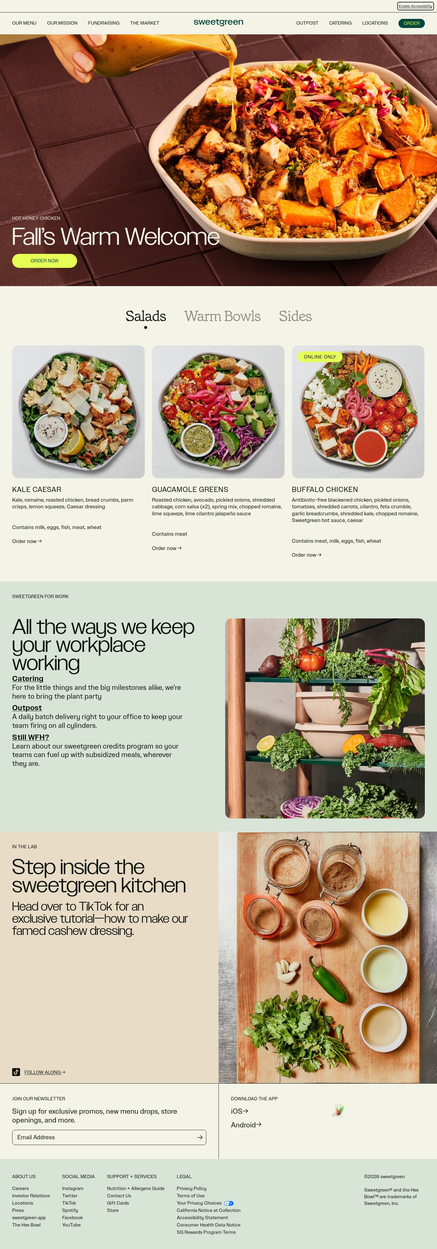
2. Look at every image in `design/sweetgreen.com-design-pack/screenshots/` and match the composition, density, whitespace and image treatment. Tokens do not carry those; the screenshots do.
3. Style everything with `design/sweetgreen.com-design-pack/tokens.css` (or `tailwind.css` if this project uses Tailwind v4). Do not invent colours, radii, shadows or font sizes that are not in the pack.
4. Load the fonts named in DESIGN.md. Where a font is not freely available, use the stand-in it names at the same sizes and weights.
5. Match the breakpoints and hover, focus and motion rules in BEHAVIOR.md. The site has no dark mode, so do not add one.

Now build: [describe the page or app you want]

When you are done, compare the result with the screenshots at desktop and phone widths, fix the biggest visual difference first, and repeat.
Kolory
Tokeny: 5Komponenty
OrderOrder nowSaladsAdres e-mail
- przycisk primary
- tekst #e6ff55 na #00473c, r 9999px, h 30px, 16px/400
- przycisk secondary
- tekst #00473c na #e6ff55, r 9999px, h 46px, 16px/400
- przycisk ghost
- tekst #0e150e na przezroczysty na #f4f3e7, r 4px, h 48px, 48px/200
- pole
- h 50px, 1px solid #0e150e, r 10px
- link
- #0e150e, underline, 400
- nagłówek
- 72px, sticky, linki: 9 po 16px
- h1
- 16px / 400, wyrównanie: start, maks. 162px
- formularze
- 1 forms, 8 inputs. Required markers: 1. Help texts: 0. Submit button is content-width. Label placement: above (1).
- ikony
- Icons: 2 inline SVGs, filled, sizes 26px.
Interakcje i animacje
- button primary "Order": background #00473c → transparent, text #e6ff55 → #0e150e, border transparent → #0e150e
- button secondary "Order now": background #e6ff55 → #00473c, text #00473c → #f4f3e7, border transparent → #00473c, icon/inner colour → #f4f3e7
- nav link "Our Menu": underline appears
- focus button primary: border → #0e150e3b
- tooltipy: Tooltip triggers exist (6 × title) but none opened on hover in the first viewport; title attributes fall back to the browser's native tooltip.
- menu: 3 aria-haspopup triggers exist; none opened on hover (click-to-open menus).
- animacje: 112 elements carry transitions; typical 0.3s with ease-in-out, mostly on color, all, transform. 1 running keyframe animations (onetrust-fade-in 0.4s 1). No scroll-reveal: content is visible without scrolling into view.
Typografia
Czcionki: 1SweetSansTextwłasny hosting, zamiennik Inter
headline-displayQuick brown fox16px / 400 / lh 1
headline-lgQuick brown fox24px / 400 / lh 1.2
headline-mdQuick brown fox24px / 600 / lh 1.4
body-mdThe quick brown fox jumps over the lazy dog18px / 400 / lh 1.25
label-mdThe quick brown fox jumps over the lazy dog24px / 400 / lh 1.2
buttonThe quick brown fox jumps over the lazy dog16px / 400 / lh 1
Używane rozmiary
1618244870
Odstępy
jednostka 4px- Szerokość treści
- 1360px
- Breakpointy
- 481, 769, 1024, 1279, 1280px
Zaokrąglenia
przycisk 9999pxpole 10pxkarta 0pxobraz 0px
Cienie
0Płasko: brak używanych cieni.
Motyw
No dark mode responded to prefers-color-scheme, a theme toggle, or a root class/attribute.
Responsywność
1440 / 1024 / 768 / 390 px| Viewport | Treść | Marginesy | Tekst | H1 | Nagłówek | Hero | Siatki | Przyciski |
|---|---|---|---|---|---|---|---|---|
| desktop 1440 | 437px | 40px | 16px | 16px, 2 lines, start | 72px, 9 links, 1 CTA | media behind/overlapping text | 3→3 col; 2→2 col; 2→2 col | content-width |
| laptop 1024 | 944px | 40px | 16px | 16px, 2 lines, start | 72px, 2 links | media behind/overlapping text | 3→3 col; 2→1 col; 2→2 col | content-width |
| tablet 768 | 688px | 40px | 16px | 16px, 2 lines, start | 48px, 2 links | media behind/overlapping text | 3→3 col; 2→1 col; 2→1 col | content-width |
| phone 390 | 358px | 16px | 16px | 16px, 2 lines, start | 48px, 2 links | media behind/overlapping text | 5→1 col | content-width |
- H1 goes 16px → 16px (100%), 2 → 2 lines.
- Nav never collapses to a hamburger (2 links still visible at 390px).
- Body text stays 16px at every width.
- Phone side gutter 16px.
- Section top padding 60px → 16px.
Pliki w pakiecie
Pliki: 14DESIGN.mdWiersze: 218
---
version: alpha
name: "sweetgreen.com"
description: "Design system extracted from https://www.sweetgreen.com/ on 2026-09-28"
colors:
  background: "#d8e5d6"
  surface: "#f4f3e7"
  foreground: "#0e150e"
  muted-foreground: "#f4f3e7"
  border: "#0e150e"
typography:
  headline-display:
    fontFamily: "SweetSansText"
    fontSize: "16px"
    fontWeight: 400
    lineHeight: "1"
  headline-lg:
    fontFamily: "SweetSansText"
    fontSize: "24px"
    fontWeight: 400
    lineHeight: "1.2"
  headline-md:
    fontFamily: "SweetSansText"
    fontSize: "24px"
    fontWeight: 600
    lineHeight: "1.4"
  body-md:
    fontFamily: "SweetSansText"
    fontSize: "18px"
    fontWeight: 400
    lineHeight: "1.25"
  label-md:
    fontFamily: "SweetSansText"
    fontSize: "24px"
    fontWeight: 400
    lineHeight: "1.2"
  button:
    fontFamily: "SweetSansText"
    fontSize: "16px"
    fontWeight: 400
    lineHeight: "1"
rounded:
  none: "0px"
  full: "9999px"
  lg: "10px"
  xl: "20px"
  sm: "4px"
  md: "8px"
spacing:
  unit: "4px"
  1: "4px"
  2: "8px"
  3: "12px"
  4: "16px"
  5: "20px"
  6: "24px"
  7: "32px"
  8: "40px"
  9: "44px"
  10: "60px"
components:
  button-primary:
    backgroundColor: "#00473c"
    textColor: "#e6ff55"
    typography: "{typography.button}"
    rounded: "9999px"
    height: "30px"
    padding: "7px 16px"
  button-secondary:
    backgroundColor: "#e6ff55"
    textColor: "#00473c"
    typography: "{typography.button}"
    rounded: "9999px"
    height: "46px"
    padding: "15px 60px"
  button-ghost:
    backgroundColor: "#f4f3e7"
    textColor: "#0e150e"
    typography: "{typography.button}"
    rounded: "4px"
    height: "48px"
    padding: "0px 0px"
  input:
    backgroundColor: "transparent"
    rounded: "10px"
    height: "50px"
---

# sweetgreen.com

## Overview

sweetgreen | Inspiring healthier communities: healthy salads, hearty wraps, grain bowls, and warm plates made in-house from scratch, using whole produce delivered that morning.

Pill-shaped controls, flat surfaces separated by hairlines, restrained display type at 16px / 400, a monochrome palette. The site ships in light mode by default. Measured from 589 rendered elements at 1440px wide on 2026-09-28.

Reference screenshots live beside this file; look at them before writing any layout, they carry the composition, density and image treatment that tokens cannot:

- `screenshots/desktop-1440-fold.png`: Desktop 1440, above the fold
- `screenshots/desktop-1440-full.jpg`: Desktop 1440, full page
- `screenshots/laptop-1024-fold.png`: Laptop 1024, above the fold
- `screenshots/tablet-768-fold.png`: Tablet 768, above the fold
- `screenshots/phone-390-fold.png`: Phone 390, above the fold
- `screenshots/phone-390-full.jpg`: Phone 390, full page

## Colors

| Token | Value | Use |
| --- | --- | --- |
| background | `#d8e5d6` | Page background |
| surface | `#f4f3e7` | Cards, panels, raised or recessed surfaces |
| foreground | `#0e150e` | Primary text |
| muted-foreground | `#f4f3e7` | Secondary text, captions |
| border | `#0e150e` | Hairlines, dividers, input borders |

Full painted palette by area (largest first): `#d8e5d6`, `#f4f3e7`, `#e6ff55`, `#00473c`.

## Typography

- **SweetSansText** for h1, h2, body, label, button: self-hosted webfont, not freely available; use **Inter** from Google Fonts as the stand-in.

| Role | Family | Size | Weight | Line height | Tracking |
| --- | --- | --- | --- | --- | --- |
| headline-display | SweetSansText | 16px | 400 | 1 | normal |
| headline-lg | SweetSansText | 24px | 400 | 1.2 | normal |
| headline-md | SweetSansText | 24px | 600 | 1.4 | normal |
| body-md | SweetSansText | 18px | 400 | 1.25 | normal |
| label-md | SweetSansText | 24px | 400 | 1.2 | normal |
| button | SweetSansText | 16px | 400 | 1 | normal |

Type scale in use: 16px, 18px, 24px, 48px, 70px. Base body size 18px.

The H1 renders at 16px / 400, start aligned, up to 162px wide. Sample: "sweetgreen".

## Layout

- Spacing unit: 4px. Scale in use: 4, 8, 12, 16, 20, 24, 32, 40, 44, 60 (px).
- Flex and grid gaps: 4, 8, 12, 24, 36, 40, 44 px.
- Content max width: 1360px, centred.
- Breakpoints: 481px, 769px, 1024px, 1279px, 1280px.
- Header: 72px tall, sticky, background `rgb(244, 243, 231)`; 9 nav links at 16px / 400 (Our Menu · Our Mission · Fundraising · The Market · sweetgreen · Outpost · Catering · Locations).

## Elevation & Depth

No box shadows in use; depth comes from hairline borders and surface tints (flat design).

## Shapes

- Buttons: 9999px
- Inputs: 10px
- Cards and panels: 0px
- Images and media: 0px
- Radius scale: none 0px, full 9999px, lg 10px, xl 20px, sm 4px, md 8px

## Components

### Button, primary

Background `#00473c`, text `#e6ff55`, border 1px solid transparent, radius 9999px, height 30px, padding 7px 16px, 16px / 400, uppercase. Sample label: "Order".

### Button, secondary

Background `#e6ff55`, text `#00473c`, border 1px solid transparent, radius 9999px, height 46px, padding 15px 60px, 16px / 400, uppercase. Sample label: "Order now".

### Button, ghost

Background transparent (it sits on `#f4f3e7`, so place it on that colour), text `#0e150e`, border none, radius 4px, height 48px, padding 0px 0px, 48px / 200, capitalize. Sample label: "Salads".

### Input

Height 50px, background `transparent`, border 1px solid #0e150e, radius 10px, 20px text, padding 12px 50px.

### Link

Colour `#0e150e`, underline, weight 400.

## Dark Mode

No dark mode responded to prefers-color-scheme, a theme toggle, or a root class/attribute.

## Responsive Behavior

| Viewport | Content width | Gutter | Body | H1 | Header | Hero | Grids | Buttons |
| --- | --- | --- | --- | --- | --- | --- | --- | --- |
| desktop 1440px | 437px | 40px | 16px | 16px, 2 lines, start | 72px, 9 links, 1 CTA | media behind/overlapping text | 3→3 col; 2→2 col; 2→2 col | content-width |
| laptop 1024px | 944px | 40px | 16px | 16px, 2 lines, start | 72px, 2 links | media behind/overlapping text | 3→3 col; 2→1 col; 2→2 col | content-width |
| tablet 768px | 688px | 40px | 16px | 16px, 2 lines, start | 48px, 2 links | media behind/overlapping text | 3→3 col; 2→1 col; 2→1 col | content-width |
| phone 390px | 358px | 16px | 16px | 16px, 2 lines, start | 48px, 2 links | media behind/overlapping text | 5→1 col | content-width |

- H1 goes 16px → 16px (100%), 2 → 2 lines.
- Nav never collapses to a hamburger (2 links still visible at 390px).
- Body text stays 16px at every width.
- Phone side gutter 16px.
- Section top padding 60px → 16px.

## Interaction & Motion

112 elements carry transitions; typical 0.3s with ease-in-out, mostly on color, all, transform. 1 running keyframe animations (onetrust-fade-in 0.4s 1).

- Hover on button-primary ("Order"): background #00473c → transparent, text #e6ff55 → #0e150e, border transparent → #0e150e; cursor pointer; transition all | 0.3s | ease-in-out.
- Hover on button-secondary ("Order now"): background #e6ff55 → #00473c, text #00473c → #f4f3e7, border transparent → #00473c, icon/inner colour → #f4f3e7; cursor pointer; transition all | 0.3s | ease-in-out.
- Hover on nav-link ("Our Menu"): underline appears; cursor pointer; transition color | 0.3s | ease-in-out.
- Focus on button-primary: border → #0e150e3b.
- Tooltip triggers exist (6 × title) but none opened on hover in the first viewport; title attributes fall back to the browser's native tooltip.
- 3 aria-haspopup triggers exist; none opened on hover (click-to-open menus).
- No scroll-reveal: content is visible without scrolling into view.

Full detail (every overlay, table, form, scroll and text rule measured) is in `BEHAVIOR.md`; raw evidence in `evidence.json`.

## Do's and Don'ts

- Do use 4px multiples for every padding, margin and gap; the site does not use odd values.
- Do keep body text at 18px in SweetSansText.
- Do match corner radii per element class (buttons 9999px, cards 0px); do not pick one radius for everything.
- Don't add drop shadows; this design is flat.
- Don't substitute a different accent hue or introduce gradients that are not listed above.
- Don't rebuild from the tokens alone; open the screenshots for composition, density and image treatment.