booking.com tasarım sistemi
Booking.com | Official site | The best hotels, flights, car rentals & accommodations
SeyahatAçık2.834 öğe ölçüldü, 4 saat önce ölçüldü
booking.com, yazı tipi olarak Avenir Next, BlinkMacSystemFont, vurgu rengi olarak #003b95 kullanıyor.Ölçüm tarihi: 28 Eylül 2026.
Site önizlemesi
1440 pxYapay zekanızla kullanın
zip içinde ayrıca README.md ve PROMPT.md olarak da var- .
- Zip dosyasını projenize açın, klasör
design/booking.com-design-pack/konumunda dursun. - İsteğe bağlı: klasörü ayrıca
.claude/skills/booking-com-design/konumuna kopyalayın. İçindeki SKILL.md sayesinde Claude Code, UI kurarken paketi kendiliğinden yükler. - Aşağıdaki prompt’u Claude Code içine yapıştırın ve ne yapılmasını istediğinizi yazın.
Prompt
Prompt İngilizce kalır: paketteki dosyaları adlarıyla anar ve yapay zekanız onu her dilde okuyabilir.
Use the design pack in `design/booking.com-design-pack/` as the source of truth for how the UI looks and behaves. It was measured from https://www.booking.com/?chal_t=1790634201850&force_referer=.

1. Read DESIGN.md (colours, type, spacing, radii, shadows, components) and BEHAVIOR.md (hover, focus, tooltips, menus, motion, scrolling, forms, responsive rules) before writing any code.
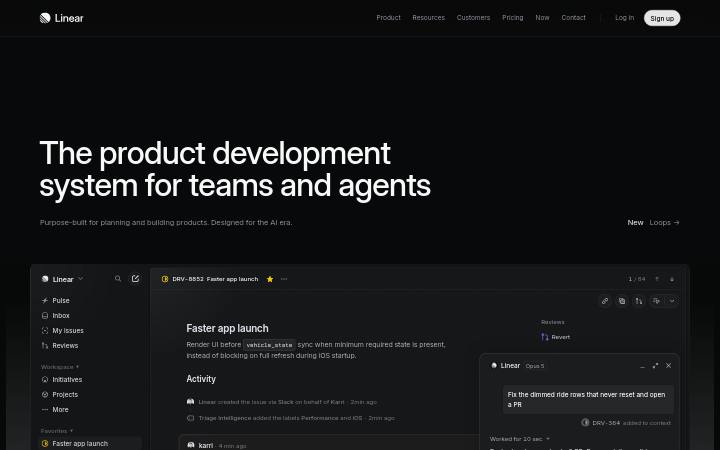
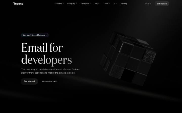
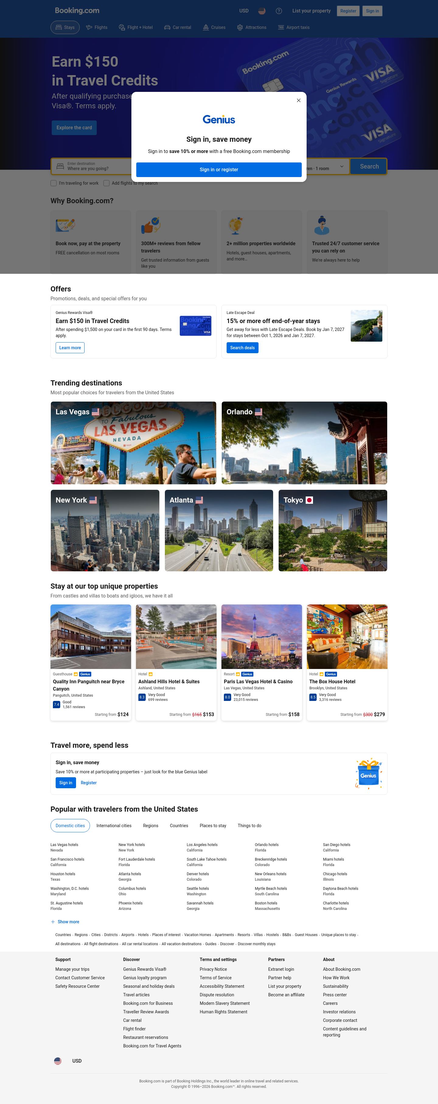
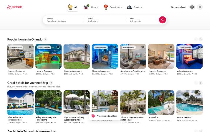
2. Look at every image in `design/booking.com-design-pack/screenshots/` and match the composition, density, whitespace and image treatment. Tokens do not carry those; the screenshots do.
3. Style everything with `design/booking.com-design-pack/tokens.css` (or `tailwind.css` if this project uses Tailwind v4). Do not invent colours, radii, shadows or font sizes that are not in the pack.
4. Load the fonts named in DESIGN.md. Where a font is not freely available, use the stand-in it names at the same sizes and weights.
5. Match the breakpoints and hover, focus and motion rules in BEHAVIOR.md. The site has no dark mode, so do not add one.

Now build: [describe the page or app you want]

When you are done, compare the result with the screenshots at desktop and phone widths, fix the biggest visual difference first, and repeat.
Renkler
8 tokenBileşenler
USDRegister
- düğme ghost
- #003b95 üzerinde saydam üzerinde #ffffff metin, r 4px, h 48px, 16px/500
- düğme secondary
- #ffffff üzerinde #006ce4 metin, r 4px, h 36px, 14px/500
- kart
- transparent, none, r 8px, gölge
- bağlantı
- #ffffff, alt çizgi yok, 500
- üst bilgi
- 124px, static, 14px boyutunda 12 bağlantı
- h1
- 24px / 700, start hizalı, maks. 600px
- ayırıcı
- Divider 1px #1a1a1a, margin 0px
- formlar
- 1 forms, 3 inputs. Required markers: 0. Help texts: 0. Submit button is content-width. Label placement: above (1).
- ikonlar
- Icons: 55 inline SVGs, filled, sizes 16px/14px/20px/40px.
Etkileşim ve animasyon
- button primary "Register": hover değişikliği yok
- button secondary "Stays": hover değişikliği yok
- nav link "List your property": hover değişikliği yok
- body link "Explore the card": hover değişikliği yok
- input: hover değişikliği yok
- focus button primary: element did not take focus
- focus body link: element did not take focus
- focus input: element did not take focus
- tooltip’ler: Tooltip triggers exist (1 × aria-describedby, 214 × title) but none opened on hover in the first viewport; title attributes fall back to the browser's native tooltip.
- menüler: 12 aria-haspopup triggers exist; none opened on hover (click-to-open menus).
- animasyon: 56 elements carry transitions; typical 0.12s with cubic-bezier(0.2, 0, 0.4, 0.8), mostly on transform, background-color, border-color. 1 running keyframe animations (onetrust-fade-in 0.4s 1). No scroll-reveal: content is visible without scrolling into view.
Tipografi
2 font ailesiAvenir Nextmuadil NunitoBlinkMacSystemFontsistem
headline-displayQuick brown fox24px / 700 / lh 1.33
headline-lgQuick brown fox24px / 700 / lh 1.33
headline-mdQuick brown fox16px / 700 / lh 1.5
body-mdThe quick brown fox jumps over the lazy dog14px / 400 / lh 1.43
label-mdThe quick brown fox jumps over the lazy dog12px / 400 / lh 1.17
buttonThe quick brown fox jumps over the lazy dog14px / 500 / lh 1.43
Kullanılan boyutlar
1214162024
Boşluk
4px birim- İçerik genişliği
- 1108px
- Kırılma noktaları
- 550, 575, 576, 1024, 1280px
Köşe yarıçapı
düğme 4pxgirdi 4pxkart 8pxgörsel 0px
Gölgeler
11
Tema
No dark mode responded to prefers-color-scheme, a theme toggle, or a root class/attribute.
Responsive
1440 / 1024 / 768 / 390 px| Viewport | İçerik | Kenar boşluğu | Gövde | H1 | Üst bilgi | Hero | Izgaralar | Düğmeler |
|---|---|---|---|---|---|---|---|---|
| desktop 1440 | 1108px | 170px | 14px | 24px, 4 lines, start | 124px, 10 links, 2 CTA | media behind/overlapping text | 5→1 col; 2→1 col; 2→2 col | content-width |
| laptop 1024 | 992px | 5px | 14px | 24px, 4 lines, start | 124px, 10 links, 2 CTA | media behind/overlapping text | 2→2 col; 2→2 col; 2→2 col | content-width |
| tablet 768 | 736px | 5px | 14px | 24px, 4 lines, start | 116px, hamburger (Menu) | media behind/overlapping text | 2→2 col; 2→2 col; 2→2 col | 3 full-width |
| phone 390 | 358px | 5px | 14px | 24px, 3 lines, start | 116px, hamburger (Menu) | media behind/overlapping text | 2→2 col; 2→2 col; 2→2 col | 6 full-width |
- H1 goes 24px → 24px (100%), 4 → 3 lines.
- Nav collapses to a hamburger by 390px (first seen at 768px); header 124px → 116px.
- Card grids: 3 columns → 3 columns on phones (gap normal → normal).
- Body text stays 14px at every width.
- Phone side gutter 5px.
- 6 buttons stretch full-width on phones.
Paketteki dosyalar
14 dosyaDESIGN.md219 satır
---
version: alpha
name: "booking.com"
description: "Design system extracted from https://www.booking.com/?chal_t=1790634201850&force_referer= on 2026-09-28"
colors:
  background: "#ffffff"
  surface: "#e7e7e7"
  foreground: "#1a1a1a"
  muted-foreground: "#595959"
  primary: "#003b95"
  on-primary: "#ffffff"
  secondary: "#ffb700"
  border: "#e7e7e7"
typography:
  headline-display:
    fontFamily: "Avenir Next"
    fontSize: "24px"
    fontWeight: 700
    lineHeight: "1.33"
  headline-lg:
    fontFamily: "Avenir Next"
    fontSize: "24px"
    fontWeight: 700
    lineHeight: "1.33"
  headline-md:
    fontFamily: "BlinkMacSystemFont"
    fontSize: "16px"
    fontWeight: 700
    lineHeight: "1.5"
  body-md:
    fontFamily: "BlinkMacSystemFont"
    fontSize: "14px"
    fontWeight: 400
    lineHeight: "1.43"
  label-md:
    fontFamily: "BlinkMacSystemFont"
    fontSize: "12px"
    fontWeight: 400
    lineHeight: "1.17"
  button:
    fontFamily: "BlinkMacSystemFont"
    fontSize: "14px"
    fontWeight: 500
    lineHeight: "1.43"
rounded:
  none: "0px"
  sm: "4px"
  md: "8px"
  full: "9999px"
spacing:
  unit: "4px"
  1: "4px"
  2: "8px"
  3: "12px"
  4: "16px"
  5: "24px"
components:
  button-ghost:
    backgroundColor: "#003b95"
    textColor: "#ffffff"
    typography: "{typography.button}"
    rounded: "4px"
    height: "48px"
    padding: "8px 12px"
  button-secondary:
    backgroundColor: "#ffffff"
    textColor: "#006ce4"
    typography: "{typography.button}"
    rounded: "4px"
    height: "36px"
    padding: "4px 12px"
  card:
    backgroundColor: "transparent"
    rounded: "8px"
    padding: "0px"
---

# booking.com

## Overview

Booking.com | Official site | The best hotels, flights, car rentals & accommodations: Explore the world with Booking.com. Big savings on homes, hotels, flights, car rentals, taxis, and attractions – build your perfect trip on any budget.

Sharp, squared-off controls, one soft shadow for depth, restrained display type at 24px / 700, a single blue accent on neutrals. The site ships in light mode by default. Measured from 2834 rendered elements at 1440px wide on 2026-09-28.

Reference screenshots live beside this file; look at them before writing any layout, they carry the composition, density and image treatment that tokens cannot:

- `screenshots/desktop-1440-fold.png`: Desktop 1440, above the fold
- `screenshots/desktop-1440-full.jpg`: Desktop 1440, full page
- `screenshots/laptop-1024-fold.png`: Laptop 1024, above the fold
- `screenshots/tablet-768-fold.png`: Tablet 768, above the fold
- `screenshots/phone-390-fold.png`: Phone 390, above the fold
- `screenshots/phone-390-full.jpg`: Phone 390, full page

## Colors

| Token | Value | Use |
| --- | --- | --- |
| background | `#ffffff` | Page background |
| surface | `#e7e7e7` | Cards, panels, raised or recessed surfaces |
| foreground | `#1a1a1a` | Primary text |
| muted-foreground | `#595959` | Secondary text, captions |
| primary | `#003b95` | Accent: primary buttons, links, focus |
| on-primary | `#ffffff` | Text on the accent |
| secondary | `#ffb700` | Secondary accent (yellow) |
| border | `#e7e7e7` | Hairlines, dividers, input borders |

Full painted palette by area (largest first): `#ffffff`, `#767676`, `#000000`, `#003b95`, `#ffb700`, `#595959`, `#e7e7e7`.

Gradients in use: `linear-gradient(90deg, rgb(0, 0, 0) 0px, rgba(0, 0, 0, 0) 11.5%), linear-gradient(270deg, rgb(0, 0, 0) 0px, rgba(0, 0, 0, 0) 11.5%)`; `linear-gradient(0deg, rgba(0, 0, 0, 0.44) 0%, rgba(0, 0, 0, 0.51) 13.81%, rgba(0, 0, 0, 0.58) 28.27%, rgba(0, 0, 0, 0.65) 42.12%, rgba(0, 0, 0, 0.7) 56.28%, rgb`.

The accent `#003b95` is used sparingly: primary buttons, links and focus rings. Everything else stays neutral.

## Typography

- **Avenir Next** for h1, h2: unknown source; use **Nunito** as the stand-in if it does not load.
- **BlinkMacSystemFont** for h3, body, label, button: system font stack.

| Role | Family | Size | Weight | Line height | Tracking |
| --- | --- | --- | --- | --- | --- |
| headline-display | Avenir Next | 24px | 700 | 1.33 | normal |
| headline-lg | Avenir Next | 24px | 700 | 1.33 | normal |
| headline-md | BlinkMacSystemFont | 16px | 700 | 1.5 | normal |
| body-md | BlinkMacSystemFont | 14px | 400 | 1.43 | normal |
| label-md | BlinkMacSystemFont | 12px | 400 | 1.17 | normal |
| button | BlinkMacSystemFont | 14px | 500 | 1.43 | normal |

Type scale in use: 12px, 14px, 16px, 20px, 24px. Base body size 14px.

The H1 renders at 24px / 700, start aligned, up to 600px wide. Sample: "Earn $150in Travel Credits".

## Layout

- Spacing unit: 4px. Scale in use: 4, 8, 12, 16, 24 (px).
- Flex and grid gaps: 4, 8, 12, 16, 24, 32 px.
- Content max width: 1108px, centred.
- Breakpoints: 550px, 575px, 576px, 1024px, 1280px.
- Header: 124px tall, static, background `rgb(0, 59, 149)`; 12 nav links at 14px / 500 (List your property · Register · Sign in · Stays · Flights · Flight + Hotel · Car rental · Cruises).

## Elevation & Depth

Shadows in use, most common first:

- shadow-1: `rgba(26, 26, 26, 0.16) 0px 2px 8px 0px`

## Shapes

- Buttons: 4px
- Inputs: 4px
- Cards and panels: 8px
- Images and media: 0px
- Radius scale: none 0px, sm 4px, md 8px, full 9999px

## Components

### Button, ghost

Background transparent (it sits on `#003b95`, so place it on that colour), text `#ffffff`, border none, radius 4px, height 48px, padding 8px 12px, 16px / 500. Sample label: "USD".

### Button, secondary

Background `#ffffff`, text `#006ce4`, border none, radius 4px, height 36px, padding 4px 12px, 14px / 500. Sample label: "Register".

### Card

Background `transparent`, border none, radius 8px, padding 0px, shadow `rgba(26, 26, 26, 0.16) 0px 2px 8px 0px`. Typical size about 265×382px.

### Link

Colour `#ffffff`, no underline at rest, weight 500.

## Dark Mode

No dark mode responded to prefers-color-scheme, a theme toggle, or a root class/attribute.

## Responsive Behavior

| Viewport | Content width | Gutter | Body | H1 | Header | Hero | Grids | Buttons |
| --- | --- | --- | --- | --- | --- | --- | --- | --- |
| desktop 1440px | 1108px | 170px | 14px | 24px, 4 lines, start | 124px, 10 links, 2 CTA | media behind/overlapping text | 5→1 col; 2→1 col; 2→2 col | content-width |
| laptop 1024px | 992px | 5px | 14px | 24px, 4 lines, start | 124px, 10 links, 2 CTA | media behind/overlapping text | 2→2 col; 2→2 col; 2→2 col | content-width |
| tablet 768px | 736px | 5px | 14px | 24px, 4 lines, start | 116px, hamburger (Menu) | media behind/overlapping text | 2→2 col; 2→2 col; 2→2 col | 3 full-width |
| phone 390px | 358px | 5px | 14px | 24px, 3 lines, start | 116px, hamburger (Menu) | media behind/overlapping text | 2→2 col; 2→2 col; 2→2 col | 6 full-width |

- H1 goes 24px → 24px (100%), 4 → 3 lines.
- Nav collapses to a hamburger by 390px (first seen at 768px); header 124px → 116px.
- Card grids: 3 columns → 3 columns on phones (gap normal → normal).
- Body text stays 14px at every width.
- Phone side gutter 5px.
- 6 buttons stretch full-width on phones.

## Interaction & Motion

56 elements carry transitions; typical 0.12s with cubic-bezier(0.2, 0, 0.4, 0.8), mostly on transform, background-color, border-color. 1 running keyframe animations (onetrust-fade-in 0.4s 1).

- Hover on button-primary ("Register"): no visible change; cursor pointer; transition transform | 0.12s | cubic-bezier(0.2, 0, 0.4, 0.8).
- Hover on button-secondary ("Stays"): no visible change; cursor pointer; transition border-color, background-color | 0.12s | cubic-bezier(0.2, 0, 0.4, 0.8).
- Hover on nav-link ("List your property"): no visible change; cursor pointer; transition transform | 0.12s | cubic-bezier(0.2, 0, 0.4, 0.8).
- Hover on body-link ("Explore the card"): no visible change; cursor pointer; transition transform | 0.12s | cubic-bezier(0.2, 0, 0.4, 0.8).
- Hover on input: no visible change; cursor text.
- Focus on button-primary: element did not take focus.
- Focus on body-link: element did not take focus.
- Focus on input: element did not take focus.
- Tooltip triggers exist (1 × aria-describedby, 214 × title) but none opened on hover in the first viewport; title attributes fall back to the browser's native tooltip.
- 12 aria-haspopup triggers exist; none opened on hover (click-to-open menus).
- No scroll-reveal: content is visible without scrolling into view.

Full detail (every overlay, table, form, scroll and text rule measured) is in `BEHAVIOR.md`; raw evidence in `evidence.json`.

## Do's and Don'ts

- Do use 4px multiples for every padding, margin and gap; the site does not use odd values.
- Do reserve `#003b95` for actions and focus; never paint large areas with it.
- Do keep body text at 14px in BlinkMacSystemFont and headings in Avenir Next.
- Do match corner radii per element class (buttons 4px, cards 8px); do not pick one radius for everything.
- Do use the measured shadows above; do not invent heavier ones.
- Don't substitute a different accent hue or introduce gradients that are not listed above.
- Don't rebuild from the tokens alone; open the screenshots for composition, density and image treatment.