tesla.com tasarım sistemi
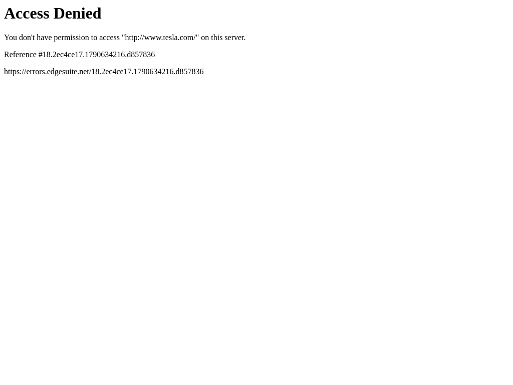
Access Denied
tesla.com, yazı tipi olarak Times New Roman kullanıyor. Ölçüm tarihi: 28 Eylül 2026.
Yapay zekanızla kullanınzip içinde ayrıca README.md ve PROMPT.md olarak da var
- .
- Zip dosyasını projenize açın, klasör
design/tesla.com-design-pack/konumunda dursun. - İsteğe bağlı: klasörü ayrıca
.claude/skills/tesla-com-design/konumuna kopyalayın. İçindeki SKILL.md sayesinde Claude Code, UI kurarken paketi kendiliğinden yükler. - Aşağıdaki prompt’u Claude Code içine yapıştırın ve ne yapılmasını istediğinizi yazın.
Prompt
Prompt İngilizce kalır: paketteki dosyaları adlarıyla anar ve yapay zekanız onu her dilde okuyabilir.
Use the design pack in `design/tesla.com-design-pack/` as the source of truth for how the UI looks and behaves. It was measured from https://www.tesla.com/.

1. Read DESIGN.md (colours, type, spacing, radii, shadows, components) and BEHAVIOR.md (hover, focus, tooltips, menus, motion, scrolling, forms, responsive rules) before writing any code.
2. Look at every image in `design/tesla.com-design-pack/screenshots/` and match the composition, density, whitespace and image treatment. Tokens do not carry those; the screenshots do.
3. Style everything with `design/tesla.com-design-pack/tokens.css` (or `tailwind.css` if this project uses Tailwind v4). Do not invent colours, radii, shadows or font sizes that are not in the pack.
4. Load the fonts named in DESIGN.md. Where a font is not freely available, use the stand-in it names at the same sizes and weights.
5. Match the breakpoints and hover, focus and motion rules in BEHAVIOR.md. The site has no dark mode, so do not add one.

Now build: [describe the page or app you want]

When you are done, compare the result with the screenshots at desktop and phone widths, fix the biggest visual difference first, and repeat.Renkler2 token
background
#ffffff
foreground
#000000
Boşluk8px birim
- İçerik genişliği
- akışkan
Köşe yarıçapı
düğme 0pxgirdi 0pxkart 0pxgörsel 0px
Gölgeler0
Düz: kutu gölgesi kullanılmıyor.
Tipografi1 font ailesi
Times New Romansistem
headline-displayQuick brown fox32px / 700 / lh 1.4
headline-lgQuick brown fox32px / 600 / lh 1.4
headline-mdQuick brown fox24px / 600 / lh 1.4
body-mdThe quick brown fox jumps over the lazy dog16px / 400 / lh 1.4
label-mdThe quick brown fox jumps over the lazy dog13px / 500 / lh 1.4
buttonThe quick brown fox jumps over the lazy dog14px / 500 / lh 1.4
Kullanılan boyutlar
1632
Bileşenler
- h1
- 32px / 700, start hizalı, maks. 1424px
- formlar
- 0 forms, 0 inputs. Required markers: 0. Help texts: 0. Label placement: no labelled inputs.
- ikonlar
- No icons detected.
Ekran görüntüleri1440 ve 390 genişlik
Etkileşim ve animasyon
- tooltip’ler: No tooltips: nothing on the page carries tooltip attributes or roles and no tooltip styles exist. Do not add tooltips when rebuilding.
- menüler: No dropdown menus found in the header.
- animasyon: No CSS transitions on rendered elements: state changes are instant. No scroll-reveal: content is visible without scrolling into view.
Tema
No dark mode responded to prefers-color-scheme, a theme toggle, or a root class/attribute.
Responsive1440 / 1024 / 768 / 390 px



| Viewport | İçerik | Kenar boşluğu | Gövde | H1 | Üst bilgi | Hero | Izgaralar | Düğmeler |
|---|---|---|---|---|---|---|---|---|
| desktop 1440 | fluid | 16px | 32px, 1 line, start | text only | content-width | |||
| laptop 1024 | fluid | 16px | 32px, 1 line, start | text only | content-width | |||
| tablet 768 | fluid | 16px | 32px, 1 line, start | text only | content-width | |||
| phone 390 | fluid | 16px | 32px, 1 line, start | text only | content-width |
- H1 goes 32px → 32px (100%), 1 → 1 lines.
- Body text stays 16px at every width.
- Horizontal overflow at 390px (the source has a responsive bug; do not copy it).
Paketteki dosyalar14 dosya
DESIGN.md
Google’ın DESIGN.md formatı; Stitch, Claude Code ve Cursor bunu okur
tokens.json
Style Dictionary ve Figma eklentileri için W3C Design Tokens (DTCG)
tokens.css
Aynı değerler CSS değişkenleri olarak
tailwind.css
Tailwind v4 @theme bloğu
SKILL.md
Paketi ajan için sıraya koyan Claude Code / Cursor skill’i
BEHAVIOR.md
Hover, focus, tooltip, menü, animasyon, kaydırma, tablo, form, metin, responsive, koyu mod, stack
evidence.json
İki belgenin arkasındaki ham ölçümler (her viewport, probe ve kural)
screenshots/
desktop-1440-fold.png, desktop-1440-full.jpg, laptop-1024-fold.png, tablet-768-fold.png, phone-390-fold.png, phone-390-full.jpg
DESIGN.md146 satır
---
version: alpha
name: "tesla.com"
description: "Design system extracted from https://www.tesla.com/ on 2026-09-28"
colors:
  background: "#ffffff"
  foreground: "#000000"
typography:
  headline-display:
    fontFamily: "Times New Roman"
    fontSize: "32px"
    fontWeight: 700
    lineHeight: "1.4"
  headline-lg:
    fontFamily: "Times New Roman"
    fontSize: "32px"
    fontWeight: 600
    lineHeight: "1.4"
  headline-md:
    fontFamily: "Times New Roman"
    fontSize: "24px"
    fontWeight: 600
    lineHeight: "1.4"
  body-md:
    fontFamily: "Times New Roman"
    fontSize: "16px"
    fontWeight: 400
    lineHeight: "1.4"
  label-md:
    fontFamily: "Times New Roman"
    fontSize: "13px"
    fontWeight: 500
    lineHeight: "1.4"
  button:
    fontFamily: "Times New Roman"
    fontSize: "14px"
    fontWeight: 500
    lineHeight: "1.4"
rounded:
  none: "0px"
  full: "9999px"
spacing:
  unit: "8px"
  1: "16px"
  2: "24px"
components:
---

# tesla.com

## Overview

Access Denied

Sharp, squared-off controls, flat surfaces separated by hairlines, restrained display type at 32px / 700, a monochrome palette. The site ships in light mode by default. Measured from 4 rendered elements at 1440px wide on 2026-09-28.

Reference screenshots live beside this file; look at them before writing any layout, they carry the composition, density and image treatment that tokens cannot:

- `screenshots/desktop-1440-fold.png`: Desktop 1440, above the fold
- `screenshots/desktop-1440-full.jpg`: Desktop 1440, full page
- `screenshots/laptop-1024-fold.png`: Laptop 1024, above the fold
- `screenshots/tablet-768-fold.png`: Tablet 768, above the fold
- `screenshots/phone-390-fold.png`: Phone 390, above the fold
- `screenshots/phone-390-full.jpg`: Phone 390, full page

## Colors

| Token | Value | Use |
| --- | --- | --- |
| background | `#ffffff` | Page background |
| foreground | `#000000` | Primary text |

Full painted palette by area (largest first): .

## Typography

- **Times New Roman** for h1, body: system font stack.

| Role | Family | Size | Weight | Line height | Tracking |
| --- | --- | --- | --- | --- | --- |
| headline-display | Times New Roman | 32px | 700 | 1.4 | normal |
| headline-lg | Times New Roman | 32px | 600 | 1.4 | normal |
| headline-md | Times New Roman | 24px | 600 | 1.4 | normal |
| body-md | Times New Roman | 16px | 400 | 1.4 | normal |
| label-md | Times New Roman | 13px | 500 | 1.4 | normal |
| button | Times New Roman | 14px | 500 | 1.4 | normal |

Type scale in use: 16px, 32px. Base body size 16px.

The H1 renders at 32px / 700, start aligned, up to 1424px wide. Sample: "Access Denied".

## Layout

- Spacing unit: 8px. Scale in use: 16, 24 (px).
- Content max width: not detected (fluid).

## Elevation & Depth

No box shadows in use; depth comes from hairline borders and surface tints (flat design).

## Shapes

- Buttons: 0px
- Inputs: 0px
- Cards and panels: 0px
- Images and media: 0px
- Radius scale: none 0px, full 9999px

## Components

## Dark Mode

No dark mode responded to prefers-color-scheme, a theme toggle, or a root class/attribute.

## Responsive Behavior

| Viewport | Content width | Gutter | Body | H1 | Header | Hero | Grids | Buttons |
| --- | --- | --- | --- | --- | --- | --- | --- | --- |
| desktop 1440px | fluid |  | 16px | 32px, 1 line, start |  | text only |  | content-width |
| laptop 1024px | fluid |  | 16px | 32px, 1 line, start |  | text only |  | content-width |
| tablet 768px | fluid |  | 16px | 32px, 1 line, start |  | text only |  | content-width |
| phone 390px | fluid |  | 16px | 32px, 1 line, start |  | text only |  | content-width |

- H1 goes 32px → 32px (100%), 1 → 1 lines.
- Body text stays 16px at every width.
- Horizontal overflow at 390px (the source has a responsive bug; do not copy it).

## Interaction & Motion

No CSS transitions on rendered elements: state changes are instant.

- No tooltips: nothing on the page carries tooltip attributes or roles and no tooltip styles exist. Do not add tooltips when rebuilding.
- No dropdown menus found in the header.
- No scroll-reveal: content is visible without scrolling into view.

Full detail (every overlay, table, form, scroll and text rule measured) is in `BEHAVIOR.md`; raw evidence in `evidence.json`.

## Do's and Don'ts

- Do use 8px multiples for every padding, margin and gap; the site does not use odd values.
- Do keep body text at 16px in Times New Roman.
- Do match corner radii per element class (buttons 0px, cards 0px); do not pick one radius for everything.
- Don't add drop shadows; this design is flat.
- Don't substitute a different accent hue or introduce gradients that are not listed above.
- Don't rebuild from the tokens alone; open the screenshots for composition, density and image treatment.