














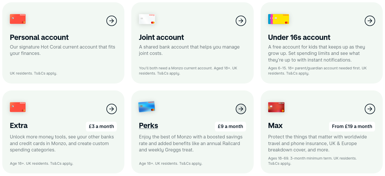
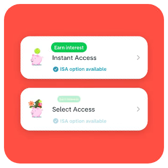

monzo.com design system
Monzo | Open a Free Account
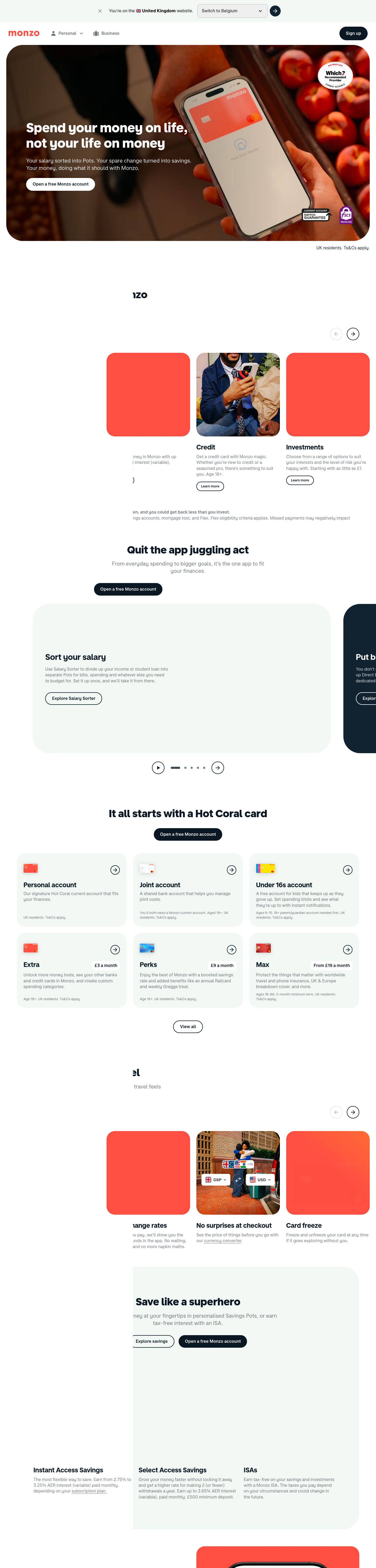
FintechLight2,836 elements measured, measured 3 hours ago
monzo.com uses MonzoSansDisplay, MonzoSansText for type and #091723 as its accent color.Measured September 29, 2026.
Website specimen
1440 pxUse it with your AI
- Unzip the pack into your project so the folder sits at
design/monzo.com-design-pack/. - Optional: also copy the folder to
.claude/skills/monzo-com-design/. The SKILL.md inside makes Claude Code load the pack by itself whenever it builds UI. - Paste the prompt below into Claude Code and fill in what you want built.
Prompt
Use the design pack in `design/monzo.com-design-pack/` as the visual reference for how the UI looks and behaves. It was extracted from https://monzo.com/; distinguish measurements from values explicitly marked as inferred or fallback.

1. Read START_HERE.md, tokens.css and BRAND.md first. Open the referenced logo/icon crops. Read DESIGN.md and BEHAVIOR.md when you need component or interaction detail; leave evidence.json out of the initial context.
2. Look at the desktop and phone fold images in `design/monzo.com-design-pack/screenshots/` and match the composition, density, whitespace and image treatment. If REGIONS.md is included, inspect its context, detail and icon crops, reconstruct outer/inner surfaces and group spacing, then check the full page again. Treat image/canvas internals as visual inferences, not measured DOM.
3. Start with `design/monzo.com-design-pack/tokens.css` (or `tailwind.css` if this project uses Tailwind v4). Preserve observed values. Resolve inferred roles and fallback values against the screenshots; follow measured component recipes before turning a candidate accent into a filled button. Adapt unmeasured details to the requested content.
4. If included, read FONTS.md and load fonts.css before tokens.css; older packs have font notes in DESIGN.md. Preserve exact weights and variable-font settings, and verify the actual Rendered Fonts. If the source font is unavailable, explicitly name the substitute and compare its width and apparent weight before adjusting the type scale.
5. Match the breakpoints and hover, focus and motion rules in BEHAVIOR.md. No alternate theme was verified; use the observed theme unless another is requested.

Now build: [describe the page or app you want]

When you are done, compare the result with the screenshots at desktop and phone widths, fix the biggest visual difference first, and repeat.
Colors
7 tokensComponents
Confirm Selected CountrySign upOpen a free Monzo accounEmail address
- button ghost
- #000000 text on transparent over #f2f8f3, r 0px, h 42px, 0px/400
- button primary
- #ffffff text on #091723, r 500px, h 51px, 16px/600
- button secondary
- #091723 text on #ffffff, r 500px, h 48px, 16px/600
- input
- h 52px, 1px solid #b2b2b2, r 10px
- link
- #0000ee, underline, 400
- header
- 87px, sticky, 4 links at 16px
- hero heading
- 48.8288px / 800, start aligned, max 620px
- forms
- 2 forms, 6 inputs. Required markers: 0. Help texts: 1. Submit button is content-width. Label placement: above (1).
- icons
- Icons: 32 inline SVGs, filled/mixed; inspect brand references, sizes 24px/56px/55px/42px.
Interaction and motion
- button primary "Sign up": background #091723 → #2c3a43, border #091723 → #2c3a43
- button secondary "Open a free Monzo account": background #ffffff → #ffffffcc, border #ffffff → #ffffffcc
- nav link "Business": text #09172399 → #091723, border #09172399 → #091723, icon/inner colour → #091723
- focus button primary: outline 1px solid rgb(33, 143, 183), offset 2px
- tooltips: No tooltip could be triggered from the first viewport, but the stylesheet defines tooltip rules (.Tooltip_Tooltip__6n9nm): position: relative.
- menus: Hover/click menus: below the trigger, 24px gap, shifted right; #ffffff, radius 0px, padding 48px 48px, shadow none; 6 items, 107px tall, 16px, padding 16px 16px, 2 columns; appears after a delay; stays open after the pointer leaves (click-away or hover-intent grace).
- motion: 226 elements carry transitions; typical 0.3s with cubic-bezier(0.22, 0, 0.12, 1), mostly on background-color, opacity, transform. 1 running keyframe animations (RevealInView_reveal__AqI33 1s 1). 18 sizable elements sit at opacity 0 before scrolling: scroll-reveal animations are in use (reveal on enter, fade + rise is the usual recipe).
Typography
2 familiesMonzoSansDisplayself-hosted, stand-in InterMonzoSansTextself-hosted, stand-in Inter
headline-displayQuick brown fox48.8288px / 800 / lh 58.5946px
headline-lgQuick brown fox39.0624px / 800 / lh 46.8749px
headline-mdQuick brown fox25px / 700 / lh 35px
body-mdThe quick brown fox jumps over the lazy dog16px / 400 / lh 22.4px
label-mdThe quick brown fox jumps over the lazy dog12.8px / 400 / lh 17.92px
buttonThe quick brown fox jumps over the lazy dog16px / 400 / lh 22.4px
Sizes in use
1316202531394449
Spacing
8px unit- Content width
- 1392px
- Breakpoints
- 481, 769, 820, 1041, 1440px
Radius
button 500pxinput 10pxcard 0pximage 0px
Shadows
11
Theme
No dark mode responded to prefers-color-scheme, a theme toggle, or a root class/attribute.
Logo and icons
5 referencesThese crops and their measurements are in BRAND.md. Check that the logo picked is the right one before you use the pack.
Component inventory
25 of 87 kinds · 51 variants · 40 states · 1 overlaysButton, outline#ffffff text on transparent, border 1px solid transparent, radius 4px, h 44px, padding 0px 0px 0px 0px, 16px/600
Button, ink#ffffff text on #091723, radius 128px, h 48px, padding 0px 24px 0px 24px, 16px/400
Button, outline (sm)#091723 text on transparent, border 2px solid #091723, radius 128px, h 36px, padding 0px 16px 0px 16px, 12.8px/400
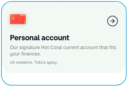
Button, secondary-with-icon (lg)#091723 text on #f2f8f3, radius 8px, h 107px, padding 16px 16px 16px 16px, 16px/400
hover, focus (keyboard): no change
Button, outline · main#091723 text on transparent, border 2px solid #091723, radius 128px, h 48px, padding 0px 24px 0px 24px, 16px/400
focus (keyboard), disabled: no change
Button, secondary-with-icon (lg) · header#091723 text on #f2f8f3, radius 8px, h 130px, padding 16px 16px 16px 16px, 16px/400
hover, focus (keyboard): no change
Button, ghost (lg)#000000 text on transparent, radius 16px, h 139px, padding 24px 24px 24px 24px, 16px/400
hover, focus (keyboard): no change
Button, ink · main#ffffff text on #091723, border 1px solid #091723, radius 500px, h 48px, padding 12px 24px 12px 24px, 16px/600
hover, focus (keyboard), active (pressed): no change
Icon button, outline#091723 text on transparent, border 2px solid #091723, radius 128px, h 48px, padding 0px 0px 0px 0px, 16px/400, icon only 24px
Icon button, outline · footer#091723 text on transparent, border 1px solid transparent, radius 500px, h 44px, padding 0px 0px 0px 0px, 16px/600
Icon button, outline · mainrgba(9, 23, 35, 0.3) text on transparent, border 2px solid rgba(9, 23, 35, 0.1), radius 128px, h 48px, padding 0px 0px 0px 0px, 16px/400, icon only 24px
Icon button, ghost#000000 text on transparent, radius 0px, h 26px, padding 1px 6px 1px 6px, 16px/400
Toggle / segmented control, ghost#000000 text on transparent, radius 16px, h 113px, padding 16px 16px 16px 16px, 16px/400
Toggle / segmented control, ghost · main#000000 text on transparent, radius 16px, h 158px, padding 16px 16px 16px 16px, 16px/400
Text link, underlinedrgba(9, 23, 35, 0.6), underline, offset 18.02%, 16px/400
Select (native), outlinedh 52px, bg #efefef, border 1px solid #b2b2b2, radius 10px, padding 16px 48px 16px 16px, 16px text #000000
Field label, above12.8px/700 #000000, above the field, margin-bottom -1px, uppercase
rest only
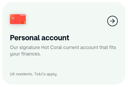
Header / navbarh 87px, sticky, bg transparent, 13 links, CTAs: Sign up, Personal account, Joint account, inner 1376px, logo left
rest only
Navigation link, plainrgba(9, 23, 35, 0.6), no underline, 20px/600
hover, focus (keyboard): no change
Menu / dropdown trigger, ghostrgba(9, 23, 35, 0.6) text on transparent, radius 8px, h 46px, padding 11px 12px 11px 12px, 20px/600, icon left 24px
hover: no change
Menu / dropdown trigger, ghost · header#000000 text on transparent, radius 0px, h 40px, padding 0px 0px 0px 0px, 16px/400, icon left 24px
Tabs, plain5 tabs, horizontal, tab #091723 16px/400, padding 12px 8px 12px 8px, selected #091723/400
Tabs, plain · main3 tabs, vertical, tab #091723 16px/400, padding 12px 8px 12px 8px, selected #091723/400
Footer link, underlined#0000ee, underline, 16px/400

Skip linkoff-screen until focused
focus (keyboard): no change
Language / region switch#ffffff text on rgba(255, 255, 255, 0.2), radius 100px, h 34px, padding 4px 12px 4px 12px, 16px/700
Banner / announcement bar, subtle-filled#000000 on #f2f8f3, radius 0px, padding 16px 16px 16px 16px, 16px, dismissible, sticky top, h 84px
rest only
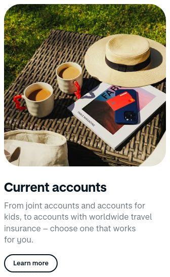
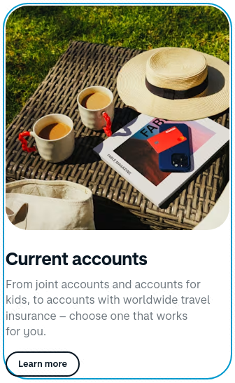
Card, flat-media-topbg transparent, border none, radius 0px, padding 0px 0px 0px 0px, no shadow, about 320×529px, media on top 320×320, radius 0px, h3 25px/700, body 16px rgba(9, 23, 35, 0.6), 1 per row
Card, flat-media-top · mainbg transparent, border none, radius 32px, padding 0px 0px 0px 0px, no shadow, about 320×320px, media on top 320×320, radius 0px, 1 per row
Card, flatbg transparent, border none, radius 0px, padding 8px 24px 24px 24px, no shadow, about 340×142px, body 16px #ffffff, 1 per row
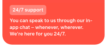
Card, filled-media-topbg #ff4f40, border none, radius 32px, padding 0px 0px 0px 0px, no shadow, about 340×320px, media on top 340×178, radius 0px, body 16px #ffffff, 1 per row
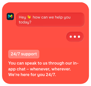
Card, filled-media-top · mainbg #112231, border none, radius 32px, padding 0px 0px 0px 0px, no shadow, about 340×320px, media on top 340×156, radius 0px, body 16px #ffffff, 1 per row
focus (keyboard): no change
Card, filled-with-mediabg #f2f8f3, border none, radius 64px, padding 64px 64px 64px 64px, no shadow, about 550×665px, media inside 422×430, radius 0px, h3 16px/600, 1 per row
rest only
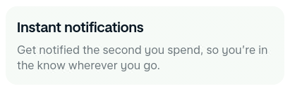
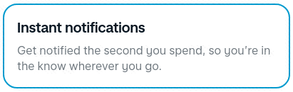
Feature item (icon + title + text), outlined-interactivebg #f2f8f3, border 2px solid transparent, radius 32px, padding 32px 24px 24px 24px, no shadow, about 421×281px, h3 25px/700, body 16px rgba(9, 23, 35, 0.6), 1 per row, clickable
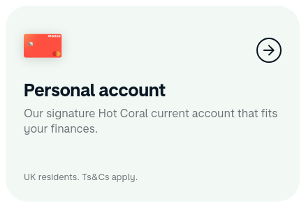
Styled list6 items, marker none, icon per item, gap 24px, item padding 0px 0px
Styled list · main3 items, marker none, icon per item, gap 24px, item padding 0px 0px
rest only
Image / figure, aspect-1-rounded320×320px, aspect 1, radius 32px, object-fit cover
Image / figure, aspect-0.5395×790px, aspect 0.5, radius 0px, object-fit fill
rest only
Image / figure, aspect-1320×320px, aspect 1, radius 0px, object-fit cover
rest only
Video / media embed320×320px, radius 0px, no controls
Icon, filled-24px24×24px, filled, fill #000000
rest only
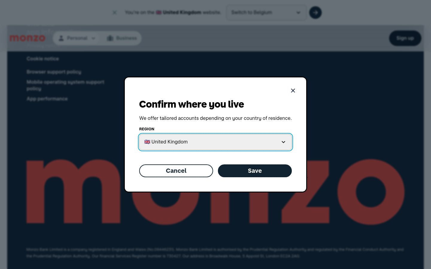
Dialog / modal 1612×387px, centered, bg #ffffff, text #000000 16px, radius 16px, padding 16px 16px 16px 16px, no shadow, border 3px solid #000000, backdrop rgba(9, 23, 35, 0.6) + blur(2px), 3 items 56px tall in 2 columns, with icons, close button, 1 input(s), closes on Escape
Not on this page: Button group, Floating action button, Close / dismiss button, Text input, Search field, Textarea, Combobox / custom select, Checkbox, Radio, Switch / toggle, Range slider, File input / dropzone, Date / time input, Input with attached button or addon, Help / hint text, Validation error text, Fieldset / form section, Breadcrumb, Pagination, Stepper / progress steps, Sidebar navigation, Footer, Back to top, Social icon links, Theme toggle, Tooltip, Popover, Dropdown menu, Drawer / sheet / off-canvas, Toast / snackbar, Cookie / consent notice, Lightbox / media viewer, Badge / pill / tag, Chip (removable / selectable tag), Alert / callout, Progress bar, Spinner / loader, Skeleton / shimmer, Counter / notification dot, Empty state, Rating / stars, Pricing card / plan, Testimonial / quote card, Stat / metric, List row / menu row, Table, Table row, Accordion / disclosure, Avatar, Avatar stack, Divider, Code block / inline code, Keyboard key, Blockquote, Carousel / slider, Logo strip, Eyebrow / kicker, FAQ block, Call-to-action band, Newsletter / signup form, Search results / listing row, Sticky bar.
Responsive
1440 / 1024 / 768 / 390 px| Viewport | Content | Gutter | Body | Heading | Header | Hero | Grids | Buttons |
|---|---|---|---|---|---|---|---|---|
| desktop 1440 | 395px | 100px | 16px | 48.8px, 2 lines, start | 87px, 3 links, 1 CTA | text only | 2→1 col; 2→2 col; 4→1 col | content-width |
| laptop 1024 | 720px | 88px | 16px | 48.4px, 3 lines, start | 87px, 3 links, 1 CTA | text only | 2→1 col; 2→2 col; 4→1 col | content-width |
| tablet 768 | 704px | 64px | 16px | 45.3px, 2 lines, start | 72px, hamburger (Toggle Personal navigation menu), 1 CTA | text only | 2→1 col; 3→3 col; 6→6 col | 10 full-width |
| phone 390 | 358px | 40px | 16px | 40.7px, 4 lines, start | 65px, hamburger (Toggle Personal navigation menu), 1 CTA | text only | 2→1 col; 3→3 col; 6→6 col | 12 full-width |
- H1 goes 48.8px → 40.7px (83%), 2 → 4 lines.
- Nav collapses to a hamburger by 390px (first seen at 768px); header 87px → 65px.
- Card grids: 1 columns → 1 column on phones (gap normal → normal).
- Body text is 16px at the sampled desktop and phone widths.
- Phone side gutter 40px.
- 12 buttons stretch full-width on phones.
- Section top padding 64px → 32px.
Files in the pack
103 filesStart with 30 kB of guide text. All the text in the pack is 1,022 kB; open the detailed files as you need them. Images are separate.
START_HERE.md81 lines
# Start here: monzo.com

Observed 2026-09-29T20:33:16.021Z; default light theme. This is a compact handoff, not the full evidence archive.
Use this file and tokens.css first. Open desktop and phone fold screenshots for composition, then BRAND.md and brand crops for logo/icon detail. Read DESIGN.md for component detail, COMPONENTS.md for every component variant and measured state and BEHAVIOR.md for interactions. evidence.json is diagnostic data; do not paste the entire archive into the first request.

## Priority values and evidence

Values labeled fallback were not observed for that role; inferred-role means a visible heading was mapped to a display role. Keep observed values, but treat fallbacks as suggestions.
Keep measured sizes, tracking, radii and colors unless the new content requires an explicit adaptation. Do not enlarge the headline simply to fill a different line length.
Content width: 1392px. Inferred spacing base: 8px; sampled scale: 8, 16, 24, 32, 48, 64px. Observed CSS breakpoints: 481, 769, 820, 1041, 1440px.
Colors: background=#ffffff; surface=#efefef; foreground=#6b747b; primary=#091723; on-primary=#ffffff; secondary=#0000ee; border=#091723.
- primary: Selected from measured button, link, text, painted-area and theme colors. It is not proof of a filled primary button; follow the observed component recipes.
Radii: button 500px, card 0px, input 10px, image 0px.
Shadows: rgba(0, 0, 0, 0) 0px 1px 1px 0px.

## Typography

Load fonts.css before applying tokens.css. FONTS.md contains the observed face/weight inventory and rendered-font checks. A CSS family name alone does not load a font.
Use each role as a complete recipe: family, exact numeric weight, size, line height, tracking and variable-font settings. Do not round 510 to 500/600, or turn a measured light style into a bold heading.
Fallback roles are unmeasured suggestions. If a role is absent, start from the nearest observed text treatment; do not assume headings must be bold.
- MonzoSansDisplay: observed weights 700, 800; source loading recipe in fonts.css.
- MonzoSansText: observed weights 400; source loading recipe in fonts.css.
After loading, inspect the browser's Rendered Fonts for the headline, body and button. Computed font-family/font-weight and document.fonts.check() alone do not prove which face drew the glyphs.

- headline-display: MonzoSansDisplay; 48.8288px/58.5946px; weight 800; tracking normal; observed, source h1.
- headline-lg: MonzoSansDisplay; 39.0624px/46.8749px; weight 800; tracking normal; observed, source h2.
- headline-md: MonzoSansDisplay; 25px/35px; weight 700; tracking normal; observed, source h3.
- body-md: MonzoSansText; 16px/22.4px; weight 400; tracking normal; observed, source body.
- label-md: MonzoSansText; 12.8px/17.92px; weight 400; tracking normal; observed, source label.
- button: MonzoSansText; 16px/22.4px; weight 400; tracking normal; observed, source button.
- Font MonzoSansDisplay: self-hosted; fallback Inter. Availability must be checked; self-hosted does not imply unavailable or licensed for reuse.
- Font MonzoSansText: self-hosted; fallback Inter. Availability must be checked; self-hosted does not imply unavailable or licensed for reuse.

## Regional composition

Read REGIONS.md and open the referenced context, detail and icon crops before drawing complex previews. Build outer shell, inset content panel and internal groups as distinct layers where observed. Preserve which surface owns each gradient, border and shadow; do not apply one generic card treatment to every layer.
For images, canvas, video and external SVG, use the rendered crops to infer visible internal groupings. Keep those inferences separate from measured DOM facts. Do not treat an illustration as a functional app or paste the screenshot as the finished UI. Return to the whole-page screenshots to match scale and placement.
- r1: 1392×750px at page (24, 171.6); 8 measured layers, 0 icon samples, 4 opaque media layers. screenshots/region-r1-context.jpg, screenshots/region-r1-detail.png
- r2: 1440×881.6px at page (0, 2080.6); 24 measured layers, 2 icon samples, 9 opaque media layers. screenshots/region-r2-context.jpg, screenshots/region-r2-detail.png
- r3: 1440×991.2px at page (0, 3026.2); 24 measured layers, 9 icon samples, 1 opaque media layers. screenshots/region-r3-context.jpg, screenshots/region-r3-detail.png, screenshots/region-r3-icons.png

## Component recipes

- ghost button: bg transparent; text #000000; border none; radius 0px; height 42px; padding 0px 0px; type 0px/400; shadow none.
- primary button: bg #091723; text #ffffff; border 1px solid #091723; radius 500px; height 51px; padding 12px 24px; type 16px/600; shadow none.
- secondary button: bg #ffffff; text #091723; border 1px solid #ffffff; radius 500px; height 48px; padding 12px 24px; type 16px/600; shadow none.
- Input: {"type":"select","bg":"#efefef","color":"#000000","border":"1px solid #b2b2b2","radius":"10px","height":52,"fontSize":16,"padding":"16px 48px","shadow":"none"}.

## Responsive and interaction evidence

- desktop 1440px: content 395px, gutter 100px, H1 48.8px, 2 lines, start, header 87px, 3 links, 1 CTA, grids 2→1 col; 2→2 col; 4→1 col.
- laptop 1024px: content 720px, gutter 88px, H1 48.4px, 3 lines, start, header 87px, 3 links, 1 CTA, grids 2→1 col; 2→2 col; 4→1 col.
- tablet 768px: content 704px, gutter 64px, H1 45.3px, 2 lines, start, header 72px, hamburger (Toggle Personal navigation menu), 1 CTA, grids 2→1 col; 3→3 col; 6→6 col.
- phone 390px: content 358px, gutter 40px, H1 40.7px, 4 lines, start, header 65px, hamburger (Toggle Personal navigation menu), 1 CTA, grids 2→1 col; 3→3 col; 6→6 col.
H1 goes 48.8px → 40.7px (83%), 2 → 4 lines.
Nav collapses to a hamburger by 390px (first seen at 768px); header 87px → 65px.
Card grids: 1 columns → 1 column on phones (gap normal → normal).
Body text is 16px at the sampled desktop and phone widths.
- Hover button-primary: background #091723 → #2c3a43, border #091723 → #2c3a43.
- Hover button-secondary: background #ffffff → #ffffffcc, border #ffffff → #ffffffcc.
- Hover nav-link: text #09172399 → #091723, border #09172399 → #091723, icon/inner colour → #091723.
- Focus button-primary: outline 1px solid rgb(33, 143, 183), offset 2px.
226 elements carry transitions; typical 0.3s with cubic-bezier(0.22, 0, 0.12, 1), mostly on background-color, opacity, transform. 1 running keyframe animations (RevealInView_reveal__AqI33 1s 1).
No alternate theme verified.

## Logo and icons

Logo lockup: 120×26px, filled. See BRAND.md and its crops for shape evidence.
Icon: 24×24px; filled; stroke none observed, caps not applicable.
Icon: 42×42px; filled; stroke none observed, caps not applicable.

## First images to open

- screenshots/desktop-1440-fold.png: Desktop 1440, above the fold
- screenshots/brand-logo.png: primary logo lockup
- screenshots/phone-390-fold.png: Phone 390, above the fold

## Verify the build

Render at desktop, 390px and 320px. Inspect the result, compare against the supplied references, fix the largest visible mismatch, and recheck keyboard focus, overflow, navigation and form behavior. Match the visual language while following the requested product content.
Page background comes from body; large surface colors remain in the palette.
The primary action colour is the ink colour (monochrome palette); chromatic colours appear only as small accents.


